By Marryellen Mcfadden
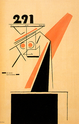
1915
American Alfred Stieglitz founded 291 Gallery in New York and published the journal 291 as well as his Camera Work, a journal that lasted much longer.
Source: flickr
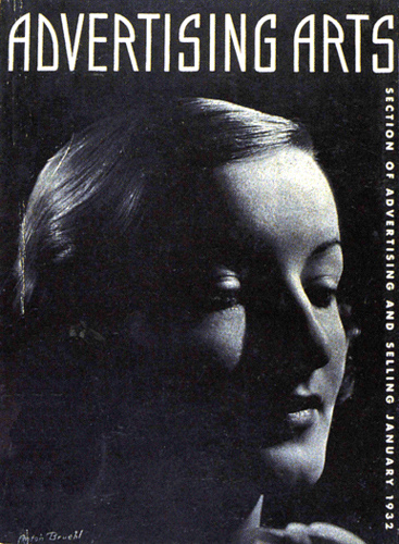
1932
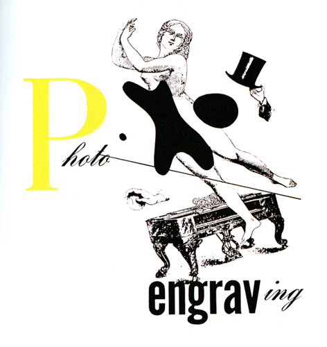
Photography was making new inroads in graphic design, or advertising art as it was called at that time, especially after WWI and the development of photogravure printing and other new printing production methods. And bleed trim became a new design element.
Source: flickr
Before WWII, advertising in America followed the line of the copywriter rather than the designer, (written copy, not creative graphic design,) but the desperation of the Great Depression called for drastic changes in advertising thinking.
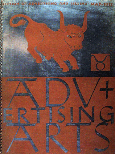
When Advertising Arts started out in 1930, its mission was to promote marketing in all forms. Graphic design (or advertising art as it was called), packaging, industrial products, the design of anything modern was covered. But emphasis was placed on the selling message through modern design. It had to successfully promote sales.
Source: flickr
1933
Source: flickr
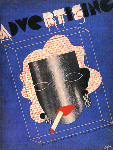
1934
Surrealism really started to be an influence on graphic design just about this time.
Source: flickr
1938
It was surreal, had nudity, and was like no graphic design that American commercial artists had ever seen before.
Source: flickr
1939
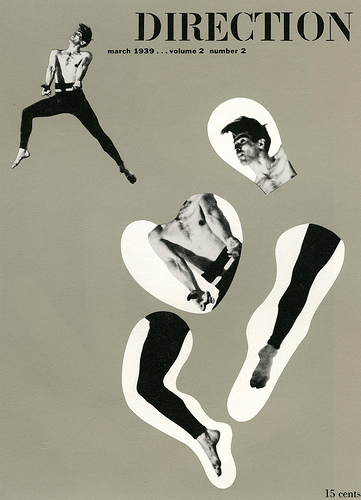
15 cents a copy, a Great Depression price.
Source: flickr
1943
Source: flickr
1945
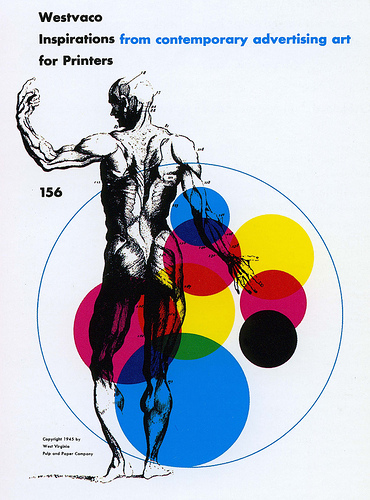
Bradbury Thompson’s 1945 design for the Westvaco corporation back when the profession of designing was called advertising art. The term graphic design was just starting to be used largely due to people in the adversiting design field (and their clients) who took a sophisticated new approach with their work. Bradbury Thompson designed 59 issues of this publication between 1939 and 1962.
Your work is only as good as your client will allow. Pray for sophisticated clients that pay
you on time!
Source: flickr
1946
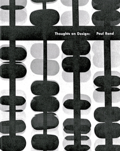
Paul Rand was another of those American designers that set new standards in the field of American graphic design. He published his book “Thoughts on Design” in 1946, and yes, I remember reading every word of it carefully.
Source: flickr
Source: flickr
1948
Source: flickr
1951
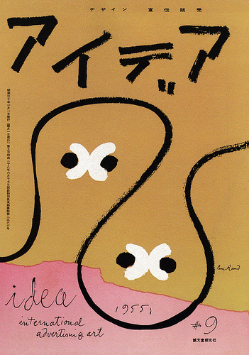
A Paul Rand cover for the International Advertising Art Idea magazine, 1951. He used humor as a basic part of his design in many instances, not the cartoon type of humor, but a humor that runs through visuals since the beginning of the visual arts. (Note the title, back in those days the business of graphic design was called advertising art.)
Source: flickr
1956
Source: flickr
19..
Source: flickr
1958
International paper trademark by Lester Beall 1958 and just as functional and elegant today as then.
Source: flickr
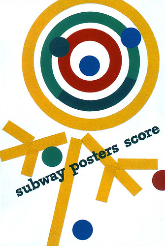
Paul Rand’s work designing corporate reports for IBM set whole new standards for American corporate graphics. This report designed in 1958.
Source: flickr
1960
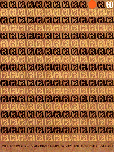
CA first CA Annual cover back when it was still the Journal of Commercal Art. Designed by Robert Runyan and Jim Fitzerald 1960.
Source: flickr
1962
Envelope for a printing company, Portland, Oregon US, designer Irwin McFadden 1962. Helvetica had just hit the American market but in hot-type only. This printing company purchased it in 6, 8,10 and 12 point but nothing larger, at least at that time. My husband drew up a full-sized copy of Helvetica and my job was to paste it up, letter by letter for headings that were then made into stats to be a final part of the mechanical.
Source: flickr
1965
Source: flickr
1968
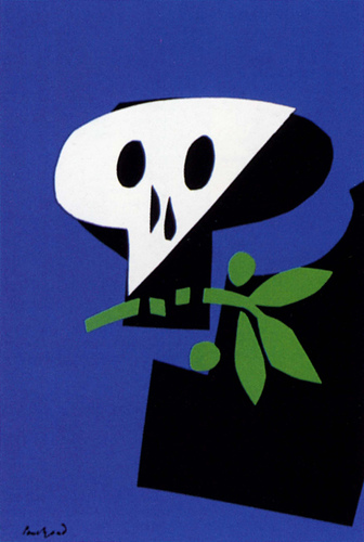
Paul Rand’s 1968 war and peace poster. Is there anyone out there that remembers the war in Vietnam? Probably only the Vietnamese and American GIs who were drafted and sent there.
Source: flickr
<1970
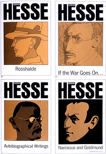
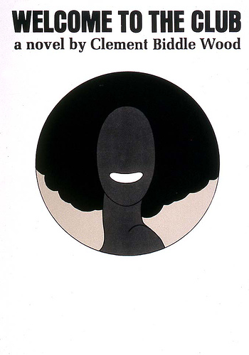
I think that this was a series of book covers or jackets by Milton Glaser designed before 1970.
Source: flickr
Source: flickr
There was a lot of design activity other than the Swiss direction in post-war US and pictorial modernism developed into a new direction. This is a Milton Glaser poster designed before 1970.
Source: flickr
1970
Source: flickr
19..
The US government adopted the international style for the majority of its publications, especially in the National Park Service publications. Years ago I received a US government employment announcement stating that any applicant for a US government graphic design position must have a thorough knowledge of new graphic design principles.
This has a topographical illustration that wraps around the booklet front, spine and back. Illustrations of this nature were not usually used but this booklet, in layout, photography and typography, is a magnificent example of new graphic design principles.
Source: flickr
<1972
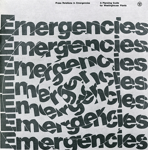
This prospectus cover, designed by Peter Megert of Ohio State University before 1972, runs cold chills up my spine every time I look at it, a very effective graphic use of letterform.
I developed a work-study program (called cooperative education) with the nuclear plant WPPSS on the Hanford reservation in eastern Washington state and I saw things, and my students were involved in things that were almost beyond my comprehension.
After WPPSS collapsed, my program was transferred to Westinghouse. When Westinghouse lost the contract, Boeing took over and my program went with it. Just before I retired I was there on site in the design and photography office when the photographers came in after verifying leaks in the huge nuclear waste holding tanks. The whole operation was closed down after that. Don’t plan on going up there to see for yourself. A S.W.A.T. team will meet you before you get to the site.
Source: flickr
1973
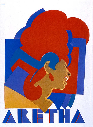
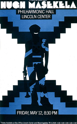
Milton Glaser’s work always seemed heavy to me. This symmetrical design does not say jazz to me.
Source: flickr
<1976
Source: flickr
19..
Source: flickr
Source: flickr
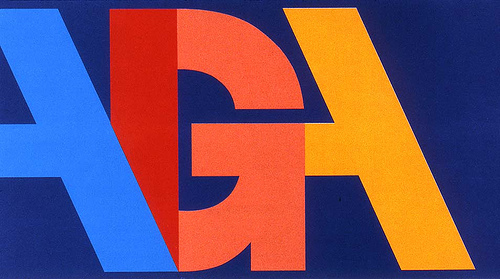
A design for AIGA or American Institute for Graphic Arts. This organization is the oldest and leading group about design in the US. Their website can be a little overwhelming for beginning or novice designers but it has a wealth of information concerning American graphic design.
Graphic design, the most ubiquitous of all arts.
Source: flickr
1981
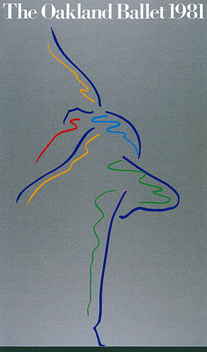
Simplicity, pure and simple.
Source: flickr
1982
Source: flickr
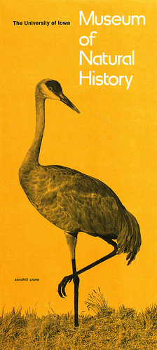
When my husband was the designer for the University of Iowa publications, he designed a logo for the university that used all lowercase. He received a very firm letter from a rural Iowa English high school teacher, informing him that it was difficult enough to teach students proper form without the university itself breaking the rules. He agreed with her and redesigned the university logo with a capital i.
Simplicity, the hardest route of all to follow.
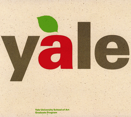
A two-color run design, the red and green screened together for the darker green. As I remember, I used this as an example of designing with just two colors. It’s so important for students to see and understand the use of color and the printing press (and the economics of it all).
Source: flickr
1984
Source: flickr
1987
Source: flickr
Source: flickr
Another example of pure and simple.
Source: flickr
1989
Source: flickr
Designed 1989.
Source: flickr
1991
Source: flickr
1995
Source: flickr
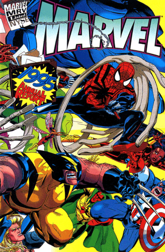
One of the most popular annual reports ever. (They’re crying all the way to the bank as the saying goes). Designed by Michel Van-Minh Le 1995.
Source: flickr
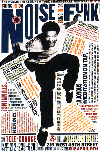
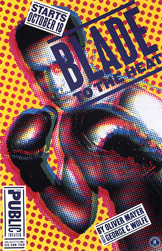
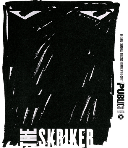
Part of the Bring In ‘Da Noise Bring In ‘Da Funk series designed by Paula Scher (and Lisa Mazur?), photographer Richard Avedon for Pentagram Design for The Public Theatre 1995 or earlier.
Source: flickr
1995/6
Source: flickr
Source: flickr
Source: flickr
Source: flickr
<1996
Source: flickr
1996
Source: flickr
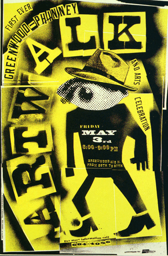
Seattle poster design by Robynne Raye, Modern Dog design, for the Greenwood Arts Council 1996.
Source: flickr
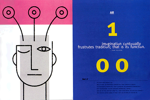
Annual report cover for Rational Software Corporation designed by Sharrie Brooks, Cahan & Associates design firm 1996.
Source: flickr
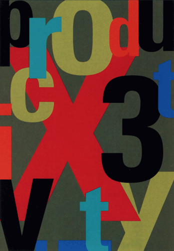
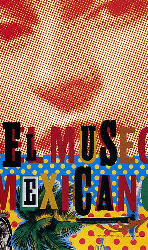
Poster designed by Craig Bailey, Moria Design, for the International Museum of Photography 1996.
The background dot patterned face is a Benday print of Frida Kahlo from the Museum of Photography. Not too many of us left around that worked with “Bendays”.
Source: flickr
Source: flickr
Source: flickr
19..
Source: flickr
Note: Komentar dari kolektor (Marryellen, pengajar desain grafis) – yang terkadang tercantum pada deskripsi masing-masing karya – sengaja tidak dihapus, karena bisa merupakan informasi yang berguna untuk melakukan penelitian yang lebih mendalam.
About Marryellen:
I started out taking Saturday art classes when I was a child at the local Portland Oregon museum school of fine art. When I was in high school I majored in art and took weekly life drawing classes at the same art school when I was not working for the Red Cross during those hectic war years. I then went on scholarship for four years of more fine arts training at the same school. I also studied “advertising art” from a local advertising artist who introduced his students to such names as Paul Rand and Bradbury Thompson. I studied calligraphy for many years with Lloyd Reynolds, nationally known calligraphy teacher. And just plain earning a living at the drawing board. I also met with a group of young start-up graphic designers one night a week after work, to study the latest issue of Neue Grafik and create design projects that we then would critique. And finally, I married a graphic designer/type designer.
There was no such name as graphic design for a major in schools outside of New York. Classes that were taught were called Advertising Art and were usually disdained by all fine arts faculty and administration (until they needed a classy design for an upcoming show of their work). What was taught in the various colleges by mediocre faculty was a far cry from the professional world of graphic design.
I am trying to remember the books that really influenced me. Jan Tschichold”s “Asymmetric Typography” and his “Treasury of Alphabets and Lettering” anything written by Bauhaus faculty (except Itten, whose ideas were silly nonsense) “Documents in the Visual Arts Volume 1: Piet Zwart” and anything by and about any of the DeStijl, Constructivist, DaDa and Suprematism movement participants. Malevich, Moholy-Nagy, El Lissitzky and Theo van Doesburg in particular. “Neue Grafik” was the turning point to the future, that future suddenly being called graphic design or information design, but no longer advertising art.
I would say that ALL graphic designers should read “A Designer’s Art” by Paul Rand, Yale University Press ISB 0-300-0348-0 as well as his “Thoughts On Design”. Any of the 18 issues of the original Neue Grafik or New Graphic Design publication out of Switzerland from 1958 to 1965 and edited by Richard Lohse, J. Müller-Brockman, Hans Neuburg and Carlo Vivarelli. ANYTHING that was written about design by those four editors and other Swiss graphic designers should be studied.
Another very influential book was “The Trajan Inscription in Rome” by Catich. We poured over those plates and I made every student that I ever had study, study study and work from copies of them. Catish’s calligraphy was stiff and stilted but did he ever open doors with his scholarly research and photographs of the classic lapidary Roman letterform. Another was “Printing Types Their History Forms & Use” by Updike. I’ll probably remember more books around 2:00 am. I gave many of my art books to the Greys Harbor Community College library so I can’t remember just what the names of all of them were.
Important design books of the last 10 years? I couldn’t answer that but I do know that most of them have their 15 minutes of fame and then pass off into oblivion. And that includes periodicals as well. It all seems a rehash of the past or a back-lash against the past. And I mean of the 1960’s era when all of the really exciting things were happening. Graphic design is like sports. There are a few that make it to the point of being famous but there is never any mention of those who don’t go on. Since part of my job as graphic design faculty was developing job sites, I made my students take a realistic view of just what was out there in terms of earning a living at being a graphic designer. It’s a hard nosed competitive business.
Graphic design is problem solving and the problems are always in a state of change. And the same can be said about the methods for solving those problems but a graphic designer still must have a basic knowledge of graphic design history and the processes for producing finished work to truly be a professional graphic designer. Do you know by sight the differences between Helvetica and Univers? (And know the history of the two typefaces?) Because you may lose your job if you don’t when an art director tells you to use Univers and you use Helvetica. I have seen it happen. There is more to graphic design than knowing Quark or InDesign.
PS I was also an avid art gallery prowler. I can still hear my young daughters whining “Do we have to go to another art gallery, we want to go to the Japanese tea garden, drink tea, and then go to Alcatraz. Mom, you’re not listening to us MOM!”
.To be continued.
Quoted
“Cheating the system is very gratifying”


