by Marryellen Mcfadden
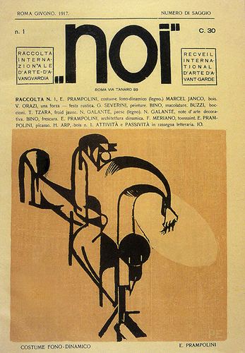
Cover designed for Noi: Rivista d’Arte Futurista by Enrico Prampolini June 1917.
Source: flickr
1920
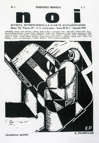
Cover designed for Noi: Rivista d’Arte Futurista by Enrico Prampolini January 1920. I think that he was also one of the editors.
Source: flickr
1925
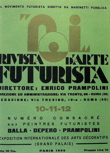
Cover designed for Noi: Rivista d’Arte Futurista 1925, but I am not sure who the designer was. Perhaps Prampolini? This was the basic format the publication followed from around 1923.
Source: flickr
1932
La Rivista cover designed by Fortunato Depero 1932.
Source: flickr
1933
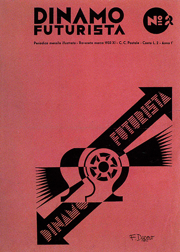
Dinamo Futurista was both edited and designed by Fortunato Depero who promoted Futurism concepts. 1933.
Source: flickr
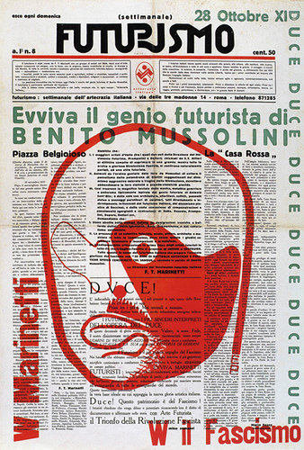
Prampolini designed the newspaper Futurisimo, edited by Marinetti and Somenzi 1933. Futurism graphics idealized Mussolini in many of their publications.
Source: flickr
1941
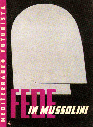
Mediterraneo Futurista cover designed by Biazzi 1941. Benito Mussolini was used in many of the Futurist graphics.
Source: flickr
1960s
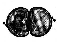
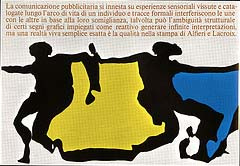
Franco Grignani advertisement for Alfieri&Lacroix, 1960s.
Source: flickr
1964
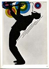
Franco Grignani advertisement design, 1964.
Source: flickr
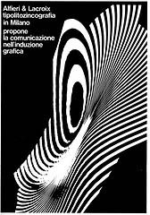
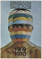
Franco Grignani advertisement for Alfieri&Lacroix, 1964.
Source: flickr
1968
Franco Grignani magazine advertisement 1968.
Source: flickr
1969
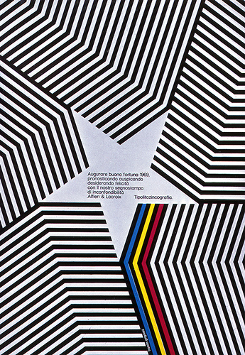
Franco Grignani book cover design, 1969.
Source: flickr
….
Designed by Max Huber, a Swiss designer working in Italy. He and Luigi Veronese and Remo Muratore founded the Rinascita school of Advertising in Milan, Italy directly after WWII. Their work with Constructivism had a distinctive quality that took an entirely different direction than Swiss design.
Source: flickr
….
I think that this was designed by Franco Grignani.
Source: flickr
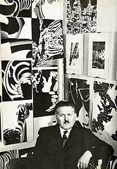
Franco Grignani (Italian, 1908-1999)
Franco Grignani (Italian graphic designer, 1908-1999).
Source: flickr
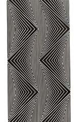
Franco Grignani experimental work in structural tensions.
Source: flickr
1998
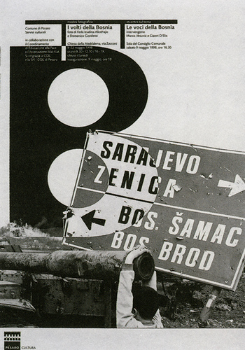
Poster designed by Leonardo Sonnoli 1998.
Source: flickr
2000
Poster for lecture on the design work of Franco Grignani. Designed by Leonardo Sonnoli 2000. The line of type at the top left got lost in the slide but that’s the event information.
Sonnoli uses little tiny type sizes on posters.
May Sonnoli never grow old and have to wear bifocal glasses when trying to find the time of the lecture.
Source: flickr
Note: Komentar dari kolektor (Marryellen, pengajar desain grafis) – yang terkadang tercantum pada deskripsi masing-masing karya – sengaja tidak dihapus, karena bisa merupakan informasi yang berguna untuk melakukan penelitian yang lebih mendalam.
•••
To be continued
Quoted
Desain (grafis) adalah kata kerja–bukan kata benda–karena mengutamakan proses; berupa pengolahan nilai keunikan dan keotentikan dari suatu problem


