CURATOR'S STATEMENT
10 Mei 2010
Type :Solo Exhibition
Year :2010
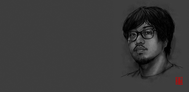
Designer :Eric Widjaja
Semangat Eksperimen dalam Diri Eric Widjaja
Tuntutan praktis di dalam pekerjaan kadang melupakan kita untuk lebih bereksperimen. Rutinitas membunuh kreativitas, tenggat waktu bagai vonis yang tak dapat ditawar, dan kita terseret untuk segera mewujudkan karya demi karya hingga melupakan ide baru, dorongan bermain dan semangat uji coba.
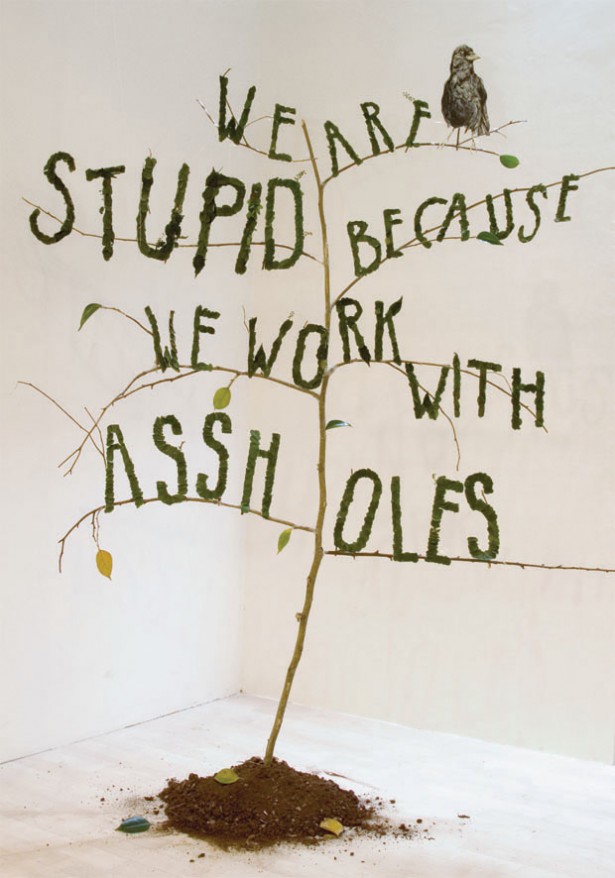
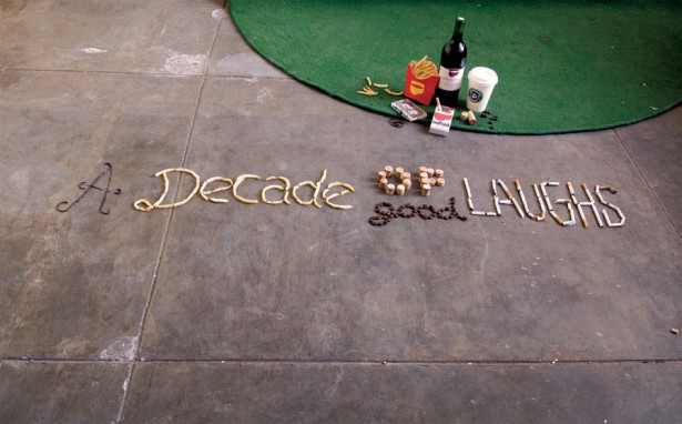
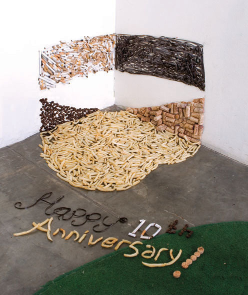
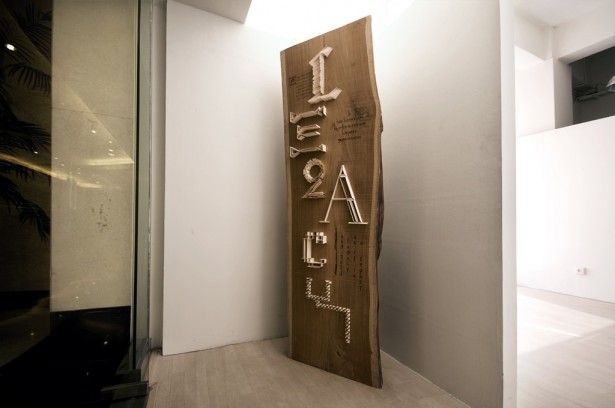
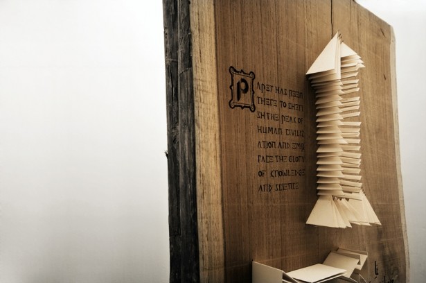
Di situlah letak kehebatan Eric Widjaja, dia sanggup bermain di antara pekatnya tuntutan praktis pekerjaan, menggulirkan ide-ide bermain di dalam visual yang diciptakannya. Dan seperti yang terlihat pada karya “We are Stupid”, “A Decade of Good Laugh” serta “Legacy”, Eric masih kerap bermain dengan obyek nyata, menyusun satu demi satu obyek tersebut, berlelah dalam instalasi hingga merekamnya dalam media visual — sebuah runut kerja proses kreatif yang semakin jarang kita lakukan karena Image Editing Software telah begitu memanjakan kita.
Selamat menikmati karya Eric Widjaja, dan bersiap untuk terinspirasi untuk kembali bermain dan bereksperimen visual. Silakan klik link berikut untuk memberikan apresiasi: “DGI Online Exhibition #05: Eric Widjaja”.
Selamat menikmati!
Danu Widhyatmoko
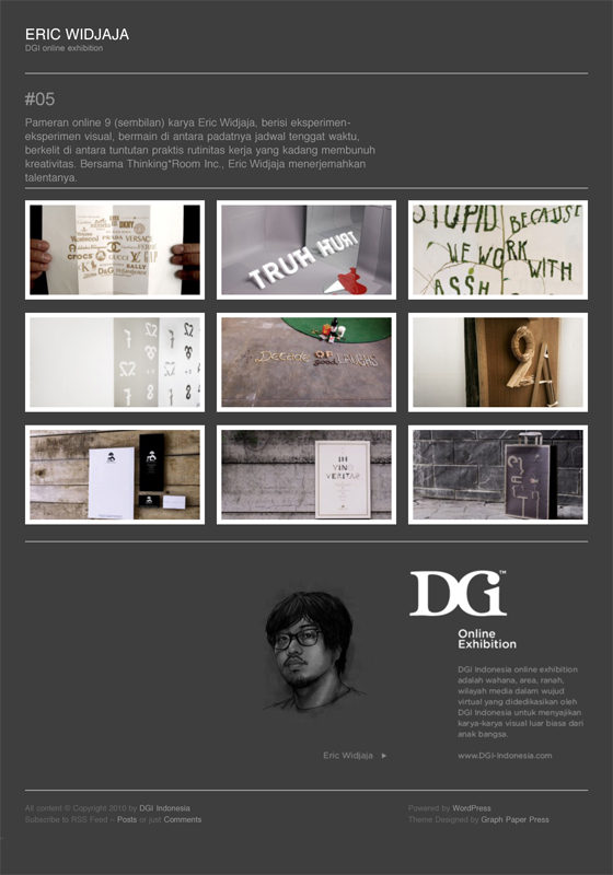
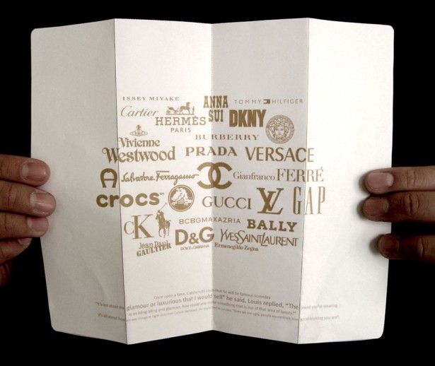
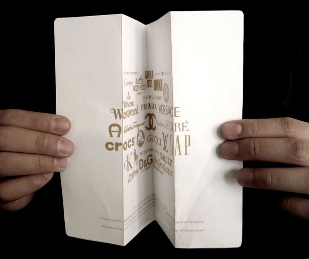
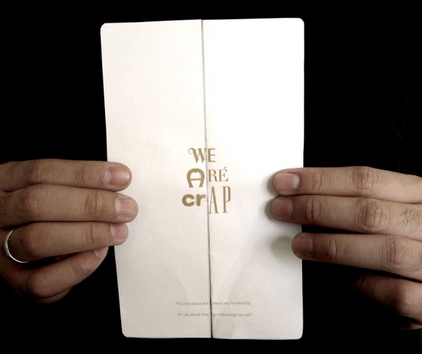
WE ARE CRAP
Title: We Are Crap
Elements: Visual Thought
Objective: No matter how good or expensive the brand you wear, you cannot hide your ugliness.
Client: Self Initated
Dimension: A4
Year: 2008
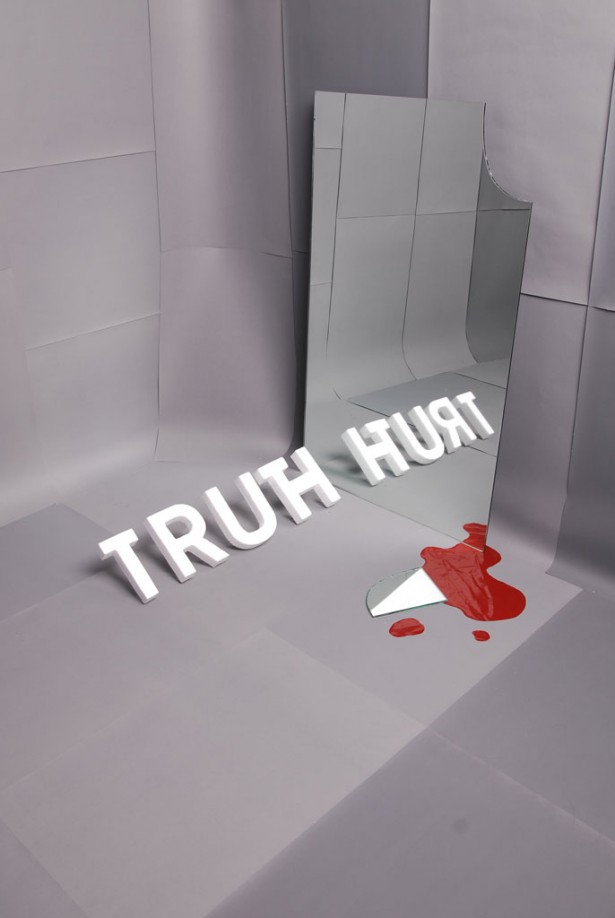
TRUTH DOES HURT
Title: TRUTH DOES HURT
Elements: Visual Concept
Objective: Reality bites. Yes, truth indeed hurts.
Client: Self Initiated
Dimension: N/A
Year: 2008
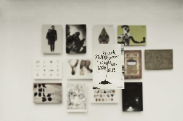
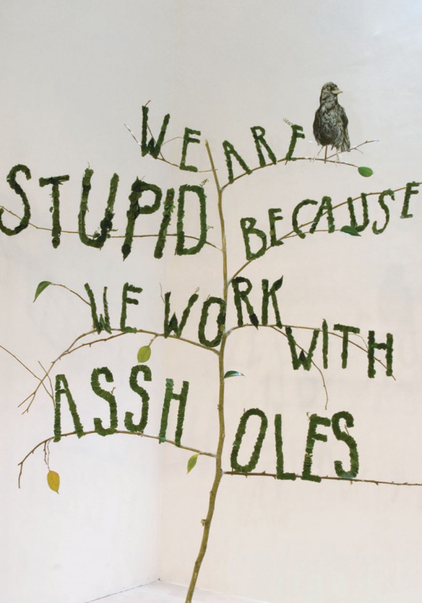
WE ARE STUPID
Title: We Are Stupid
Elements: Applied Typography
Objective: VERSUS magazine asked us to submit an artwork for their postcard series, the idea came in the nick of time, and it portrayed our situation in quite an honest way.
Client: Versus Magazine
Dimension: 180 x 100 cm
Year: 2009
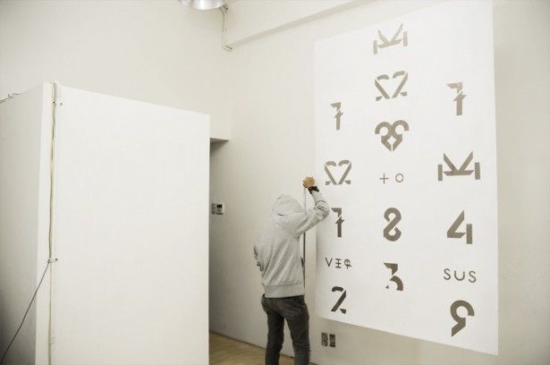
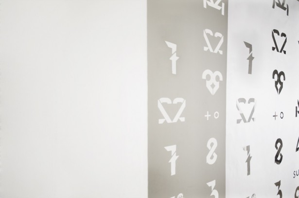
42779 24784329 TO VERSUS
Title: 42779 24784329 To Versus
Elements: Poster, Greeting
Objective: A birthday greeting for VERSUS magazine, inspired by cellphone buttons, the birthday greeting contains a secret message.
Client: Versus
Dimension: Bigger than the biggest person in our studio
Year: 2009
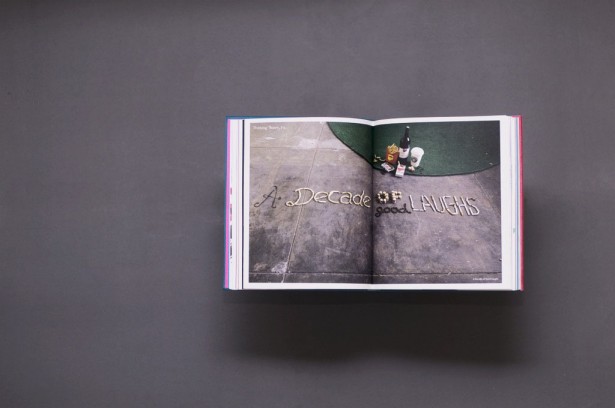
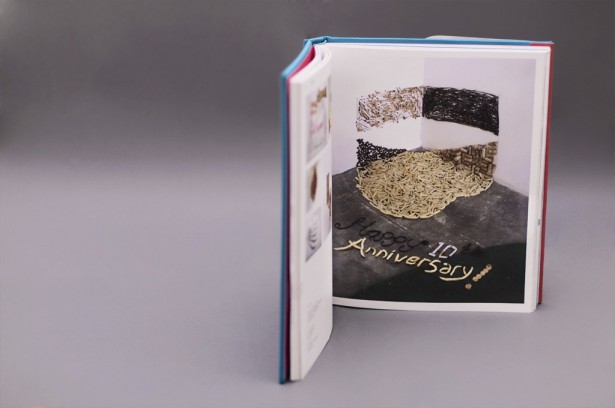
A DECADE OF GOOD LAUGH
Title: A Decade Of Good Laugh
Elements: Applied Typography, Contribution
Objective: A contribution for UNKL347’s 10th Year Book. We were asked to execute their logo to whatever we want to do. What came to our mind directly was, of course, to congratulate them and made a slogan ”A Decade of Good Laughs” describing what they did for 10 freakin’ years. Cigarette butts, cassette tapes, coffee beans, wine corks and some fries involved in this installation.
Client: UNKL347
Dimension: 20 x 30 cm
Year: 2008
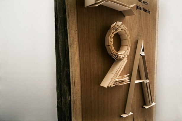
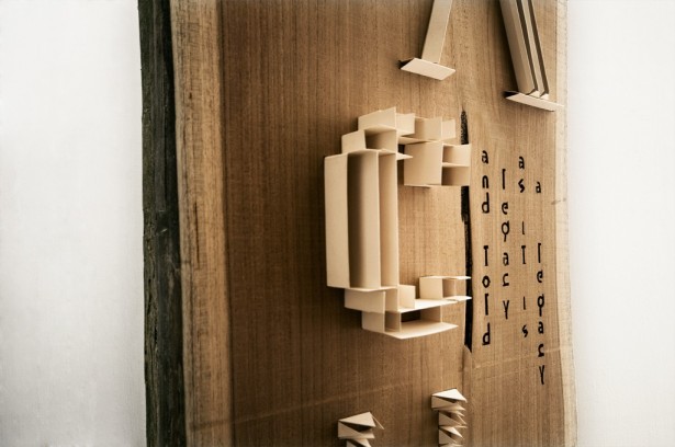
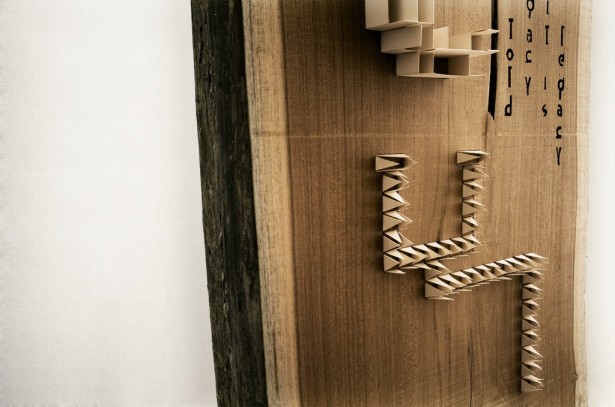
LEGACY
Tittle: Legacy
Elements: Applied Typhography
Objective: SURYA PALACEJAYA is an Indonesian established paper company, they invited twelve designers, each of them were requested to create an artwork for their 2010 calendar related to their 50th birthday with the theme paper celebration. We then decided to make a typography installation on a block of wood.
Client: Surya Palacejaya
Dimension: 300 x 50 cm
Year: 2009
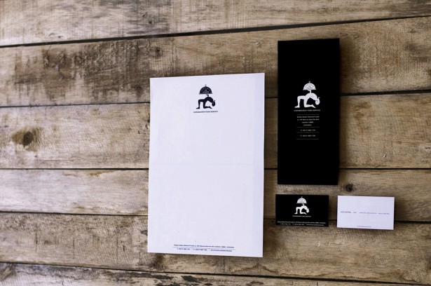
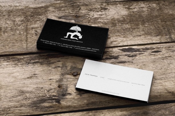
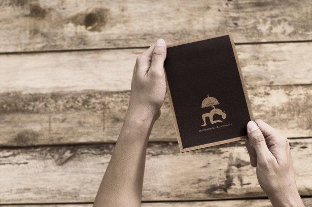
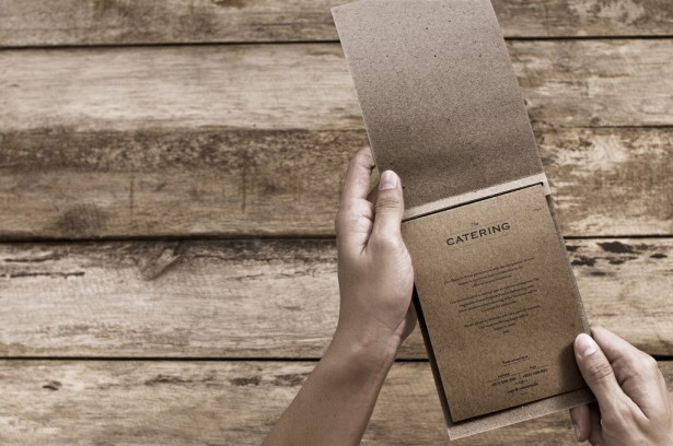
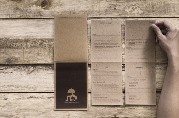
OUR PLACE OR YOURS
Title: Our Place Or Yours
Elements: Brand Identity, Logo, Catalog
Objective: Our Place Or Yours is Cork&Screw’s delivery concept. We wanted to twist the idea of being polite by portraying sarcasm in the logo.
Client: Cork & Screw
Dimension: Various
Year: 2009
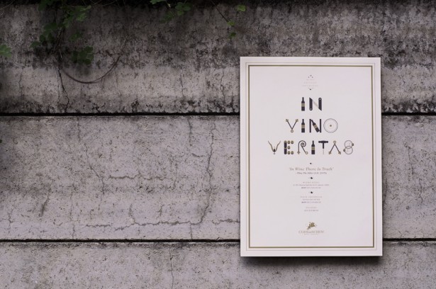
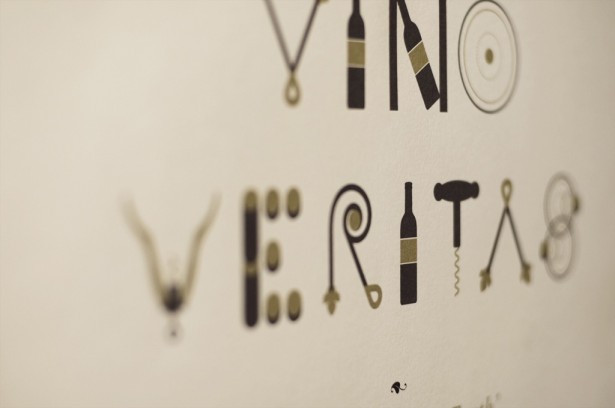
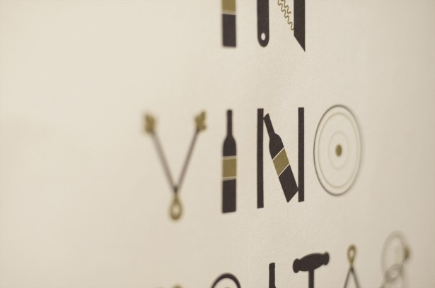
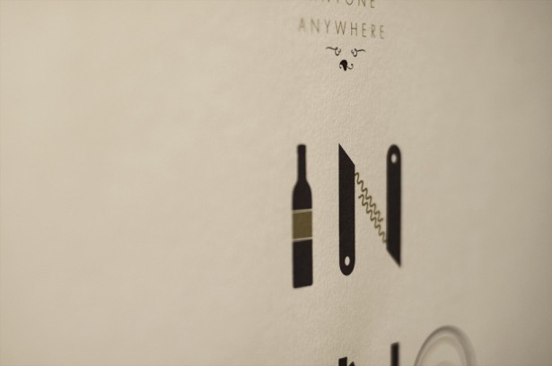
IN VINO VERITAS
Title: In Vino Veritas
Elements: Poster
Objective: We developed a custom typography specimen that was inspired by the element of wine and its serving for Cork&Screw’s campaign.
Client: Cork & Screw
Dimension: 50 x 72 cm
Year: 2009
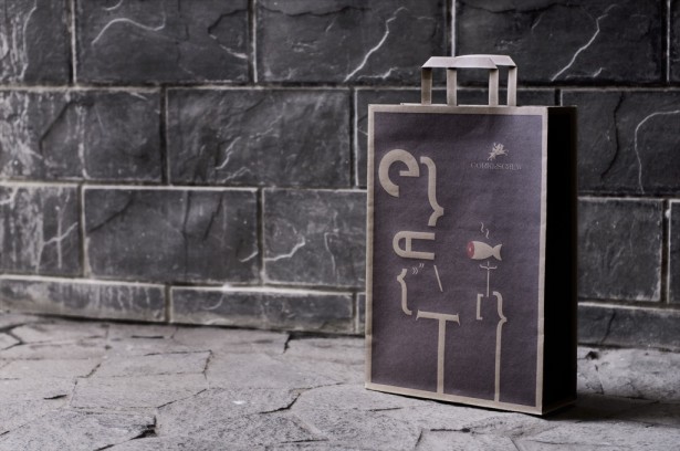
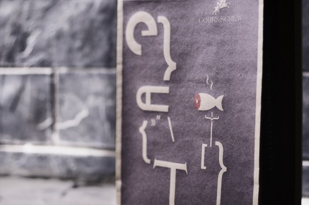
CORK & SCREW ‘EAT’ BAG
Title: Cork & Screw ‘eat’ Bag
Elements: Packaging, Merchandise
Objective: By maintaining the image of Dyonisus we execute an abstract impression for the food bag.
Client: Cork & Screw
Dimension: 16 x 35 cm
Year: 2009


