
CURATOR'S STATEMENT
24 September 2015
Year :2015
Designer :Sanrok Studio
Sanrok Studio: Energi Muda Desain Grafis Bandung
Berdiri pada 2013 atas inisiatif tiga anak muda lulusan FSRD Institut Teknologi Bandung, Sanrok Studio telah mantap melesat di jagat desain grafis Bandung. Melawan arus desain yang hanya ‘tren semata’, Sanrok Studio melangkahkan diri dengan semangat untuk menunjukkan identitasnya tersendiri. Dengan latar belakang dan fokus yang unik dari masing-masing pendirinya—tipografer, ilustrator, dan fotografer—Sanrok Studio muncul sebagai studio desain nan ikonik dan telah meraih reputasi tak hanya nasional, namun juga internasional meski usianya terbilang muda.
Para pendirinya, yakni Michael Alexander, Tito Yusuf, dan Sandy Pirouzi, selalu hadir dengan karya-karya inspiratif yang menggoda mata. Kali ini, DGI Online Exhibition hadirkan karya-karya Sanrok yang senantiasa lekat dengan sentuhan tangan/craftmanship, kepekaan tipografi yang tinggi, dan fotografi yang memikat.
Selamat menikmati.
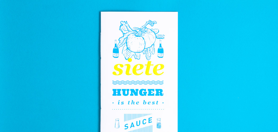
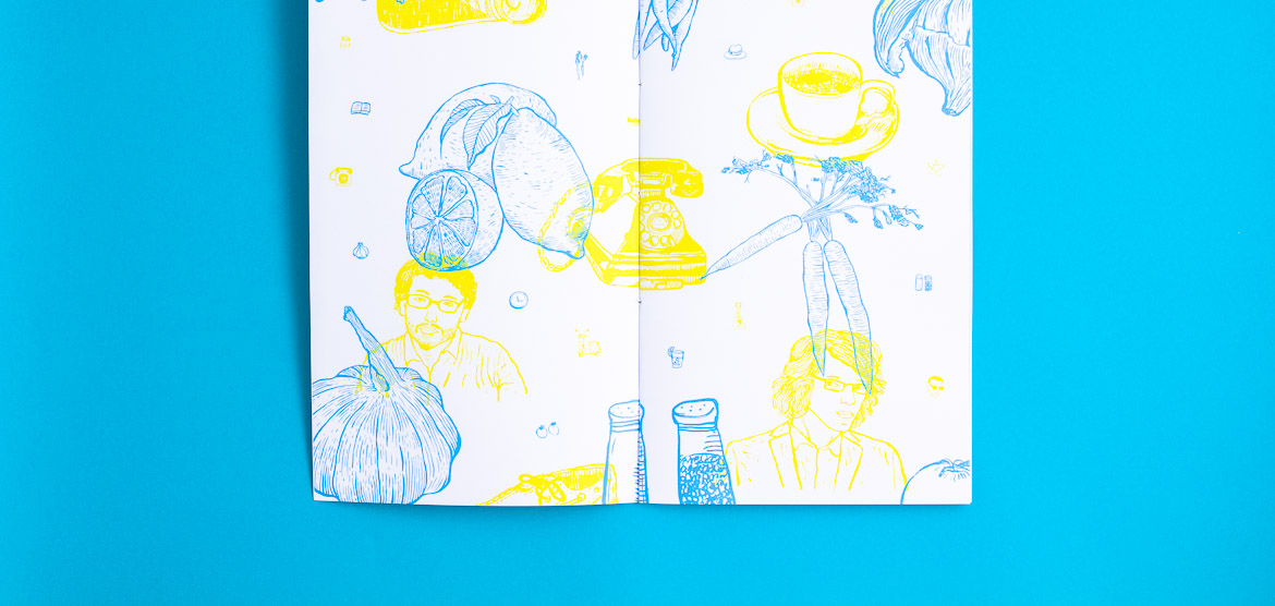
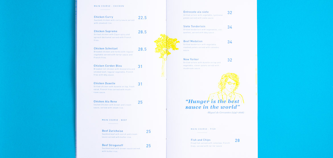
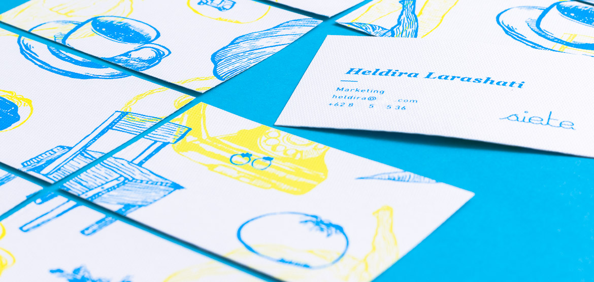
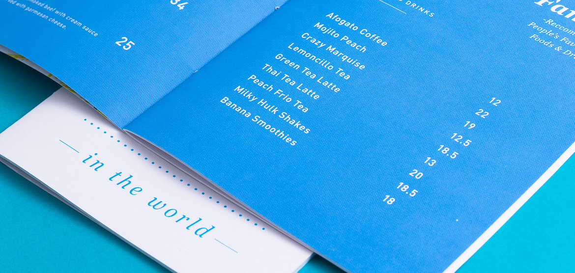
SIETE
Category
Branding
About
SIETE is a relatively small but comfortable café located in Bandung, Indonesia. A perfect place to meet-up and dine with a typical 1940’s Indonesian building and interior feel.
Objective
Targeted for creative youth communities, we use pop illustration to represent the dynamic atmosphere at SIETE.
Year
2013

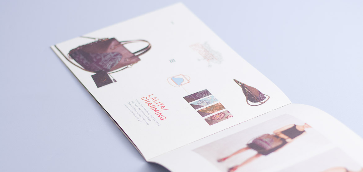
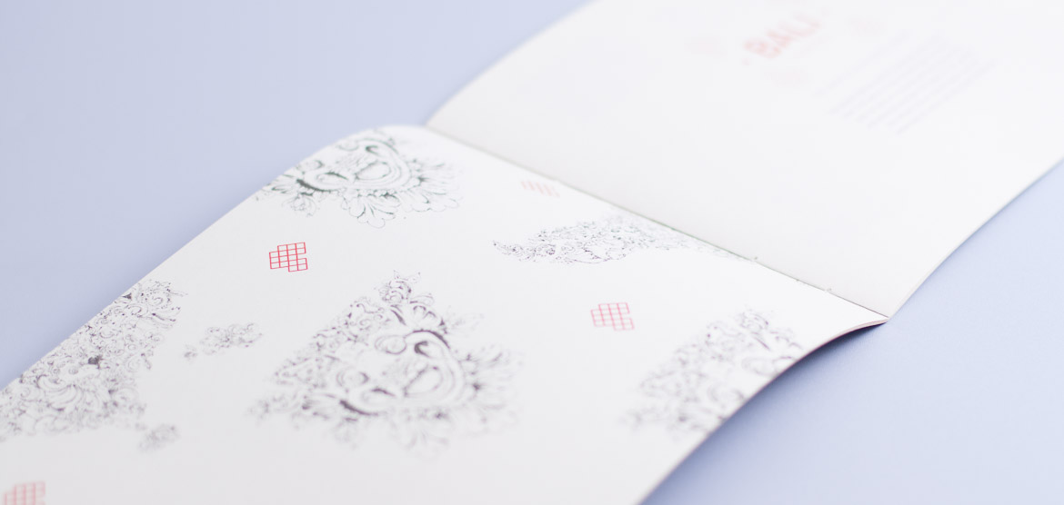

Umbara Catalog
Category
Print Design: Catalog
About
Umbara is a brand that make carrying-stuff with Indonesia’s traditional cloths as the material.
Objective
Do you know the stories behind Indonesia’s traditional cloths? We are not, honestly. But luckily these girls in Umbara kindly tell us the stories behind them—with their products.
Year
2013
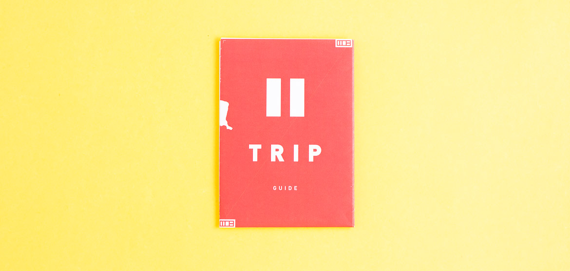
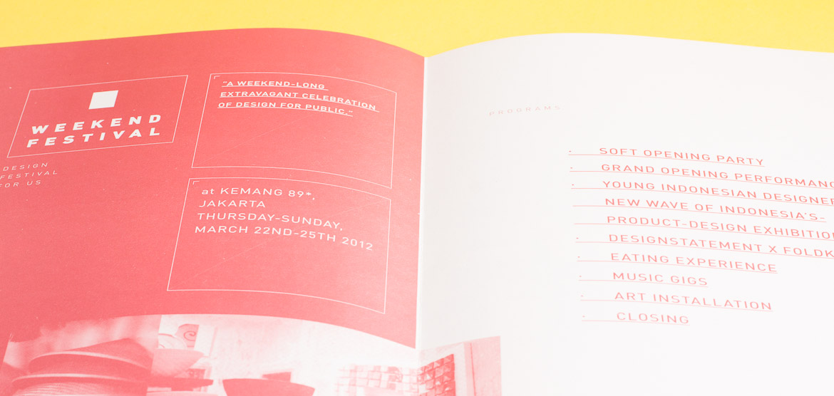
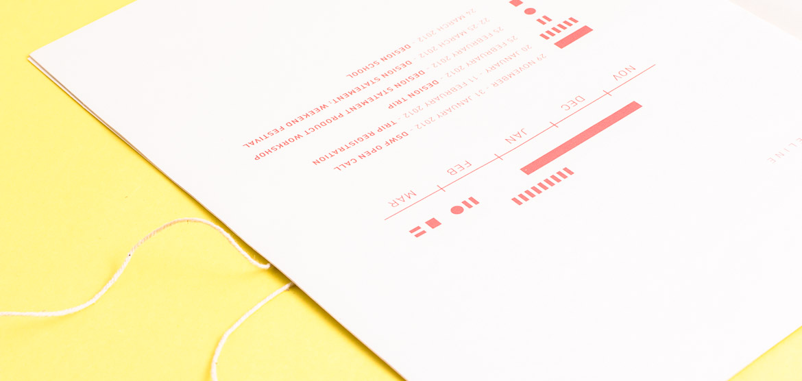

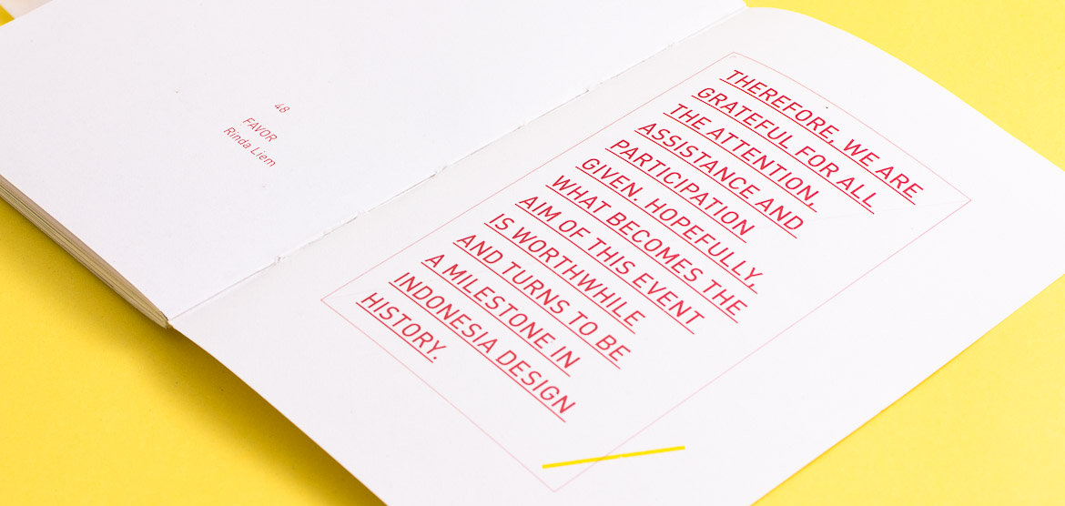
Pause Your Day
Category
Branding
About
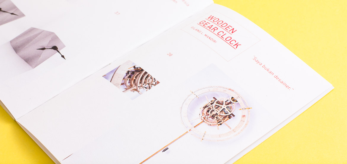
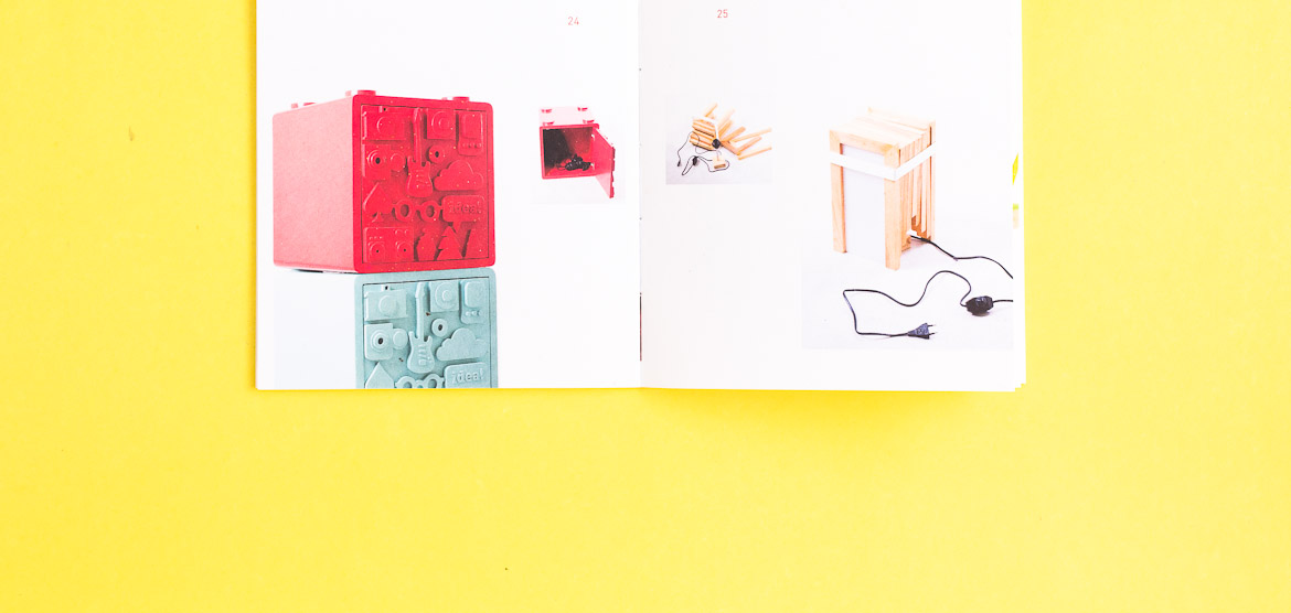
Pameran Desain Produk
Objective
Memperkenalkan dunia Desain Produk ke masyarakat awam
Year
2013
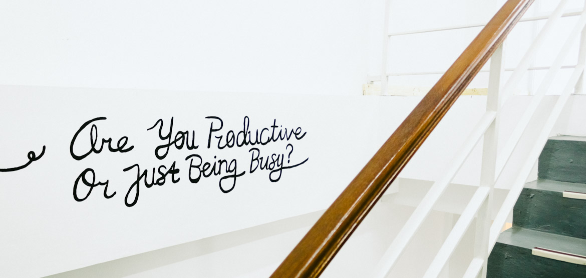
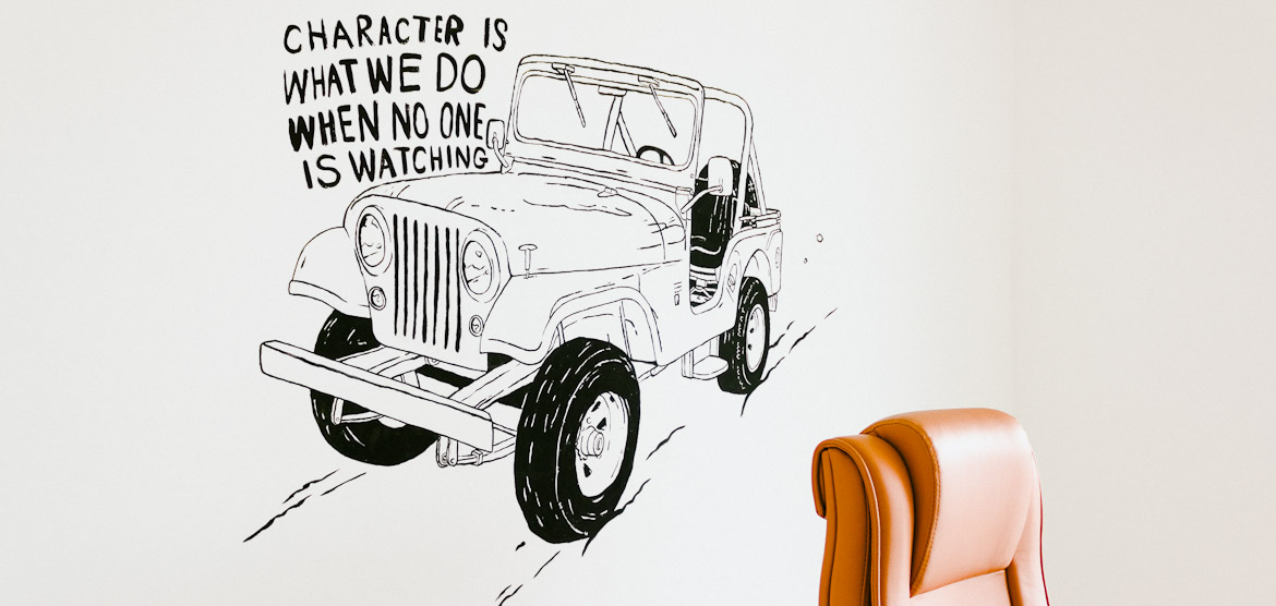
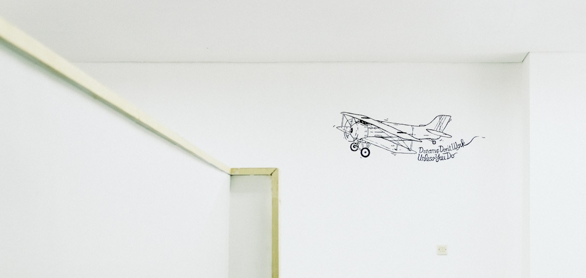
Rama Mitra Jasa
Category
Mural
About
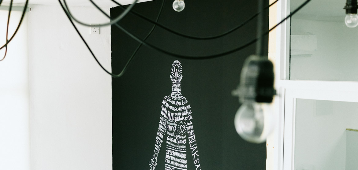
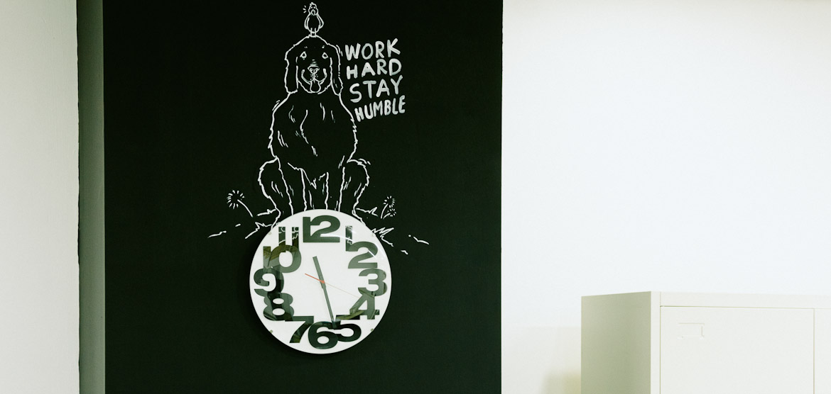
Mural project in Rama Mitra Jasa’s office, Pondok Indah.
Objective
Done with only black and white paint we are representing the company’s vision: bold and clear. The images are also a compliment for the clean lines. And the words are the courage for the spirits inside. The use of line-art style is also a homage to simplistic space that exist.
Year
2013
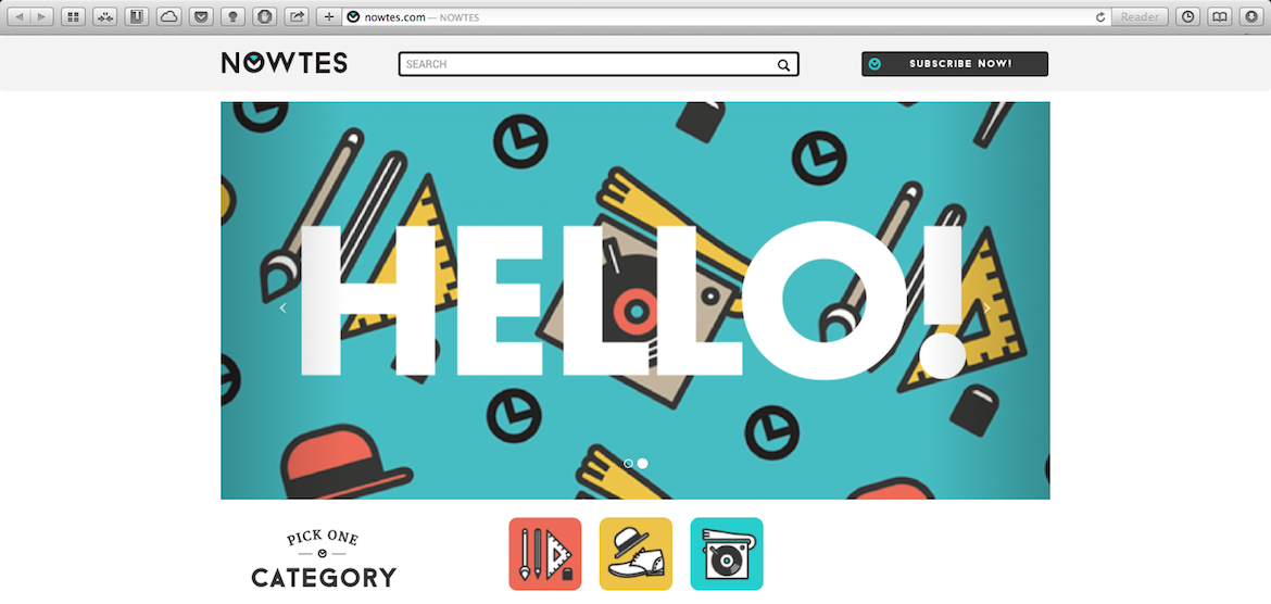
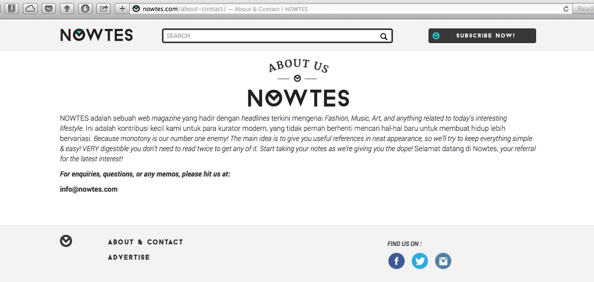
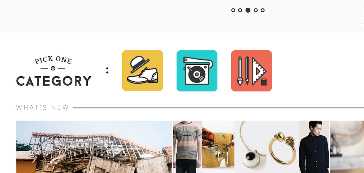
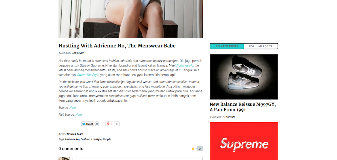
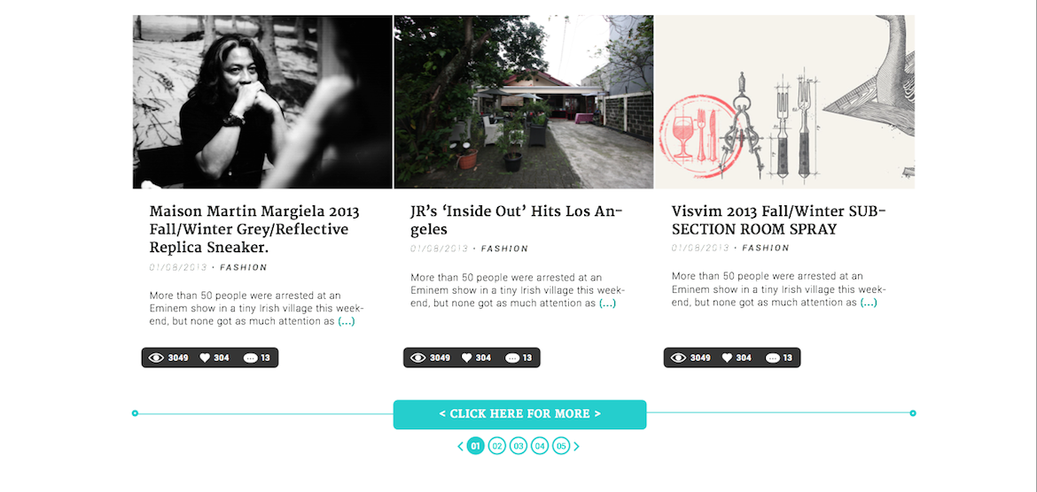
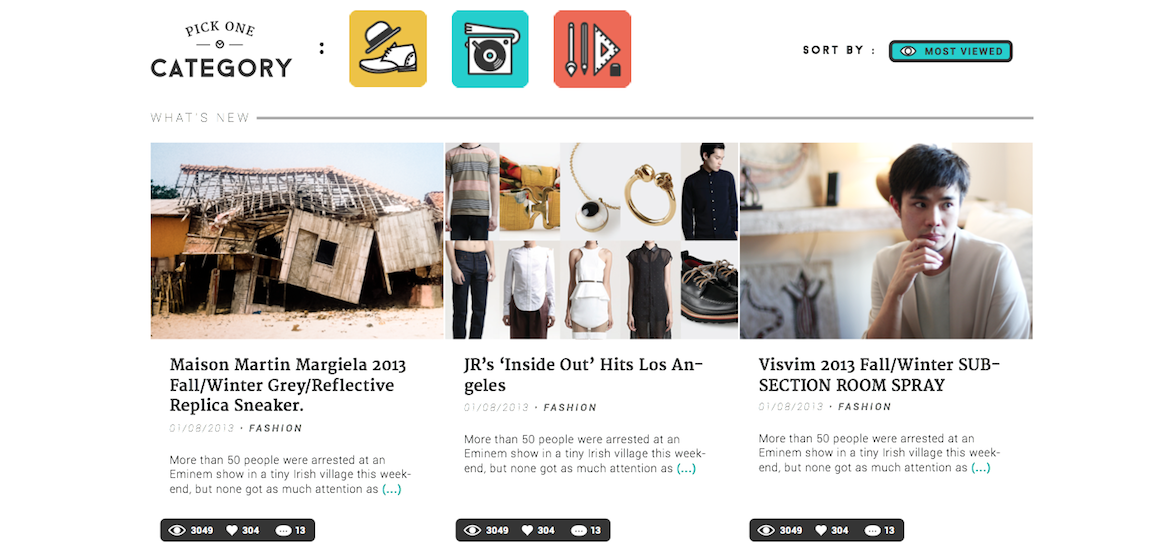
Nowtes
Category
Website Design
About
NOWTES adalah sebuah web magazine yang hadir dengan headlines terkini mengenai Fashion, Music, Art, and anything related to today’s interesting lifestyle
Objective
Mempermudah pembaca untuk meraih informasi life & style terkini dengan pendekatan sesederhana mungkin.
Year
2014
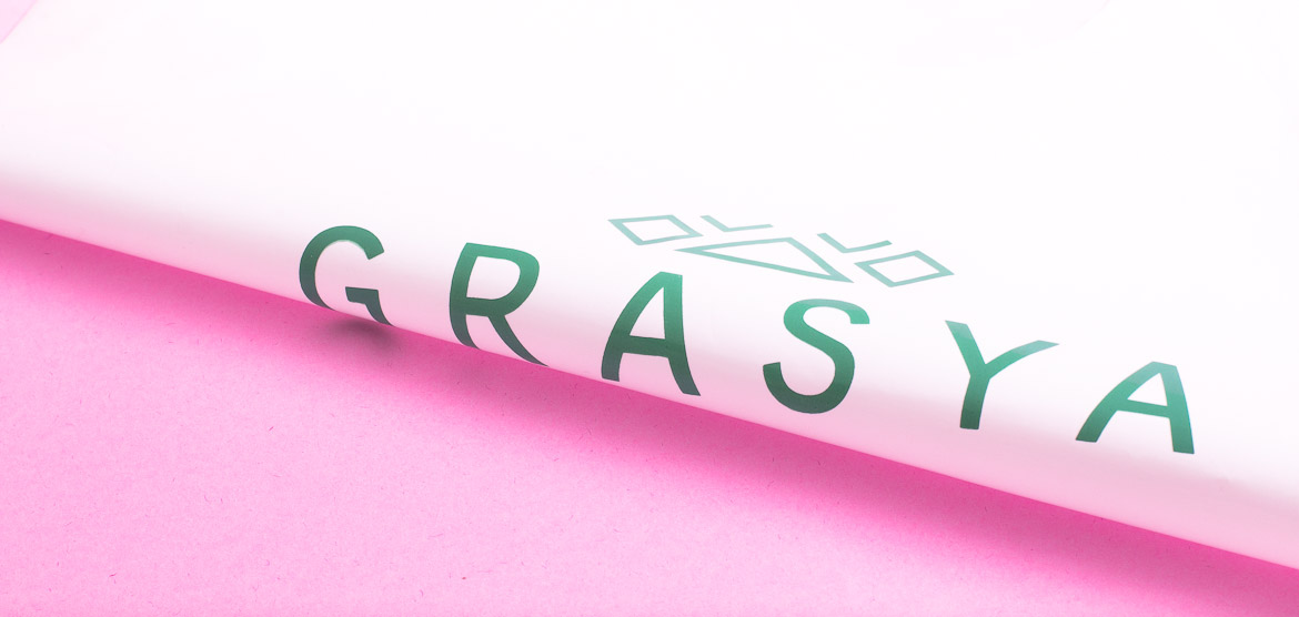

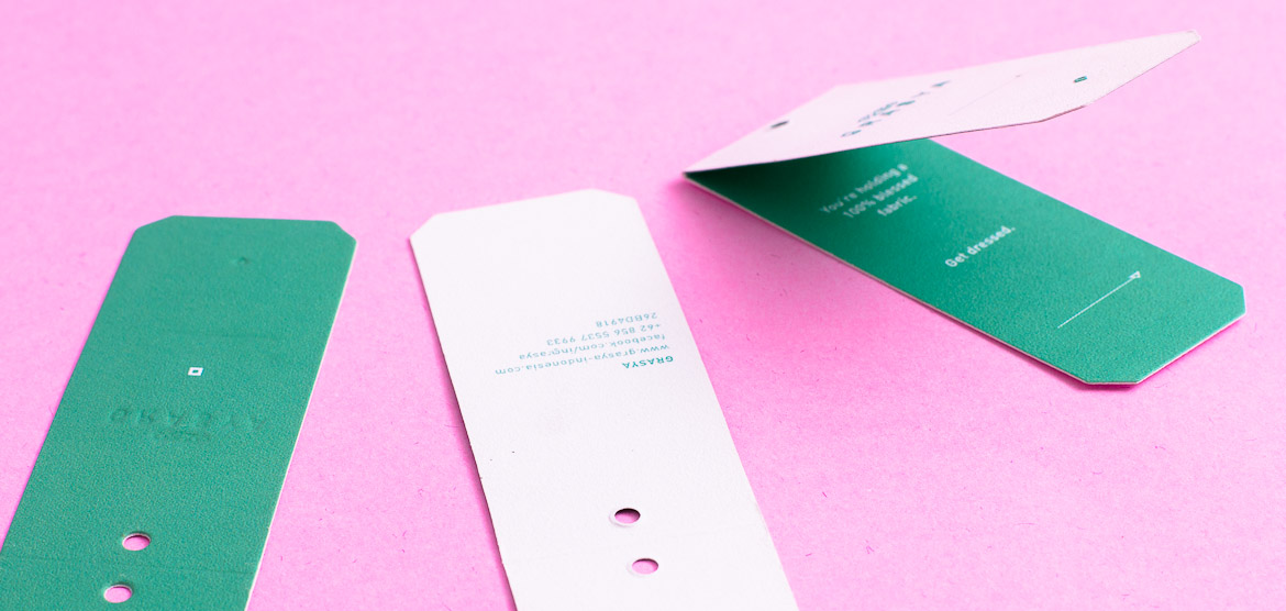
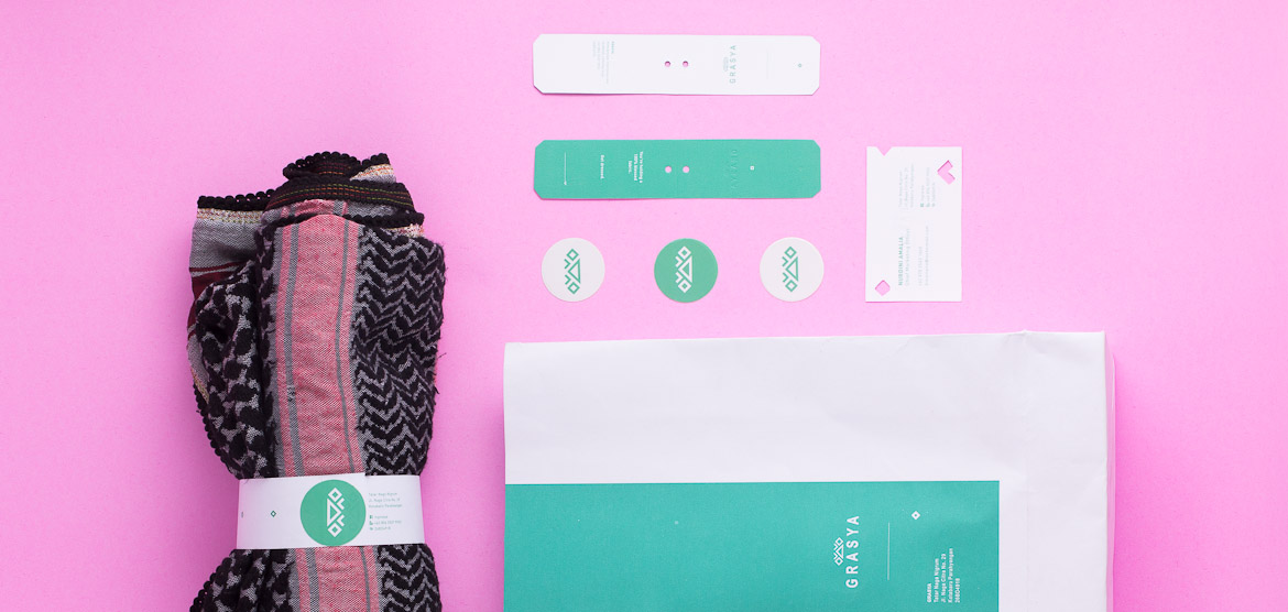
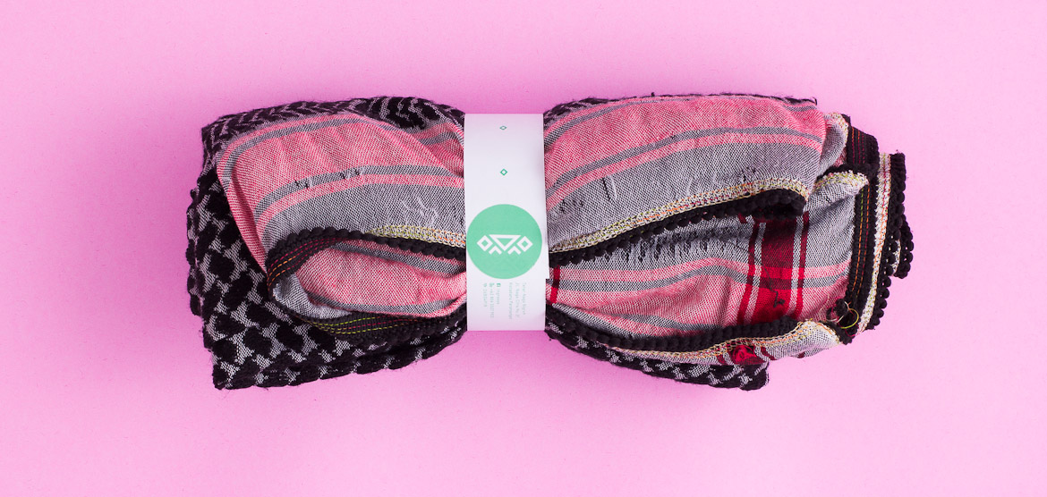

The Blessed Fabric: Grasya
Category
Branding
About
Grasya in Filipino means blessings. It leads us in purposing all of believer that such pretty apparels will reflect the charm of gorgeous spirit will get facilitated, espesially moslem ladies.
Objective
Grasya’s logo is an application of one of Islamic law which forbid the use of living things depiction. Thus the form of the logo is a series of fractals which the composition representing an up-stream, like a bless that elevate the quality of life.
The application of the design resemblance the elegance of simplicity, which reflect the design of the garments of Grasya. We apply the simple design from business card to veil wrapper to make it simply voguish.
We do something more on the design: not only to satisfy your sight but also your touch. We use the Coronado paper to imply something different on the fashion tag.
Year
2013
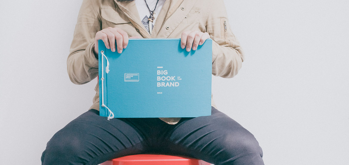
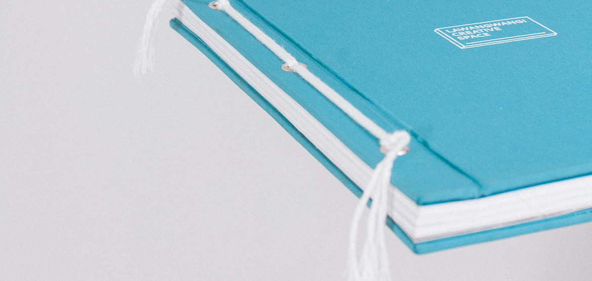
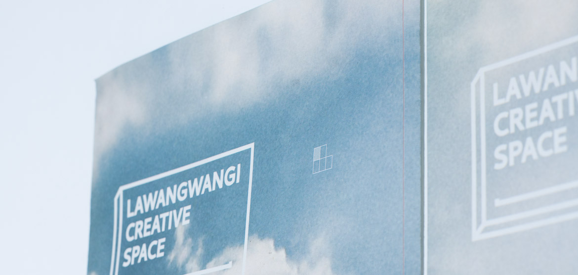
How To: Lawangwangi Creative Space
Category
Brand Guideline Book
About
As a compound contrast to the previous name ‘Lawangwangi’, now they are transforming themselves into anew Lawangwangi Creative Space. This Big Book of The Brand showcases all.
Objective
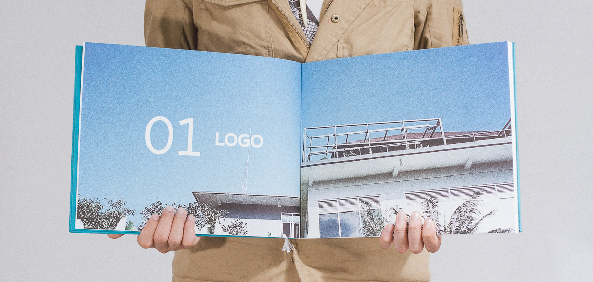
Lawangwangi’s strong and bold architectural lines represents our reference for the brand new logo making. The result is a composed length, width and height dimensions symbolizing the free, open space for everyone. As we acquire the novel brand guide, an explorative application onto basic brand identities is, of course, mandatory. Afterwards we visualize the brand identity by utilizing the brand elements on various media to provide broader and better public acknowledgement. An architectural’s finest hilltop providing pristine serenity and a lively sense of space? These set of photos might ease such exaggerated words, for we sense that those are true in Lawangwangi. The book is bound spineless with cotton rope and linen cloth to wrap the cover—a statement of importance of this very limited book.
Year
2013
Dimension
Koran libel A3 Landscape
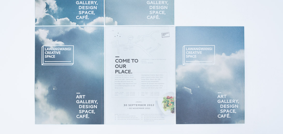
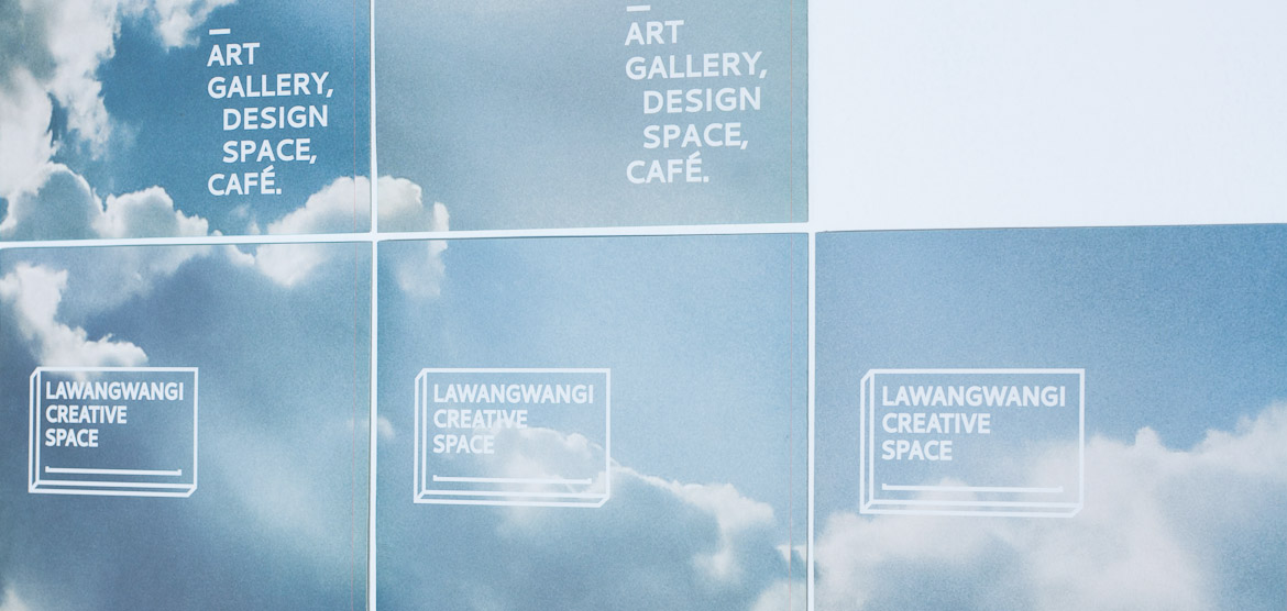
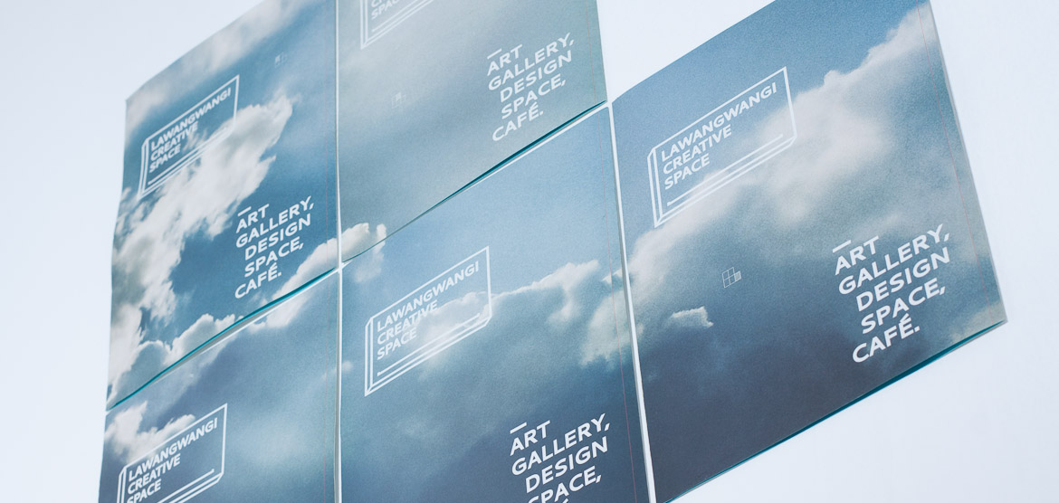
Dividing Cloud
Category
Flyer
About
This is the very first Lawangwangi Creative Space flyer ever. Divided into 5 parts, with awesome cloud and free drink if you bring one of them to Lawangwangi.
Objective
The idea is to make the customer amazed (of course, it’s our job anyway) by dividing the flyer into 5 parts which you can combine to make it a full image. We want to make the graphic put in here—the cloud—is still “Lawangwangi” so we put the cloud formation viewed from Lawangwangi itself. There’s a hint in every piece to indicate which part you are holding now. Another surprise element in this flyer is: it isn’t a piece of paper, but folded one with Lawangwangi’s blue on the folded side.
Year
2013
Dimension
A4


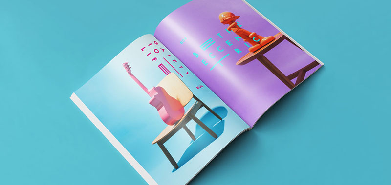
Dividing Cloud
Category
Photography Styling
About
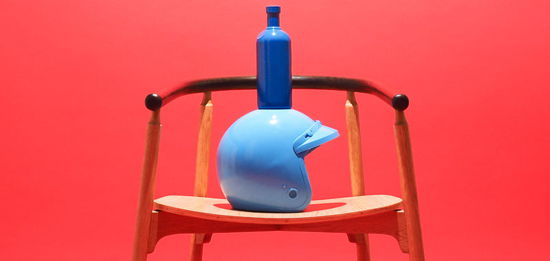
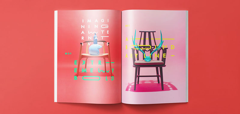
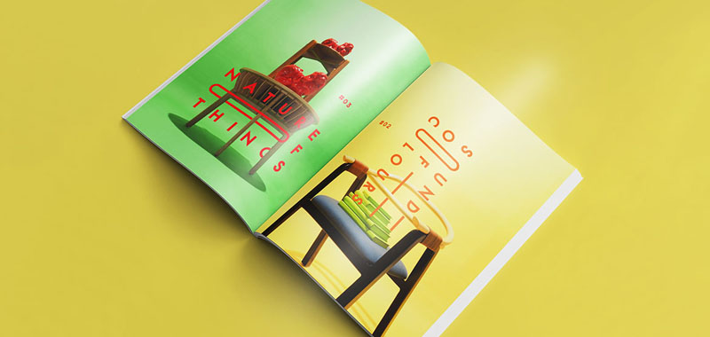
Last year we got an opportunity to fill some spreads on one of the known design magazine in Indonesia, Bravacasa. What we told to do is a photography styling for Alvin T. and Karsa Furniture.
Objective
For a thing we never did before the brief was surprisingly simple: Do as you are. Whilst outside the brief, we try to incorporate our typesetting to make it more, well, us. Please note that what we do here is only the styling, the photographs was done by Harry Subastian and the layout on the printed issue was done by Bravacasa Team.
Year
2014
Tito Yusuf – Sandy Pirouzi – Michael Alexander | sanrokstudio.com