CURATOR'S STATEMENT
26 April 2010
Type :Solo Exhibition
Year :2010
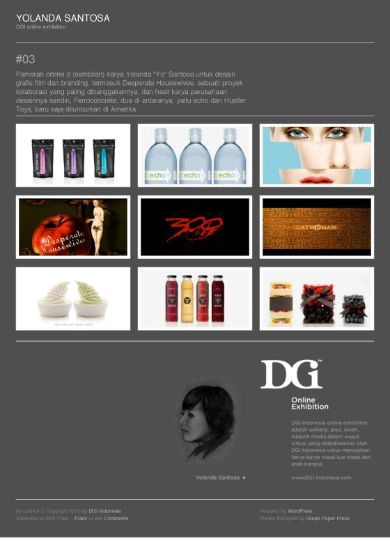
Designer :Yolanda Santosa
Keajaiban branding di tangan Yolanda “Yo” Santosa
“What makes Pinkberry, Pinkberry? If you said the yogurt, you’re only half right. Customers stand in line for a taste of the yogurt, but they get in that line because of the brand.” Obyektif inilah rupanya yang melatarbelakangi sukses besar Pinkberry, toko frozen yogurt, sejak dibuka di bulan Januari 2005 dengan nilai penjualan $70 di bulan pertamanya, hingga bertumbuh menjadi 70 outlet di berbagai negara bagian Amerika dalam waktu hanya dua tahun!
Dan di balik semua ini ada sentuhan tangan dan hati Yolanda Santosa –akrab dipanggil Yo– seorang desainer grafis kelahiran Jakarta, Februari 1978, yang bertanggungjawab terhadap citra seluruh elemen brand Pinkberry: packaging, menu, iklan, materi pemasaran, environment graphics, interior dan eksterior toko, kendaraan, hingga ke web site Pinkberry. Sukses Pinkberry tidak mungkin tidak dikaitkan dengan entusiasme Yo, yang didorong oleh kecintaannya pada produk Pinkberry. “You want to design something that you yourself is in love with,” demikian Yo.
Masih dalam suasana memperingati hari Kartini di bulan April ini, DGI memamerkan 9 (sembilan) karya Yo, yang berkisar baik pada bidang branding maupun desain grafis film (dua bidang desain grafis yang ditekuninya), pada DGI Online Exhibition #03: Yolanda Santosa. Pada kesempatan ini, DGI menampilkan karya-karya branding Yo untuk Pinkberry, juga untuk echo, éple, First Blush dan Hustler Toys, serta opening title untuk film 300, Desperate Housewives, Ugly Betty dan Catwoman.
Selamat menikmati karya Yolanda Santosa, pemenang beberapa award bergengsi termasuk ADC Young Guns 6 Award dan dinominasikan 3 tahun berturut-turut untuk Emmy Awards! Sebagai pemenang ADC Young Guns 6, pada tanggal yang sama saat dimulainya pameran online ini –26 April 2010– Yo juga menjadi pembicara dan berbagi mengenai pengalamannya di bidang branding dan film di depan audience di Third Street Promenade Apple Store, Santa Monica. Sukses untuk Yo! Juga selamat atas baru diluncurkannya echo dan Hustler Toys.
Silakan klik link berikut untuk memberikan apresiasi: “DGI Online Exhibition #03 : Yolanda Santosa”.
Enjoy!
Hanny Kardinata
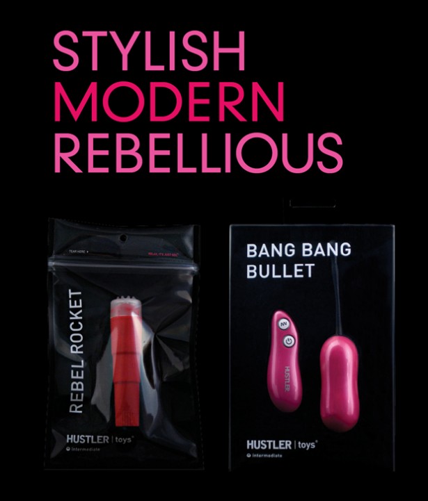
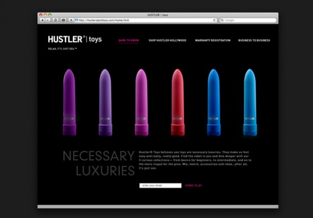
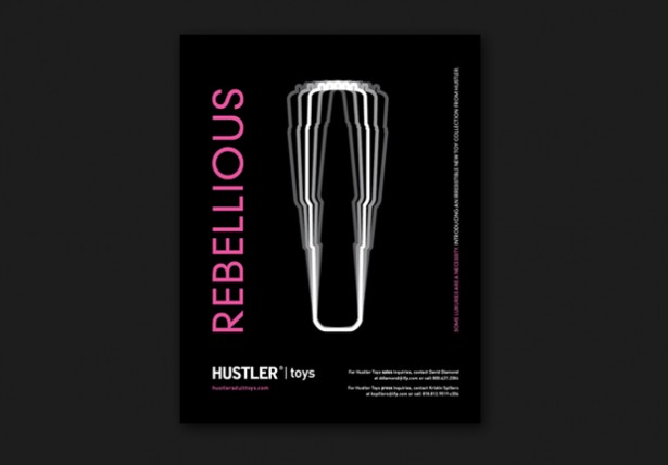
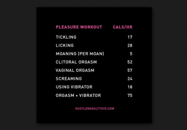
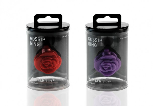
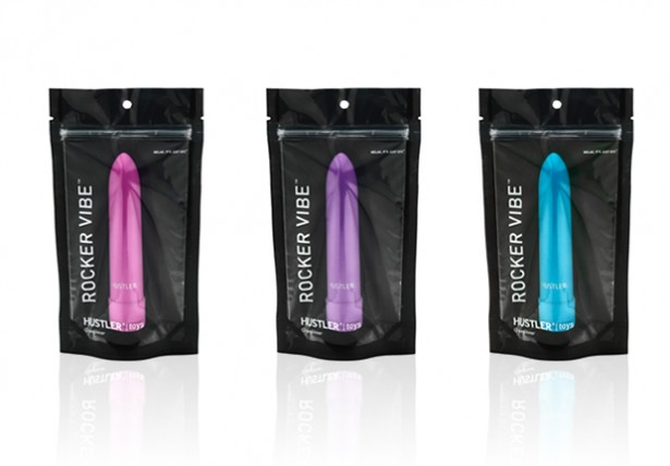
HUSTLER TOYS BRAND
Title: Hustler Toys Brand
Elements: Strategy, Identity, Package Design, Website, Product Design, Brochure
Objective: Stylish. Modern. Rebellious.
Who says sex toys have to be taboo? We say, why not embrace sexual curiosity and exploration. Ferroconcrete designed the new Hustler Toys brand and packaging with an attitude that is alluring, stylish and chic. Inspired by Hustler’s rebellious reputation as well as the latest styles, colors and innovations, the brand promotes luxury and self-expression, while encouraging customers to put their reservations aside and be adventurous.
Client: Flynt Publications
Dimension: Various
Year: 2010
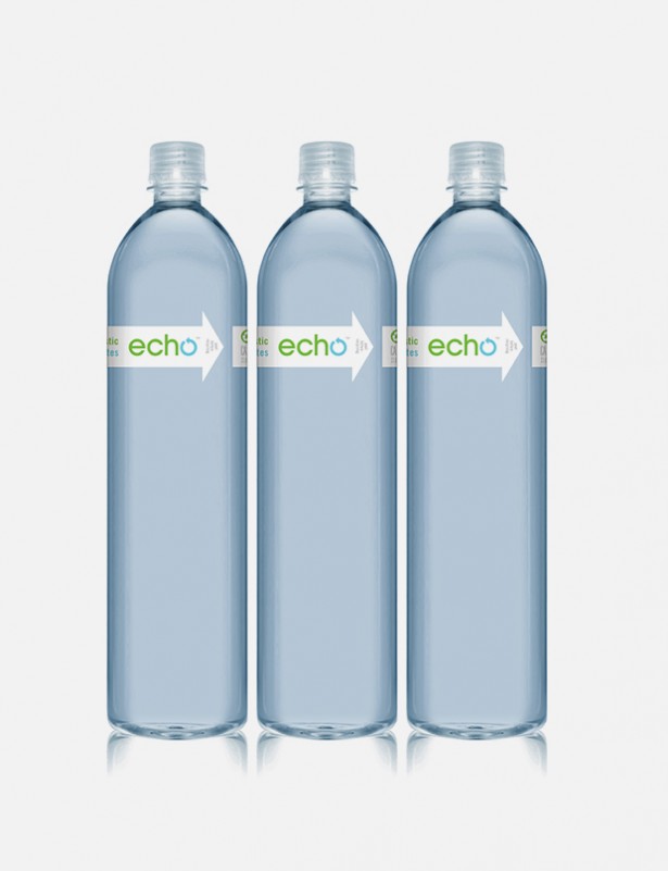
ECHO
Title: echo
Elements: Identity, Package Design
Objective: What makes echo stand out from other bottled waters is its simplicity: bottled water that minimizes its environmental impact. Ferroconcrete found beauty in that simplicity and created a brand that followed suit.
Clean, fresh and modern, the blue and green color palette evokes the purity of the water and the design of the packaging keeps waste to an absolute minimum. The name of the brand, like the arrows in the logo and the packaging, emphasizes how efficiently echo uses all of its resources.
As its tagline states, echo is “simple, local and responsibly packaged.” Ferroconcrete embraced that philosophy and turned it into a complete, personified brand.
Client: Assist Products, Inc.
Dimension: Various
Year: 2010


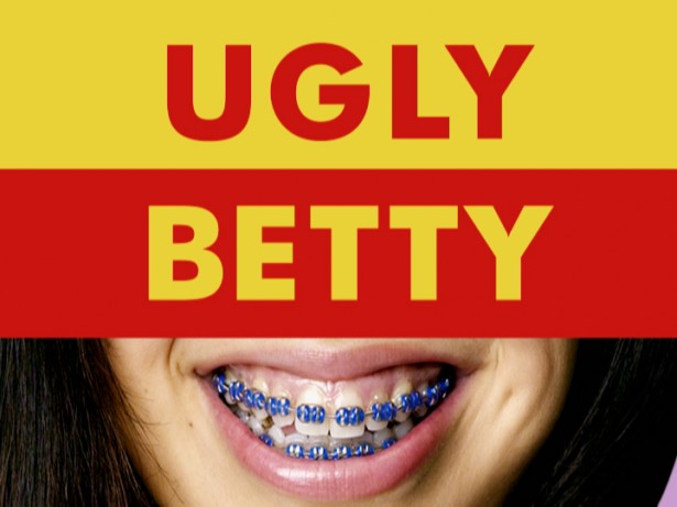
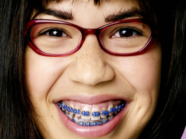
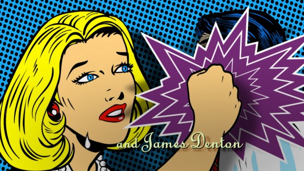
UGLY BETTY
Title: Ugly Betty
Elements: Title Sequence
Objective: This emmy-nominated show open sums up the life of our main character in 5 seconds. she’s a not so pretty young girl who finds herself painfully out of place in the high fashion magazine world.
Client: Abc Networks
Dimension: HD
Year: 2006
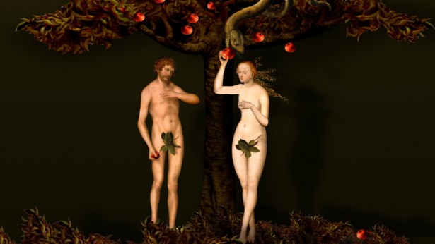
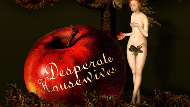

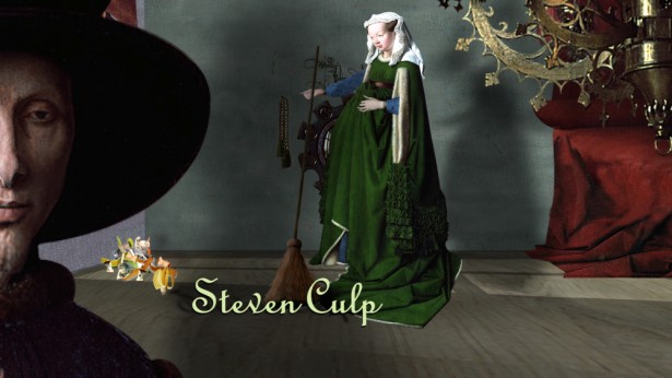
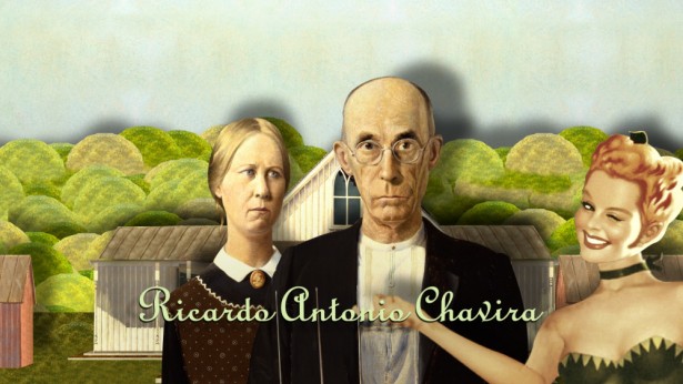
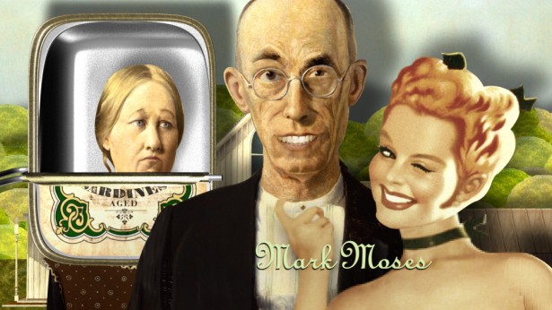

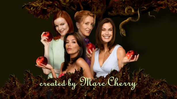
DESPREATE HOUSEWIVES
Title: Desperate Housewives
Elements: Main Title
Objective: In this emmy-nominated show open, familiar art playfully mocks the recurring theme of women’s confined roles throughout history – from lucas cranach’s adam and eve to grant wood’s american gothic, and eventually onto our modern day desperate women.
Client: Abc Networks
Dimension: HD
Year: 2004
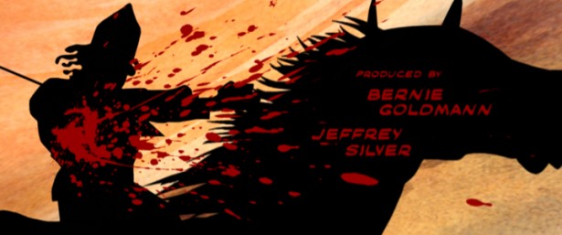
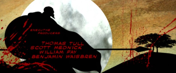
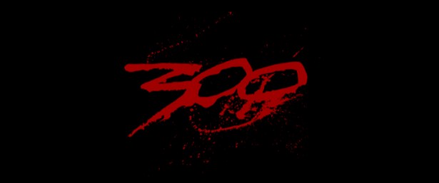
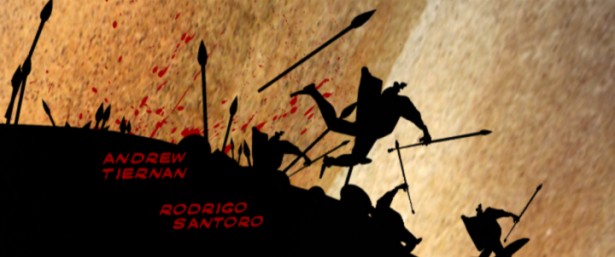
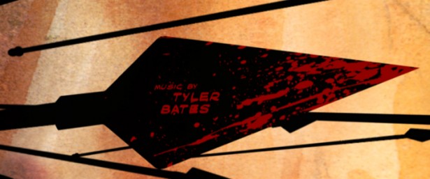

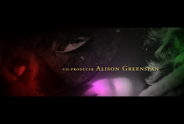
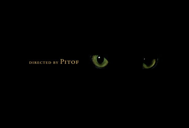
300
Title: 300 CATWOMAN Title: Catwoman PINKBERRY BRAND Title: Pinkberry Brand FIRST BLUSH BRAND Title:First Blush Brand éple Title: éple
Elements: End Title
Objective: This title pays homage to the film’s inspiration – frank miller’s historical graphic novel. the blood, a powerful motif in both the novel and the film, becomes the driving force of this sequence.
Client: Warner Brothers
Dimension: Film
Year: 2006
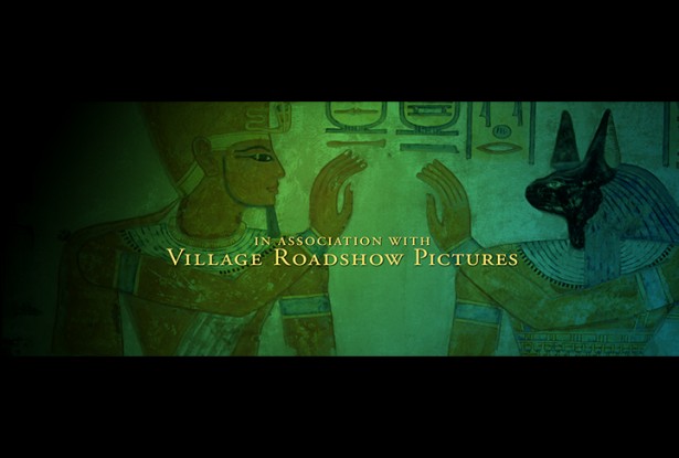
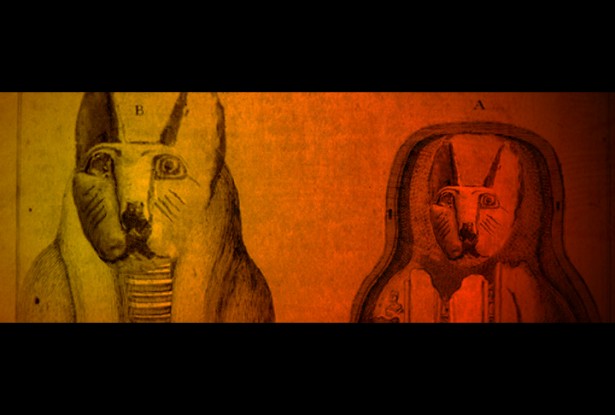
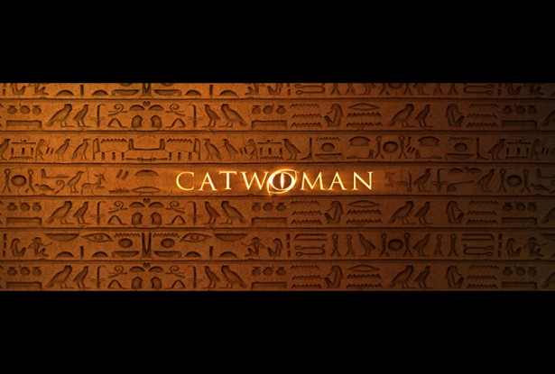
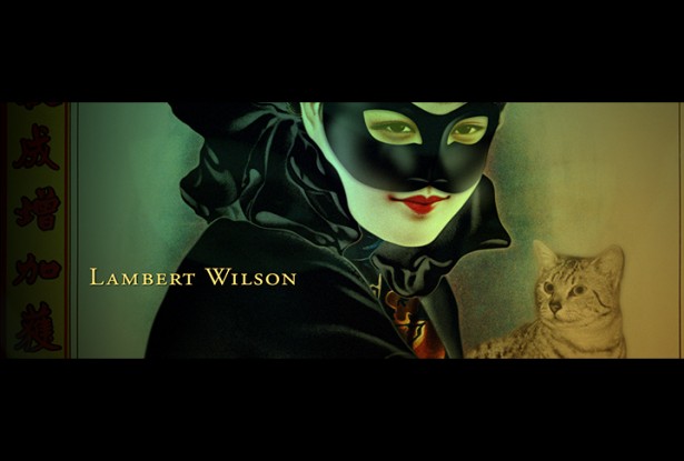
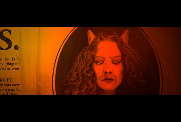
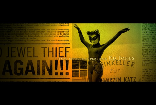

Elements: Main Title Sequence
Objective: Catwoman’s mystical main title sequence sifts through old hieroglyphs, news clippings and paintings to trace the origins of the Egyptian Mau and women with mysterious powers.
Client: Assist Products, Inc.
Dimension: Various
Year: 2004
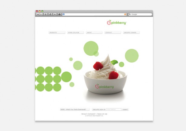
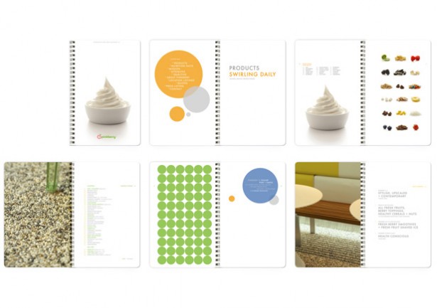
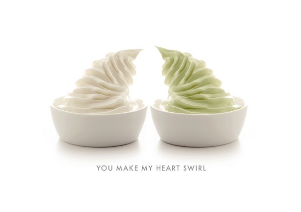
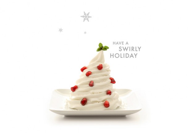
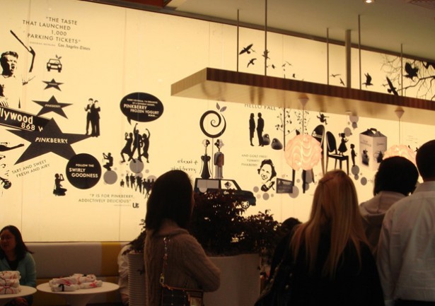
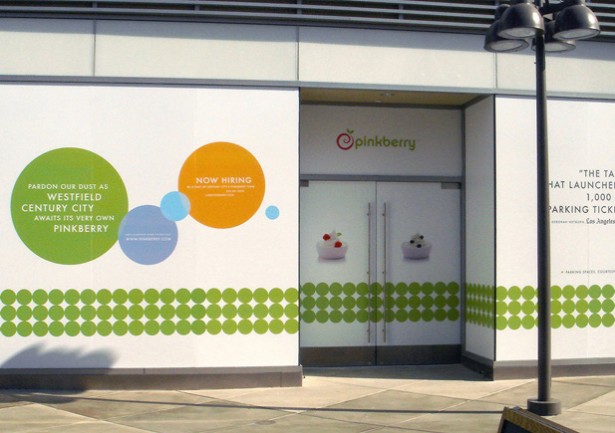
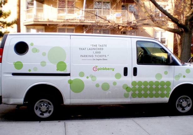
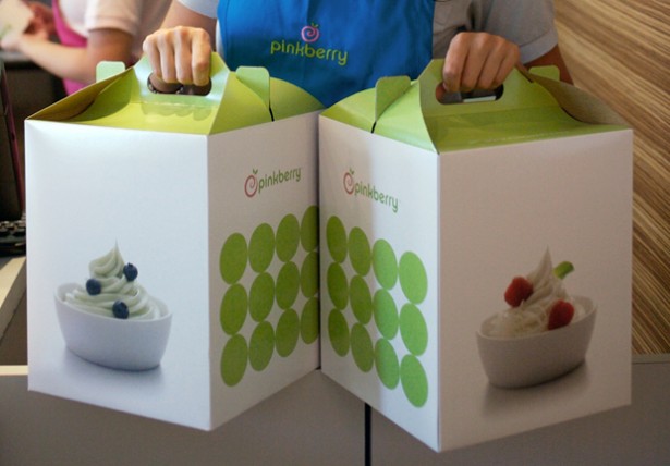
Elements: Website, Marketing Book, Ads, Environment Graphics, Store Exterior, Event Theme, Vehicle, Packaging.
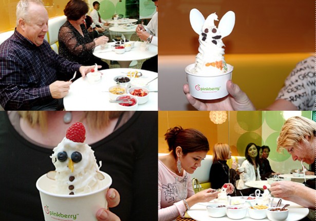
Objective: What makes Pinkberry, Pinkberry? If you said the yogurt, you’re only half right. Customers stand in line for a taste of the yogurt, but they get in that line because of the brand.
Light, sweet but not too sweet, fresh pops of color on a modern white backdrop, minimal yet infused with Swirly Goodness – that describes not only the yogurt, but also the website, the packaging, the menus, the marketing materials, the stores, the newsletters, and even the gift cards. Ferroconcrete fell in love with the essence of Pinkberry and, inspired by the yogurt and the modern décor of the first store, created an entire personality for customers to love.
Many customers have fallen so hard for Pinkberry’s Swirly Goodness that Ferroconcrete created a home for them on the website and turned them into Pinkberry Groupies. These Groupies now interact with both the brand and each other, sharing photos, stories, events and their love of Pinkberry. As Pinkberry grows to 70 stores and beyond, Ferroconcrete continues to nurture the Pinkberry brand, introducing each new product with the same enthusiasm as that very first swirl. Why? Because Ferroconcrete loves Pinkberry as much as any Pinkberry Groupie.
People don’t eat frozen yogurt anymore. They eat Pinkberry. And that’s a brand, personified.
Client: Pinkberry, Inc.
Dimension:Various
Year: 2006-2010
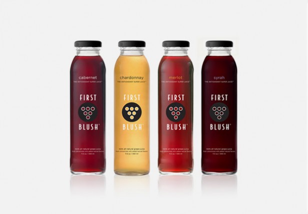

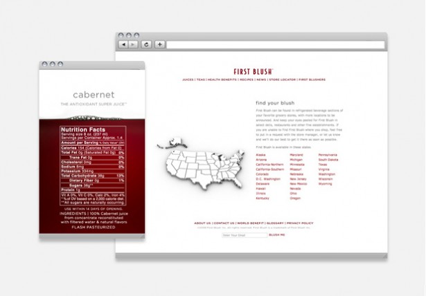
Elements:Package Design, Website
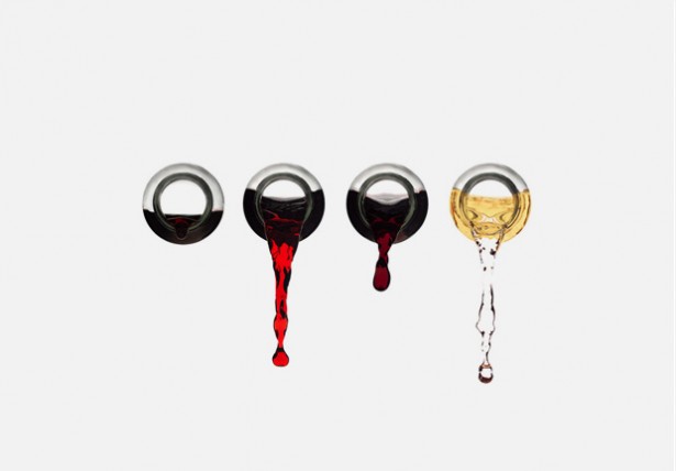
Objective: You may associate vibrant, rich colors, fresh, ripe grapes and elegant bottles with wine, that same sophistication now applies to grape juice.
Made from the wine grape varietals of Cabernet, Chardonnay, Merlot and Syrah, First Blush is a juice that Ferroconcrete has transformed into something much more grown up. Recognizing the juice as the soul of the brand, Ferroconcrete allowed it to shine through the transparency of the elegant glass bottles and made it the focus of all its branding.
From the website and packaging, to the print, the image of the grape reminds us that this juice is fresh-picked and the lively splashes evoke lightness. First Blush is natural, healthy and fresh off the vine: the Antioxidant Super Juice even the most sophisticated wine drinker would love.
First Blush is grapes all grown up.
Client: First Blush, Inc.
Dimension:Various
Year: 2008
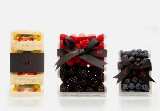
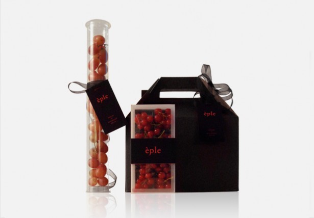
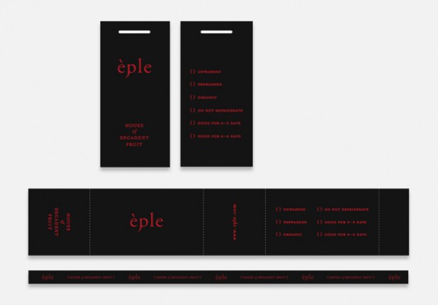
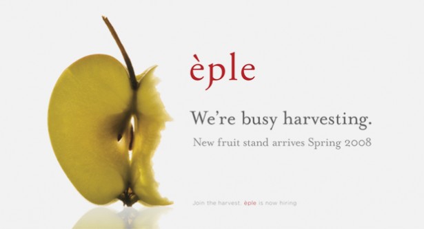
Elements: Identity, Package Design
Objective: Fruit was the original temptation in the Garden of Eden and all of the branding for èple, from the name to the packaging, gets its inspiration from that very idea. Ferroconcrete designed a brand that exudes the decadence of a sinful treat yet allows you to indulge in something healthy. As the tagline suggests, èple is not only good for you, it is the house of decadent fruit.
Client: Assist Products, Inc.
Dimension: Various
Year: 2008

Yolanda ‘Yo’ Santosa began her career designing main titles for projects like 300, Desperate Housewives and Ugly Betty. Although she loved storytelling, she couldn’t ignore a growing fascination for branding. She founded Ferroconcrete in 2006 with the Pinkberry account, and has been managing the company’s brand since. She has taught at Art Center and is an active national guest speaker. She’s earned several awards, including 3 consecutive Emmy nominations and the ADC Young Guns 6 Award.
Komentar-komentar di page DGI di Facebook: