
CURATOR'S STATEMENT
26 Februari 2012
Type :Solo Exhibition
Year :2012
Designer :Aswin Sadha
Perjalanan desainer kelahiran Bandung ini menjadi penting untuk disimak setelah bersama rekan-rekannya di Studio Newwork, New York, menerbitkan majalah desain grafis yang mengulas tipografi, fashion dan fotografi secara mendalam: Newwork Magazine. Majalah tersebut memperoleh penghargaan bergengsi tingkat internasional dari Type Director Club New York, The Society Publications of Designers, Graphis, (USA), Tokyo Art Director Club (Jepang), dan D&AD (UK). Sejumlah majalah di berbagai belahan dunia juga mengulasnya, seperti Surface, Hue (USA), Grafik, It’s Nice That, Computer Art (Inggris), Process Journal (Australia), Estapes (Prancis), Idn (Hongkong), Nylon (Korea Selatan), Mode (Singapore), Idea, +81, dan Quotation (Jepang). Beberapa publikasi dari China, Inggris, Jerman, Spanyol, dan Amerika juga telah mempublikasikan STUDIO NEWWORK dan NEWWORK MAGAZINE.
Kini, disela kesibukannya sehari-hari, Aswin Sadha mendedikasikan waktu untuk blognya yang inspiratif: Thinking Form, sebuah blog yang mengulas tipografi, sistem grid, desainer, fotografer, arsitektur, dan buku inspiratif.
Selamat menikmati karya-karya Aswin Sadha pada: DGI Online Exhibition #16: Aswin Sadha
DGI (Desain Grafis Indonesia)
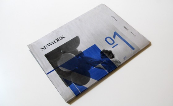

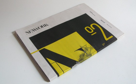
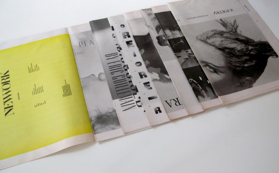
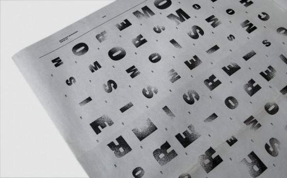
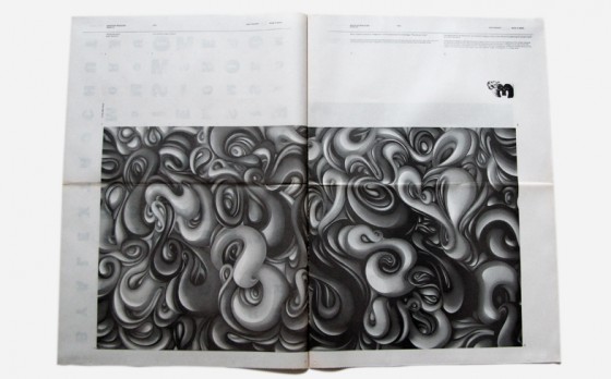
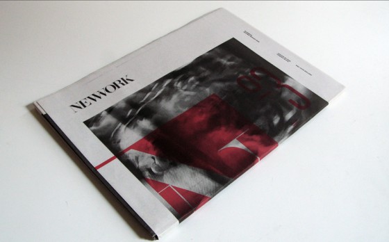
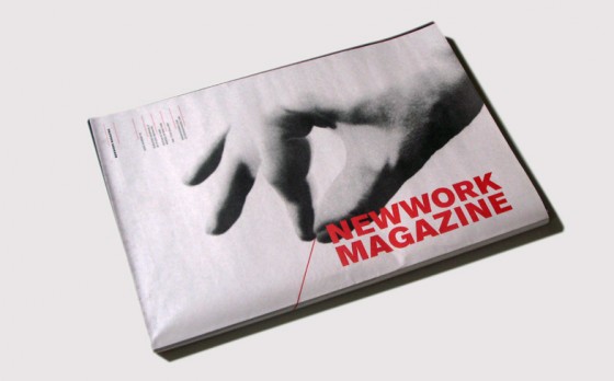
NEWWORK MAGAZINE 01
Category
Magazine
Objective
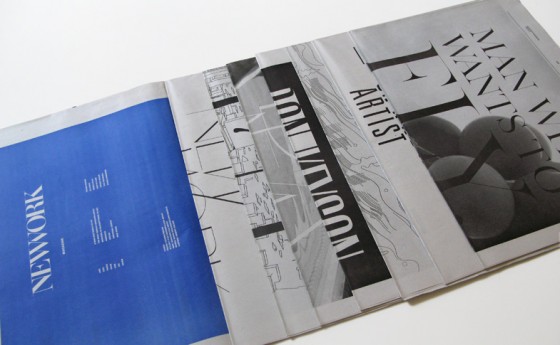
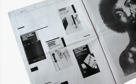
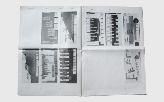
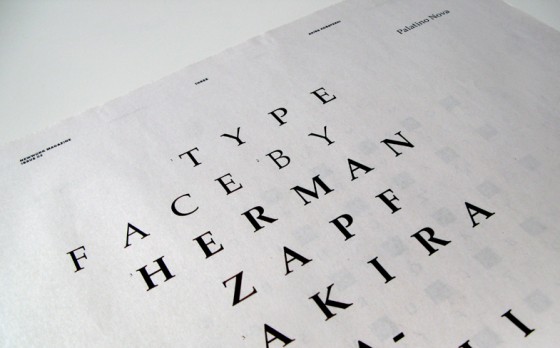
NEWWORK MAGAZINE is a large-format arts publication for connoisseur of fresh ideas. Designed and published biannually by STUDIO NEWWORK, each issue features new work from a wide range of artists and creators in the worlds of fine art, design, high fashion, culture, and politics. From art directors to business leaders, design students to curators, newwork’s contributors are united in their passion to push the boundaries of their disciplines. Among the magazine’s special features are bold, custom-designed typefaces and a twist on the traditional newspaper format, offering a stimulating juxtaposition of striking design and everyday simplicity. Since pages can be separated, each layout can be hung on the wall as an individual art piece.
Year
2007
Dimension
32”X23”
Web site
www.newworkmag.com
NEWWORK MAGAZINE 02
Category
Magazine
Objective
While the first issue highlighted the work of artists and designers from new york’s creative scene, issue 2 of NEWWORK explores the role of imagination in creative life: changing styles, changing minds, changing worlds.
Year
2008
Dimension
32”X23”
Website
www.newworkmag.com
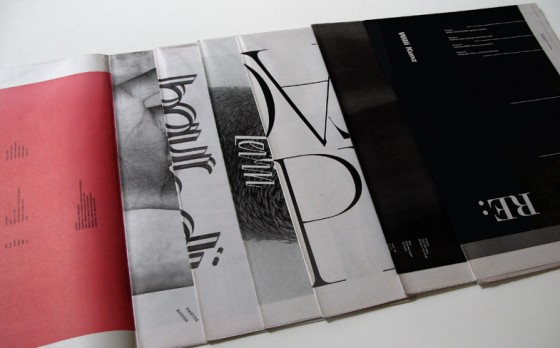
NEWWORK MAGAZINE 03
Category
Magazine
Objective
The second issue of NEWWORK MAGAZINE delved into the role of imagination in creative life: changing styles, changing minds, changing worlds. In issue number 3 we come face to face with… Faces. In both the literal and abstract sense we explore how different designers and artists invoke the notion of the face in their work.
Year
2008
Dimension
32”X23”
Website
www.newworkmag.com
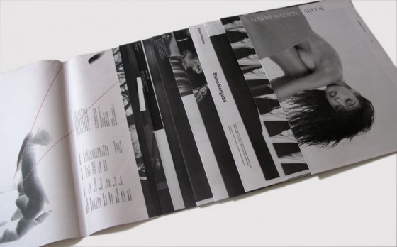
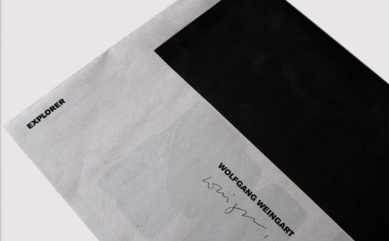
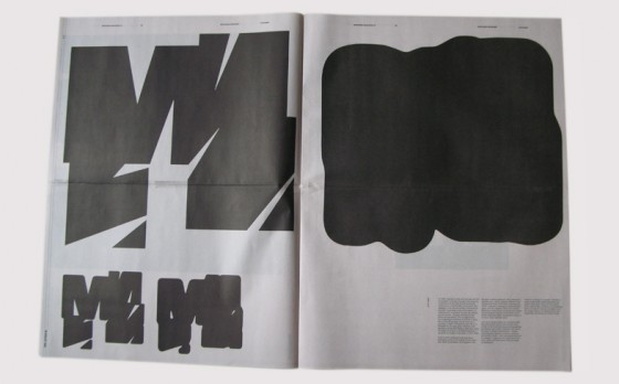

NEWWORK MAGAZINE 04
Category
Magazine
Objective
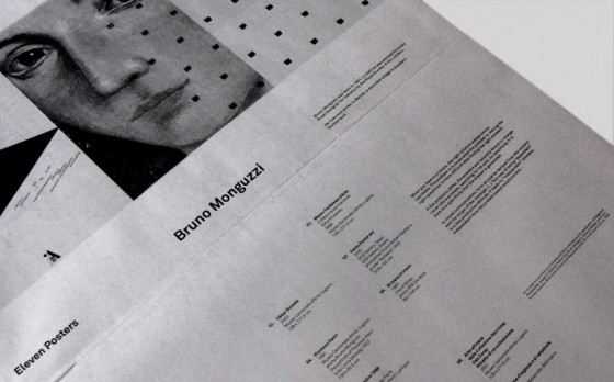
The fourth issue of NEWWORK MAGAZINE finds a range of artists and designers harnessing the power of contrast in its various forms to bring dimension, meaning and mystery to their work. Witness the juicy juxtaposition of graphic and narrative elements in the iconic imagery of photographer albert watson. Observe the synergy of classic swiss restraint and unbridled post-modern play in the typographic design of Wolfgang Weingart and the kinetic interplay of geometric and organic forms in the poster design of Bruno Monguzzi. From the one-two punch of high contrast black-and-white forms in the photography of Julian Abram Wainwright and the drawings of robert longo, to the poetic tension between two and three dimensions in Werner Jeker’s enigmatic collages, this issue profiles artists who use dynamic dualisms to yield complex and elegant visual solutions.
Year
2010
Dimension
32”X21.5”
Website
www.newworkmag.com
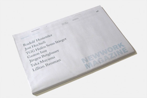
NEWWORK MAGAZINE 05
Category
Magazine
Objective
The fifth issue of NEWWORK MAGAZINE finds a range of artists and designers exploring the concept of grace, infusing their very different work with a similar attunement to the ineffable, the elegant, the sublime.
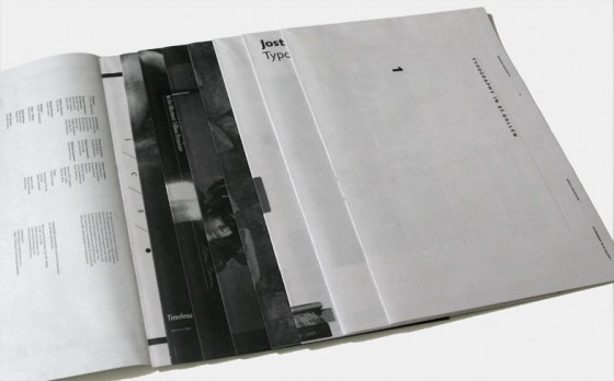
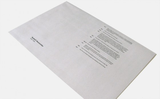
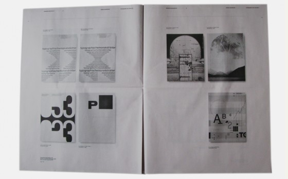
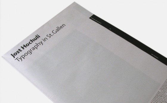
A survey of books from St. Gallen showcases three generations of book designers who have stayed true to their city’s heritage as the heart of swiss book design while breaking new ground (and old rules) with playful use of asymmetry and unconventional typographic design. Grandfather to this vibrant multigenerational movement is Rudolf Hosteler, editor of “typografische monatsblätter”, who mentored jost hochuli, master typographer, graphic designer, and book designer. Hochuli, in turn, served as teacher to the founding members of the award-winning swiss design team, TGG Hafen Senn Stieger and to Gaston Isoz, an accomplished book designer working out of berlin. While each of these designers takes a unique aesthetic approach, they are united by a fascination with graceful creative solutions.
Joining the book designers in this issue is jürgen bergbauer, a german-born fine artist / photographer who obsessively photographs rocks, extracts them from their natural contexts, and places them into flat off-white spaces, producing studies that temper analytical beauty with radiant calm. Taka Mayumi, japanese-born, paris-based fashion photographer, produces a breathtaking fashion story of genderless beauty. And veteran photographer lillian bassman breathes new life into the “mad men”-era glamour she helped define with her iconic imagery and maverick darkroom techniques. As Bassman’s interview with newwork reveals, her own inimitable grace flows from equal parts vision, spunk and timeless sex appeal.
Year
2010
Dimension
32”X21.5”
Website
www.newworkmag.com
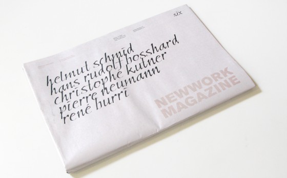
NEWWORK MAGAZINE 06
Category
Magazine
Objective
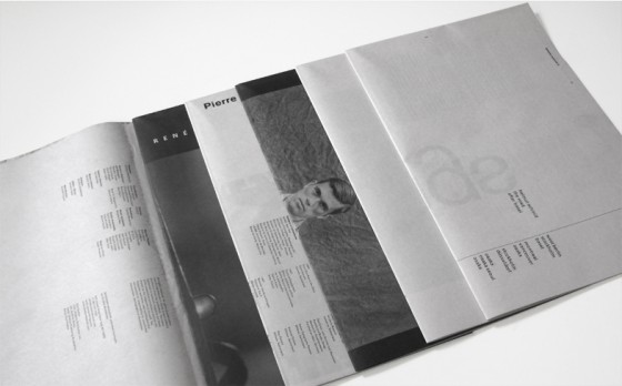
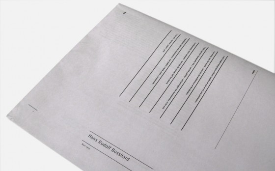
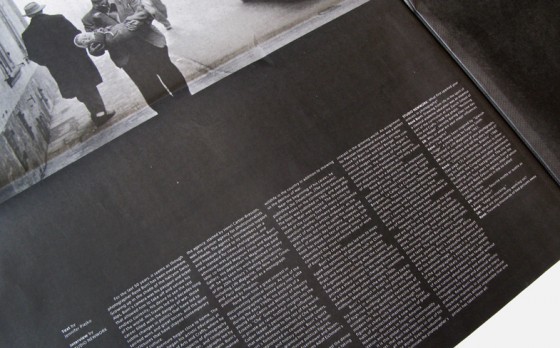
The sixth issue of NEWWORK MAGAZINE finds a range of artists and designers embracing sensuous beauty, imparting pure and sincere spirits in their work. This issue profiles stimulating artists who excel in infusing their work with the warmth of a human touch. Helmut Schmid and Hans Rudolf Bosshard share typography designs, whose elegance shine through the purity of their styles. Christophe Kutner’s fahion story, “time”, is an anti-timeline of sorts; numbers incorporated in ensembles lend harmony and continuity throughout the anachronistic images. Pierre Neumann shares some of his most famous poster designs in his section entitled “90.5 X 128”, which comes from his standard poster size. His unexpected use of image and typography is stimulating and awakening, timeless and classic. We are in the moment with photographer René Burri whose stunning images quietly illustrate the history of the last half of the twentieth century, capturing the moments in our memories, history, and society dramatically, dynamically, breathlessly.
Year
2011
Dimension
32”X21.5”
Website
www.newworkmag.com
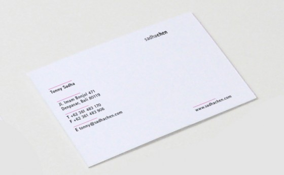
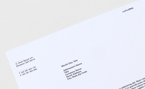
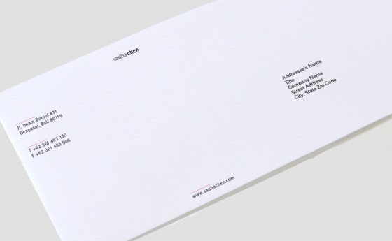

SADHA CHEN
Category
Corporate Identity
About
sadhachen is an international design practice dedicated to bringing new and sophisticated creative ideas to the hospitality world. Formerly known as tonny sadha / interior design (TSID), the company was founded in 2005 in New York City by Tonny Sadha. In 2007 Jenny Chen joined TSID, bringing 15 years of experience, with a particular focus on restaurant design. With a newly opened Shanghai office in 2011, the two partnered up, with the name of the firm changed to sadhachen
Objective
To design a memorable corporate identity.
Year
2011
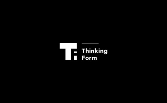
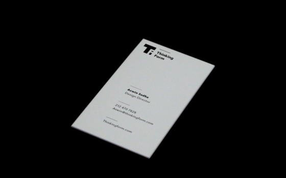


THINKING FORM
Category
Blog
Objective
A blog focused on inspirational forms of typography, books, art, architecture, design, grid systems, illustration and photography.
We salute the great artists, architects, designers, photographers, and typographers of the past and present, the remarkable individuals that have given great contributions to the world and to whom we owe so much. We would like to create a platform to remember all of our design heroes.
Year
2011
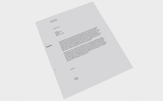
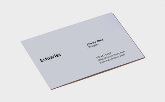
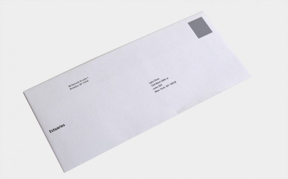
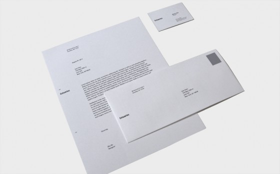
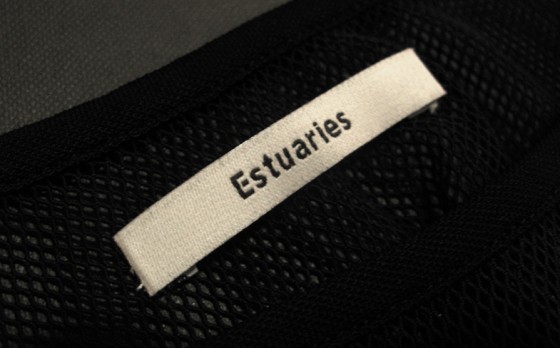
ESTUARIES
Category
Corporate Identity
About
Estuaries speaks the city’s language and captures the essence of self-expression. The collection moves the wearer from day to night, liberating her to discover and embody her personal style and youthfulness without boundaries.
The collection is designed with a sense of balance in mind – tranquility of the beach versus the energy of the city; utility versus beauty; modern versus classic. Incorporating selected designer fabrics along with a seamless merger of flattering lines and shapes, beautifies the woman’s silhouette, proposing an effortless wearability.
In between quiet moments sunbathing on a rooftop or on a bustling night out, Estuaries thrives on a continual search for new inspiration to refine a woman’s figure and lifestyle.
Objective
To design a memorable corporate identity for upcoming swimwear.
Year
2011
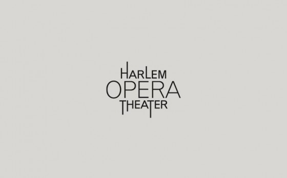
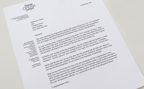
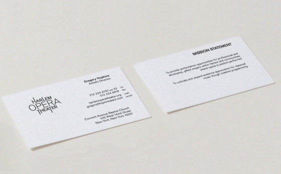
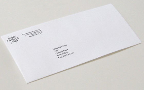
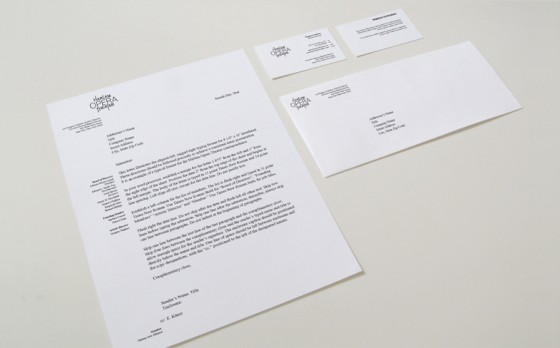
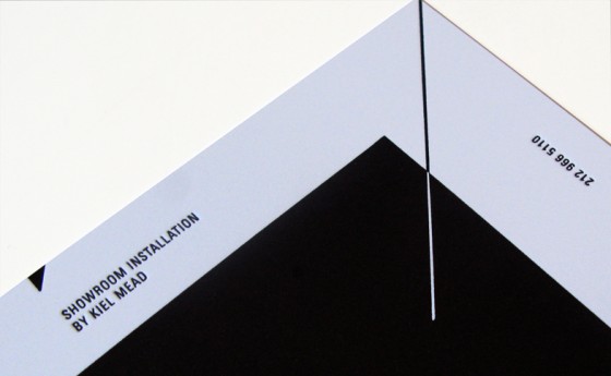
HARLEM OPERA THEATER
Category
Corporate Identity
About
Harlem Opera Theater is a platform to give an opportunity to African-American composers to project different aspects of the performing arts.
Objective
To design a logo that interpret of Opera Theater. The typographic solution for the logo is to extend some of the steam of the letters to give a sense of rhythm.
Year
2007
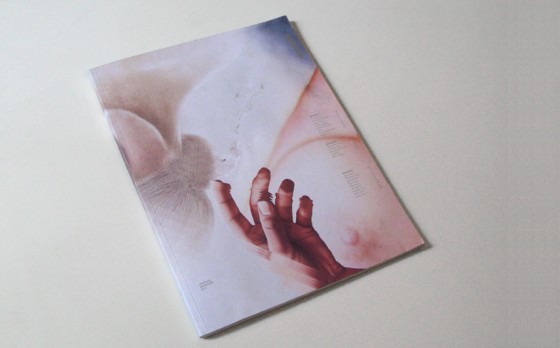
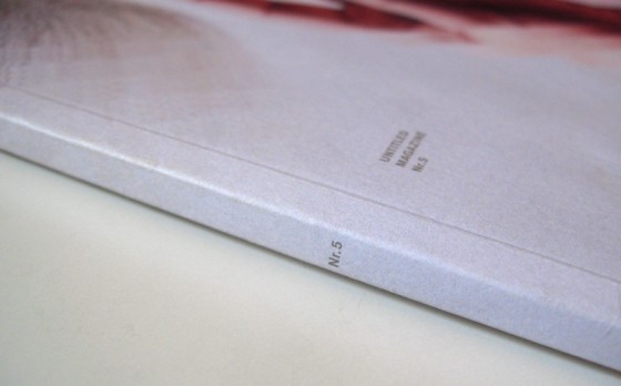
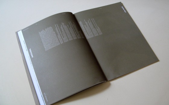
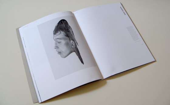
UNTITLED MAGAZINE
Category
Editorial
About
The theme of this issue is Love & Sex, telling a story in three different chapters, Intimacy, Arousal, and Release. Contributing artists include Anna Giertz, Fontaine Anderson, Anna Wolf, Micah Lidberg, Cecilia Carlstedt, Von, R.J. Shaughnessy, Sam Green, Jesse Auersalo, Heather Culp, Blossom Berkofsky, Si Scott, Mario Hugo, Benbo George, Leslie David, Elias Tahan, Mike Perry, Alex Merto, Douglass Lee, Jules Julien.
Objective
To design a love and sex issue.
Year
2011
Dimension
8.5″x11″
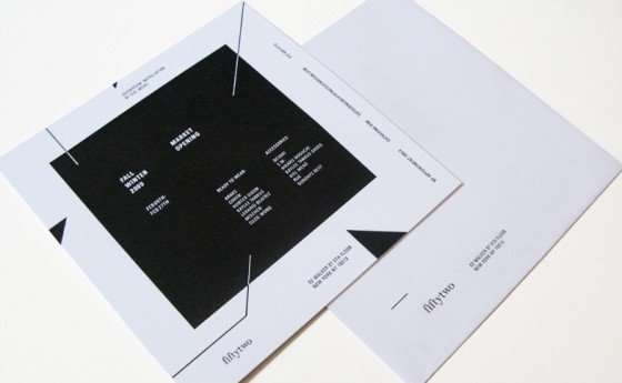
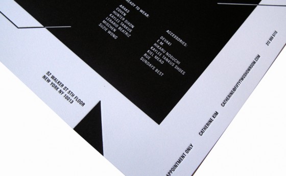
52 INVITATION
Category
Invitation
Objective
To design an invitation for Fifty Two market opening
Year
2009
Dimension
7″x7″
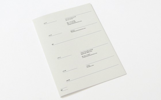
GEORGE WONG DESIGN
Category
Brochure
Objective
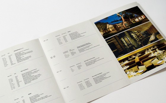
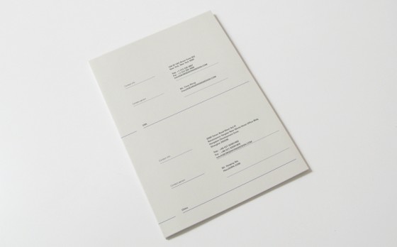
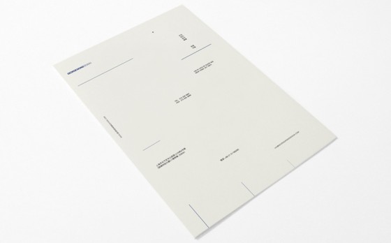
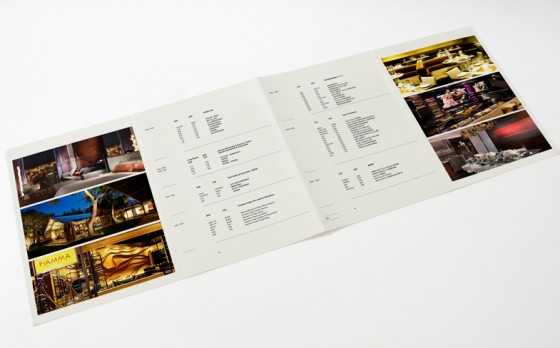
A 8 panels brochure for GWD, an interior design company based in New York and Shanghai that operates in the fields of high-end hospitality design. Their projects including Grand Hyatt New York, Sheraton Tribeca Hotel, Park Hyatt, Flamingo hotel and many more. GWD wants to have a sophisticated look at their brochure.
The typographic solution is the best option since they don’t have much high resolution pictures. The line became the elements to represent the architect drawing.The brochure shows the complete profile, project and contact information of the company. 6 images are shown to give the sample of their work.
Since they have two different locations with two different languages. GWD wants to have a different brochure with the same feeling with the English version. The line still be used as an element of design and add square to give a contras to the chinese characters. The format is the same with the English version with different typography approach.
Year
2010
Dimension
11”X7.75”
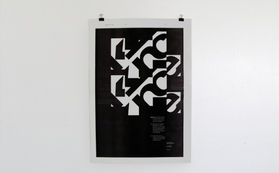
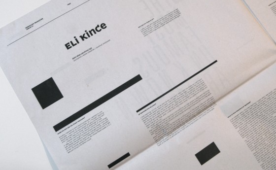
KINCE
Category
Poster
Objective
The visual language uses letter and counter form find in KINCE INC dedicated to the creativity and small detail oriented of Kince. Inc
Year
2007
ASWIN SADHA
Aswin Sadha berasal dari Bandung, Indonesia. Selepas lulus dari SMA, ia merantau ke Amerika untuk menekuni desain interior. Dalam menyelesaikan semester terakhirnya di Fashion Institute of Technology, ia mengambil kelas tipografi dan akhirnya menemukan hasrat cintanya pada tipografi. Setelah mendapatkan gelar Associate Degree, ia memperluas wawasannya dengan menekuni bidang desain grafis.
Setelah lulus kuliah, Aswin bekerja pada gurunya di perusahaan Kince Inc hingga akhirnya menjadi salah satu anggota dari STUDIO NEWWORK bersama teman sekolahnya Ryotatsu Tanaka, Ryo Kumazaki, dan Hitomi Ishigaki di New York, USA. Di akhir tahun 2007, mereka menerbitkan NEWWORK MAGAZINE, sebuah majalah desain grafis yang mengulas tipografi, fesyen, dan fotografi secara mendalam. Majalah tersebut memperoleh penghargaan bergengsi tingkat internasional dari Type Director Club New York, The Society Publications of Designers (USA), Art Director Club (Jepang), dan D&AD (UK). Tidak ketinggalan, beberapa majalah di berbagai belahan dunia mengulas NEWWORK MAGAZINE seperti Surface, Hue (USA), Grafik, It’s Nice That, Computer Art (Inggris), Process Journal (Australia), Estapes (Prancis), Idn (Hongkong), Nylon (Korea Selatan), Mode (Singapore), Idea, +81, dan Quotation (Jepang). Beberapa publikasi dari China, Inggris, Jerman Spanyol dan Amerika juga telah memublikasikan STUDIO NEWWORK dan NEWWORK MAGAZINE.
Pada tahun 2009, NEWWORK MAGAZINE diundang oleh +81 untuk berpartisipasi dalam konferensi desain tingkat internasional (http://www.grapass.net/2009/index_en.html). NEWWORK MAGAZINE dijadikan arsip di salah satu museum bergengsi MOMA dan juga oleh perpustakaan Cooper Union di New York dan Reading di Inggris.
Di bulan Maret 2011, Aswin meluncurkan blog Thinking Form www.thinkingform.com. Bagi Aswin, tipografi adalah pelajaran yang dinamis dan tak akan pernah berujung. Melalui blog tersebut, ia mendapatkan kesempatan untuk berbagi dan belajar lebih banyak lagi. Thinking Form mengulas tipografi sistem grid, desainer, fotografer, arsitektur, dan buku yang inspiratif. Di bulan Juni 2011, ia diundang sebagai tamu pada seminar AIGA di New York berjudul “Type Town: 60 Years of Book Design in St.Gallen, Switzerland” (http://aigany.org/events/details/11S9/). Ia juga diundang untuk menulis referensi untuk buku desain Page Unlimited mengenai inovasi pada desain layout. Di awal bulan November 2011, ia memutuskan untuk berpisah dengan STUDIO NEWWORK dan mendedikasikan waktunya untuk Thinking Form.
*Ditulis oleh Lucky Surya Haryadi