CURATOR'S STATEMENT
8 Mei 2014
Type :Solo Exhibition
Year :2014
Designer :Danis Sie
Kelahiran 1987, Danis Sie menghabiskan masa kecilnya di kota Porong – Sidoarjo Jawa Timur, yang saat ini terkenal dengan lumpurnya. Danis belajar desain grafis secara otodidak, lalu pada tahun 2005 ia melanjutkan studi Visual Communication Design di Singapura dan meraih gelar seadanya. Terpublikasi dalam buku D&AD(Design & Art Director) Award pada tahun 2008, dan menjadi finalis Crowbar Awards pada masa kuliahnya.</h1>
Pernah bekerja sebagai desainer grafis dan identitas di Ministry of Design, BLACK, dan juga beberapa design agency di Singapura. Pada tahun 2011 kembali ke Surabaya untuk membuka beberapa usaha sampingan selain juga mendirikan Sciencewerk Studio yang fokus dalam pengerjaan desain identitas, grafis, dan website.
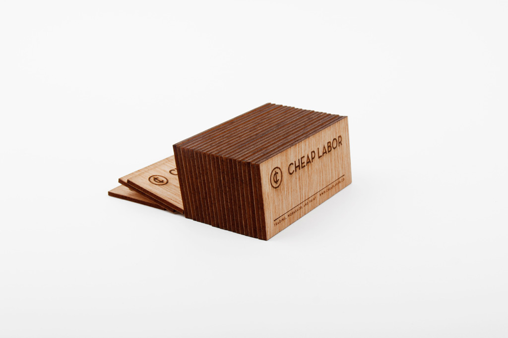
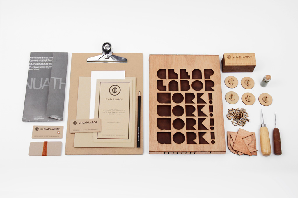
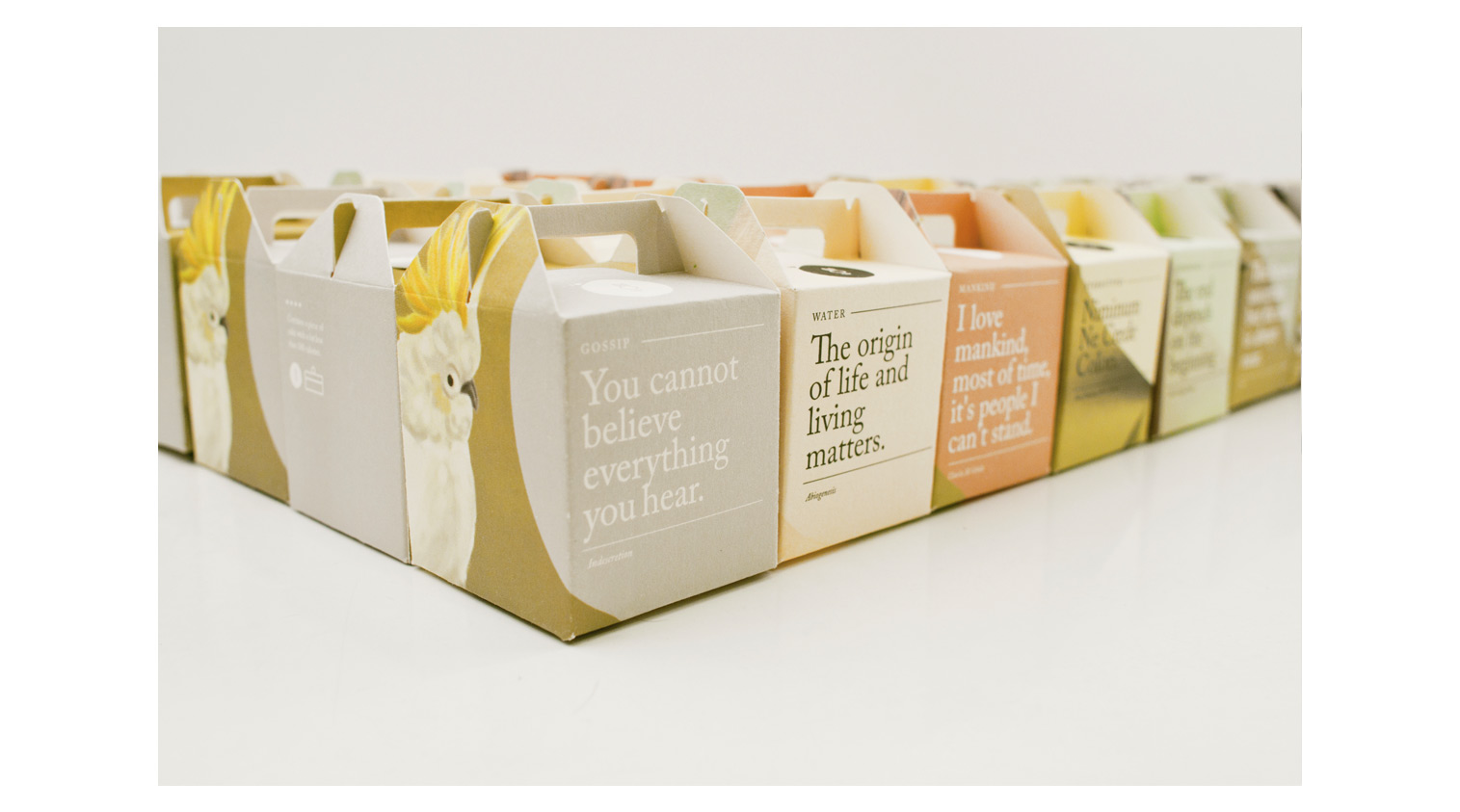
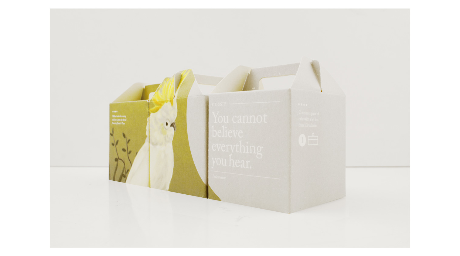
Cheap Labor
Cheap Labor – is a project run by designers & artists at Sciencewerk. All started with studio workshop to create experimental objects and packaging for fun and then came a random contemplation to clear our warehouse where hundreds of antiques, classic paintings, scluptures, things acquired from auctions, or random stuff found during our travel. And it’s now becoming a trading site, a place where they can sell things handmade, consigned, etc. The name cheap labor is to symbolise the notion that we build the project with a few cents and all materials used in the collaterals are from second hand papers, wood, and everything handmade, recycled, secondhand, or defect materials. And to describe ourself Designer as a Cheap Labor. The logo is a monogram, based on ligature one of the designer’s name, ‘OCTA’ and transformed into the symbol of ‘Cents’ / ‘¢’. Yes because we are Cheap Labor.
Client: Cheap Labor
Year: 2013
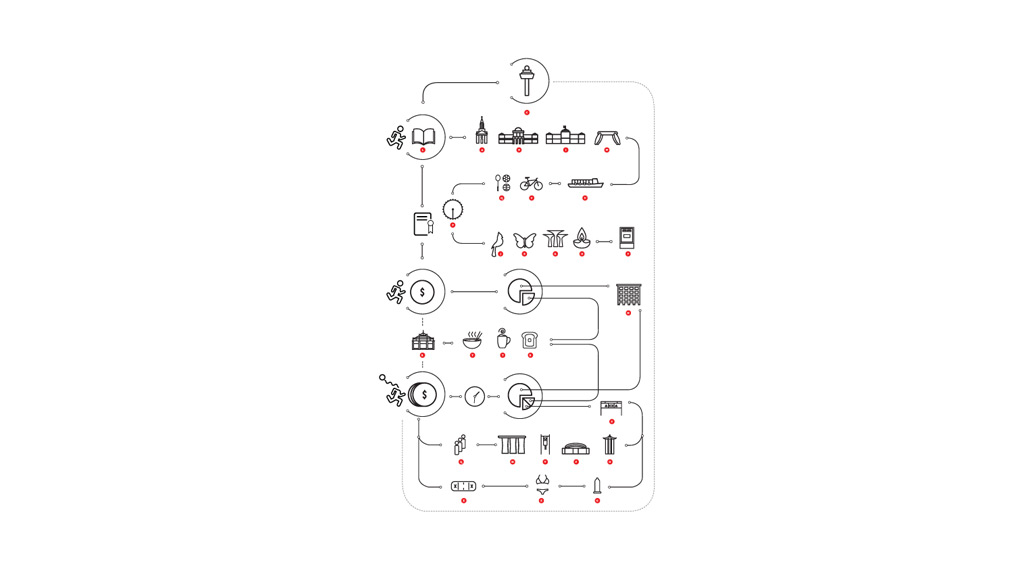
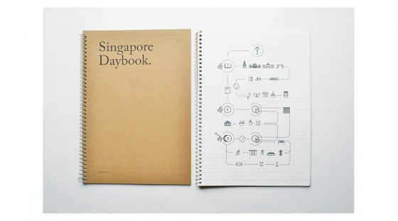
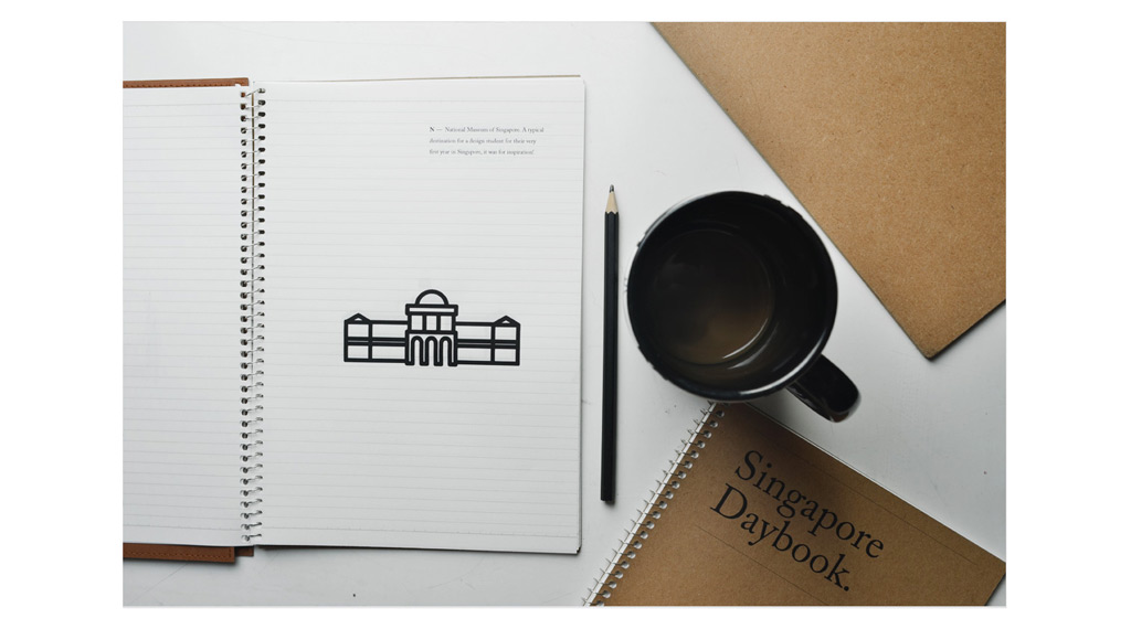
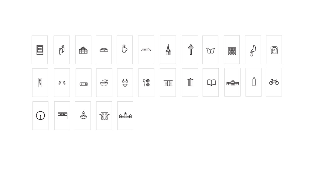
Glyphwerk: Years in Singapore
Dingbat submission for Glyphwerk Exhibition curated by StudioKaleido at Reading Room Gallery Singapore. Dingbat specimen inspired by several years journey. a long blissful tale in Singapore. The specimen humbly printed on an old unused textbook. “We made out a map of the island and you drew it on the back of my hand. We thought tattoos were for posterity, as were monuments, but perhaps the mistake was ours to make. They gave us nothing to remember them by and we were young enough to think that to forget was to forgive.”
Client: Glyphwerk
Year: 2013
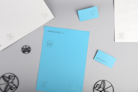
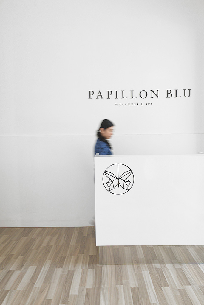
Papillo Blu
Papillon Blu is a privately owned Spa & Wellness centre located at the heart of Surabaya City. Sciencewerk directed and designed the overall identity design, graphic, environmental signage, as well as the upcoming website at www.papillonblu.com. We created a memorable symbol, translated from the word Papillon Blu itself “Blue Butterfly” in french.
Client: Papillon Blu
Year: 2014
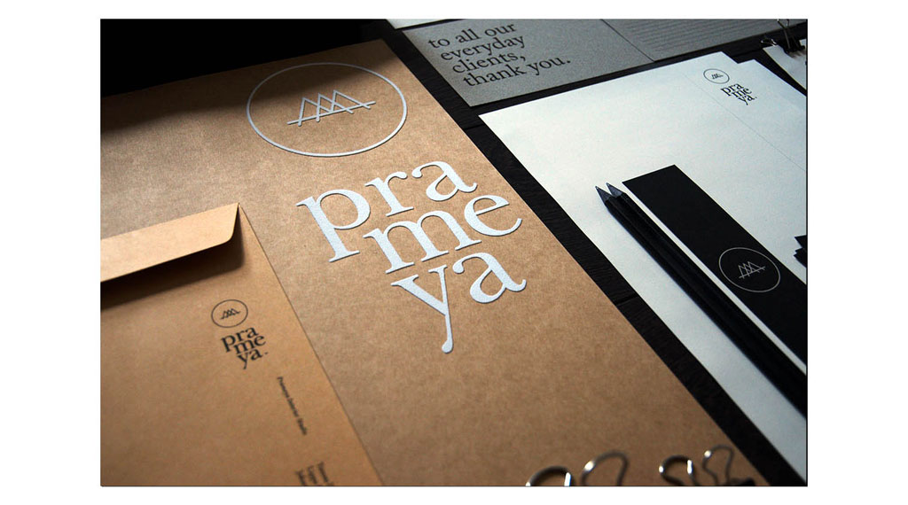
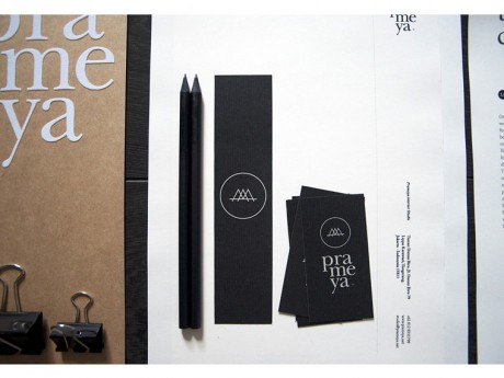
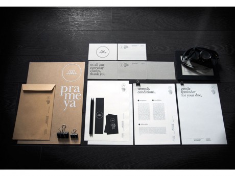
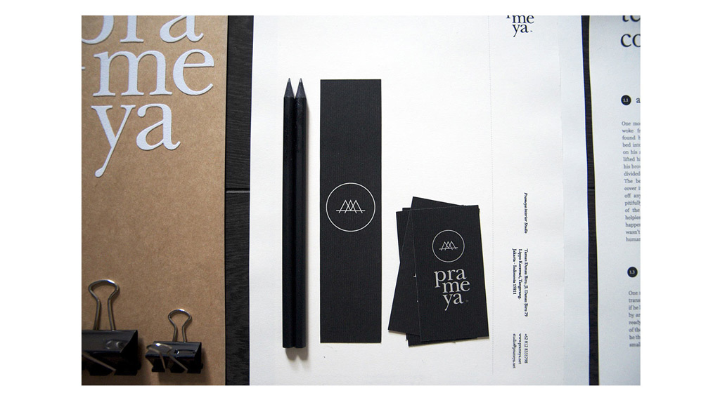
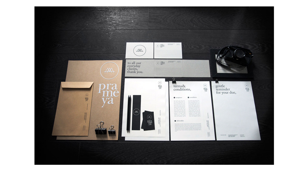
Prameya
Prameya is an interior design studio based in Jakarta. The word Prameya derived from Sanskirt which means Knowledge. We created an identity based on 3 principles; flexible, creative, and affordable. An interchangeable applications that does not stick only on one material. With this principles in mind we choose to play with Recycled Kraft Paper series as an affordable material option.
Client: Prameya
Year: 2011
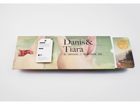
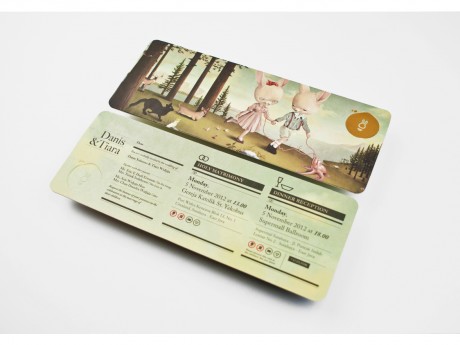
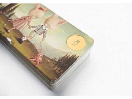
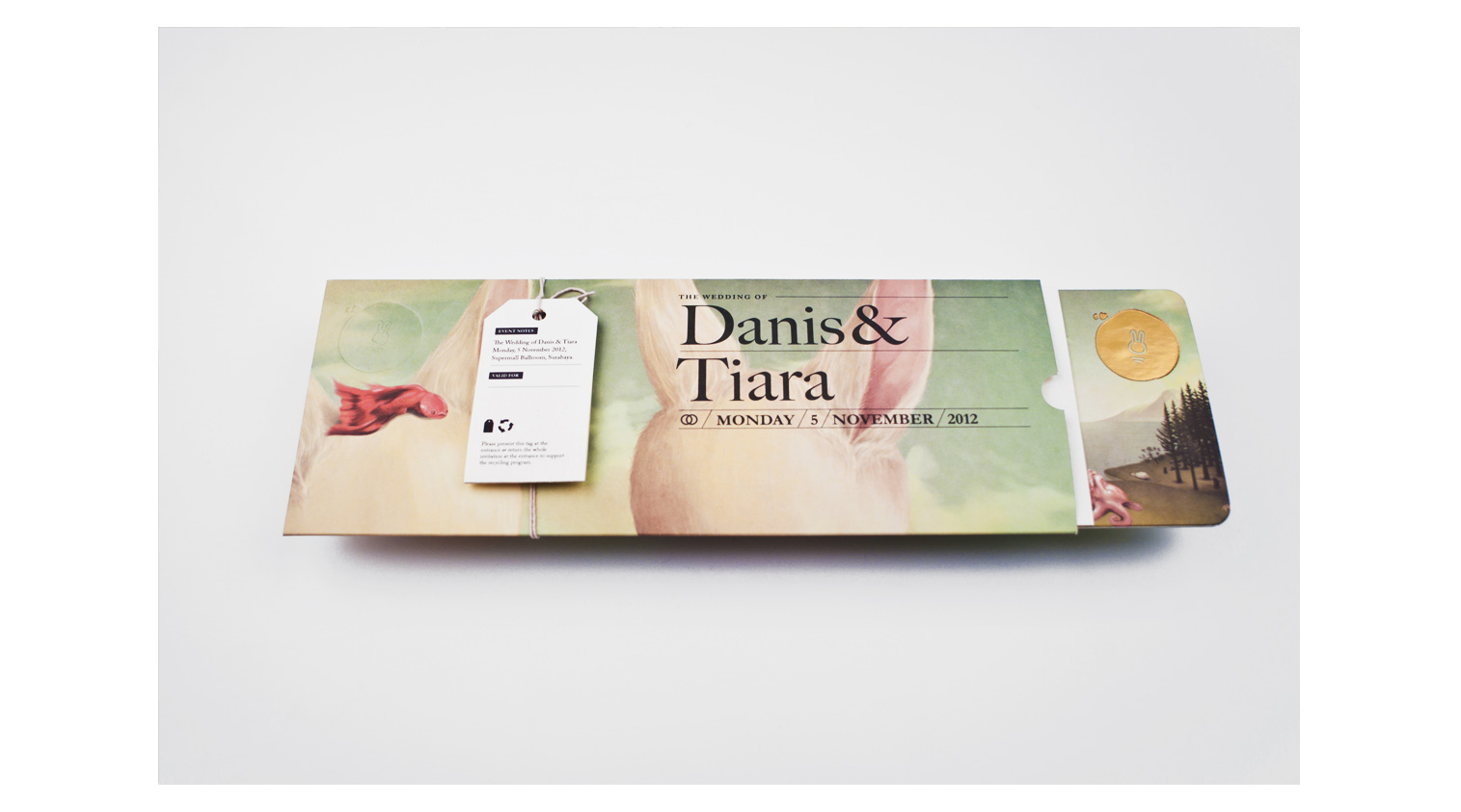
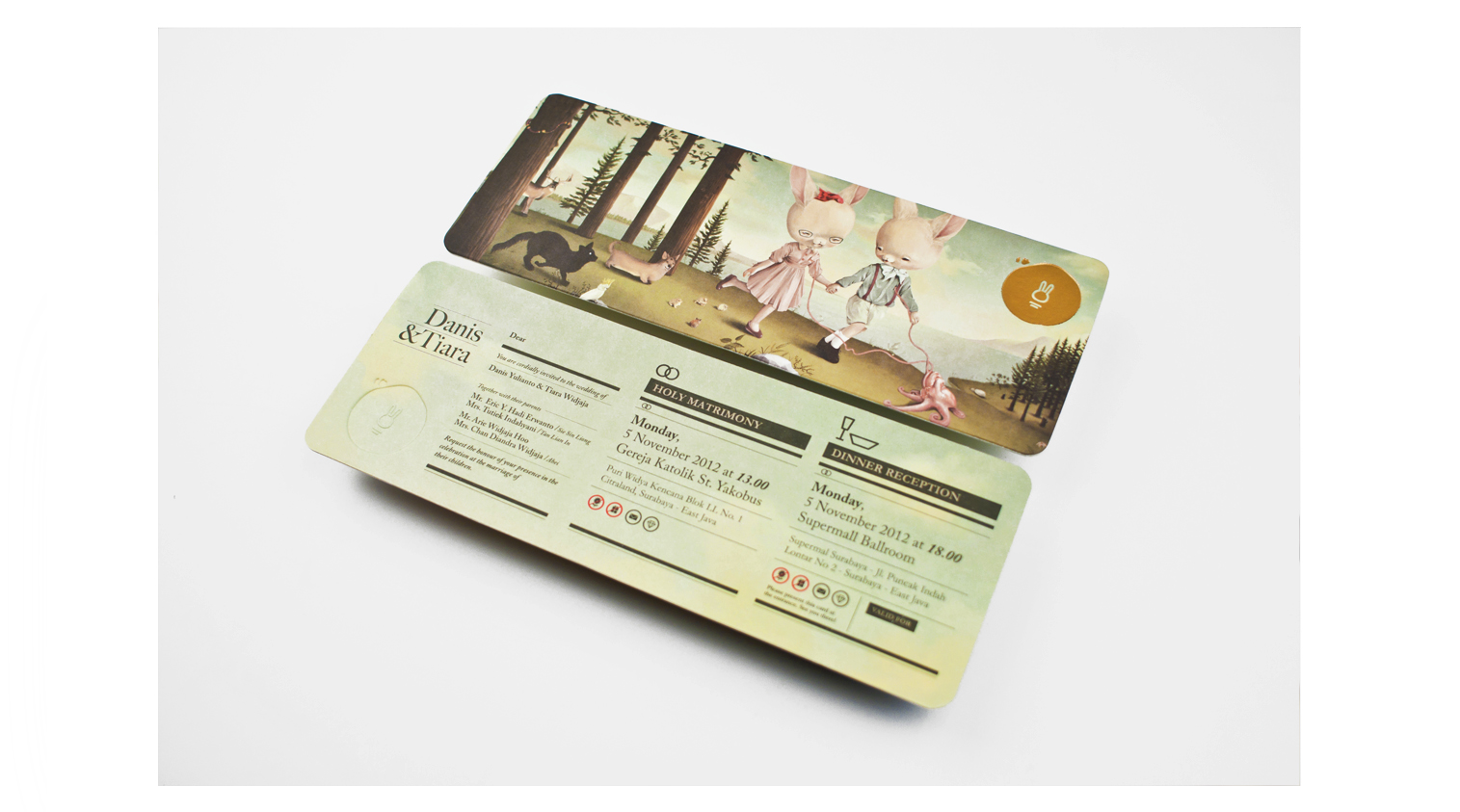
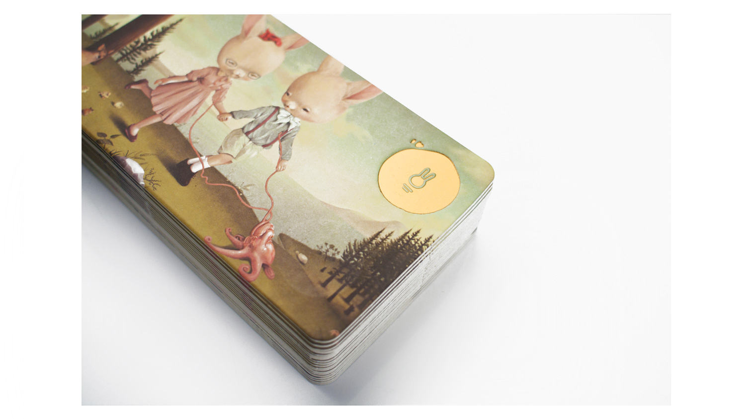
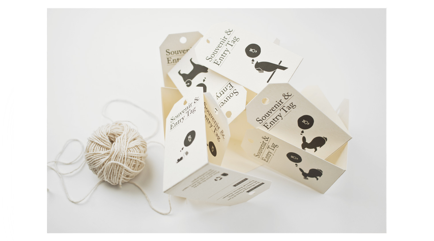
The Rabbit & Monday Misfits
The Rabbit and the Monday Misfits is a story about two rabbit lovers, a quirky wedding concept for one of our core designer in Sciencewerk. We work closely with local contemporary illustrator Robi Dwi Antono to visualize the whole story of the couple and putting all the hidden & conceptual meaning about their relationship within the rest of the merchandise.
Client: Danis & Tiara
Year: 2012
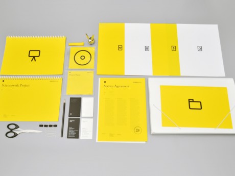
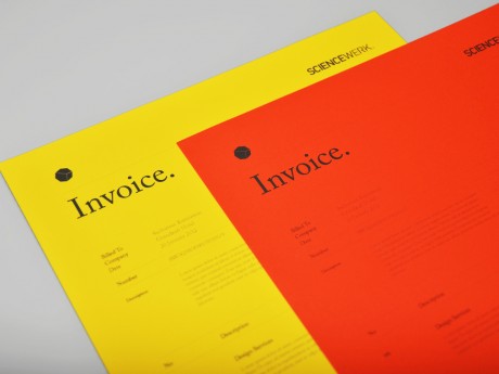
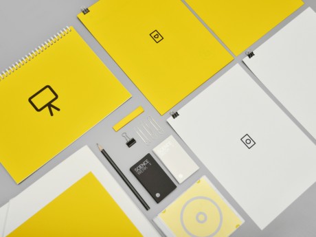
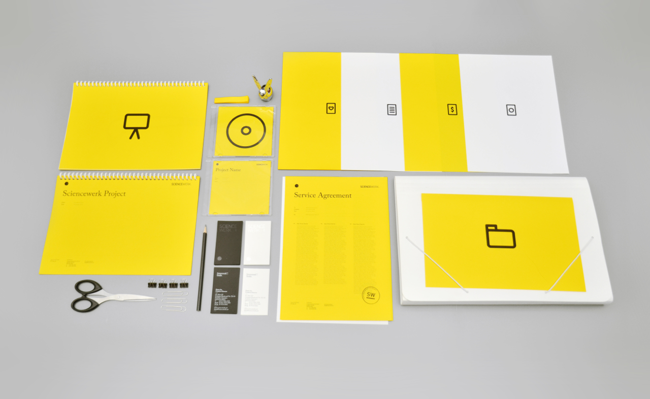
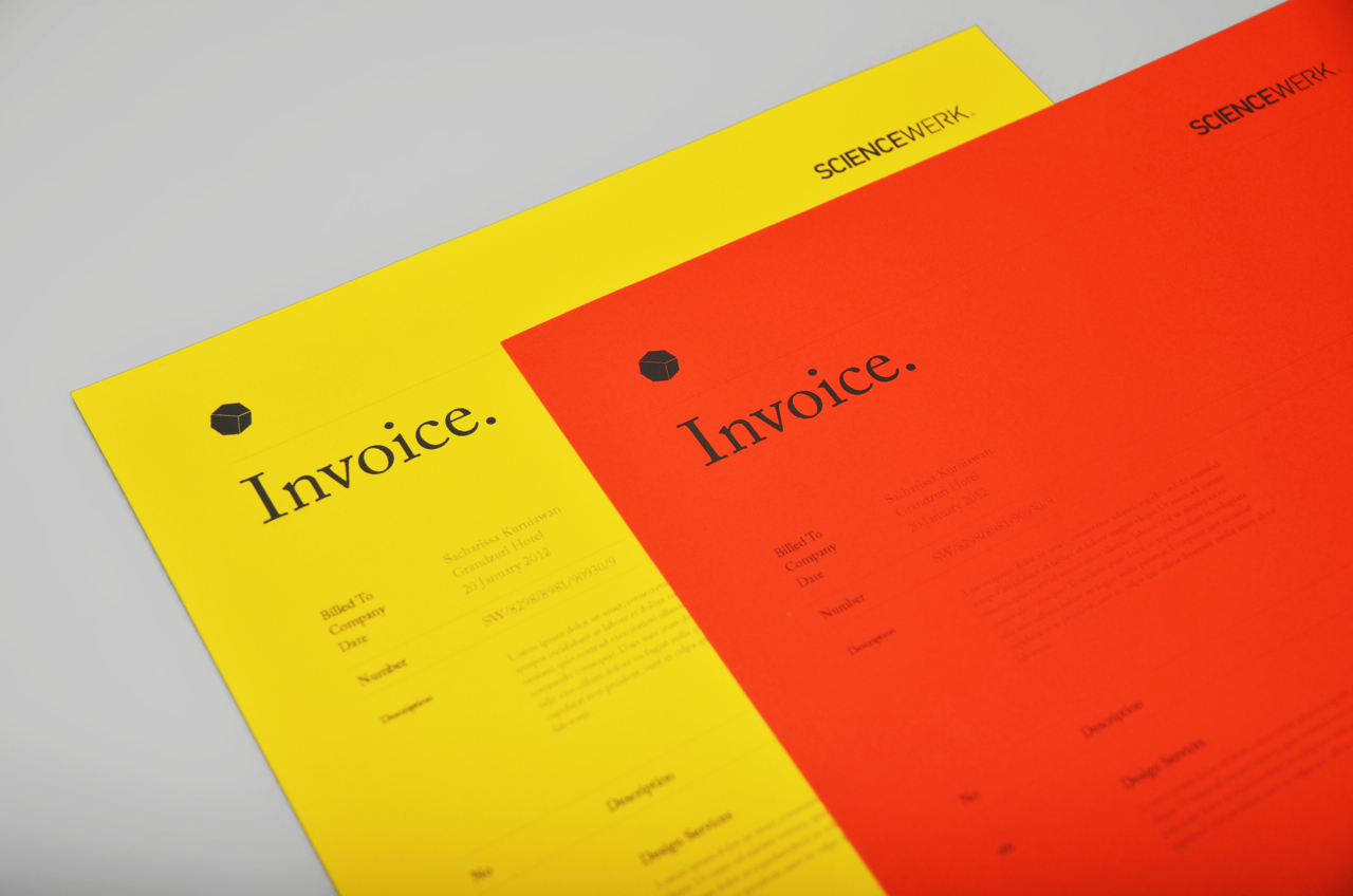
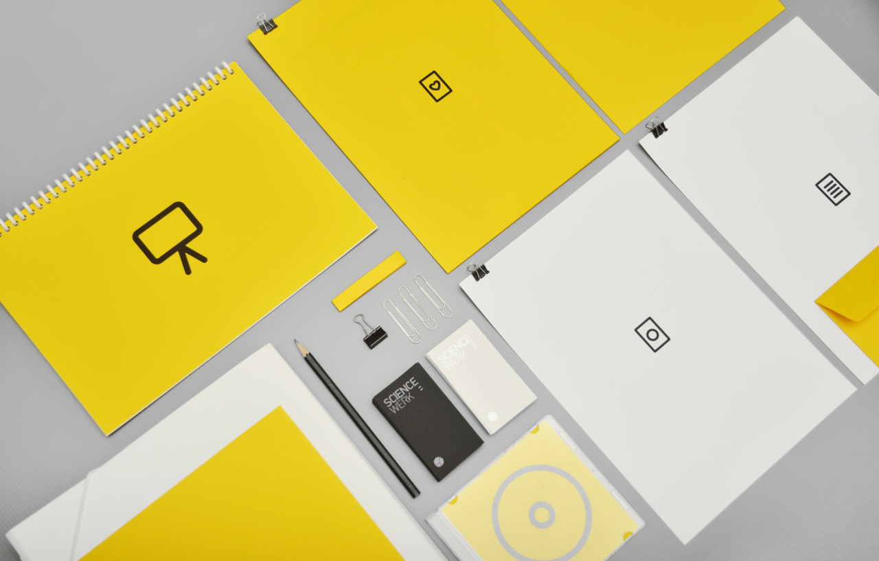
Sciencewerk ID
The whole brand identity & design transformation of Sciencewerk since the beginning until present look, both offline and online media. 2013 – Goes minimalism and exploring the world of pictogram. 2010 – For the upcoming year of metallic rabbit, we do an experimental identity using Priplak board, silkscreen, and metallic papers.
Client: Sciencewerk
Year: 2013
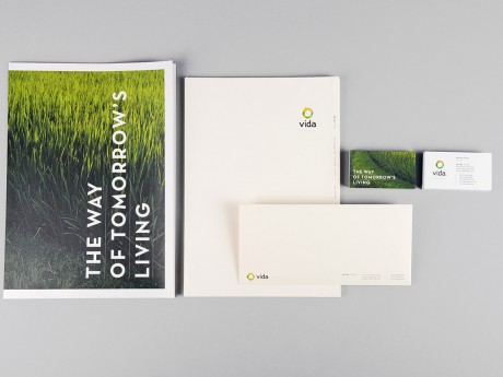
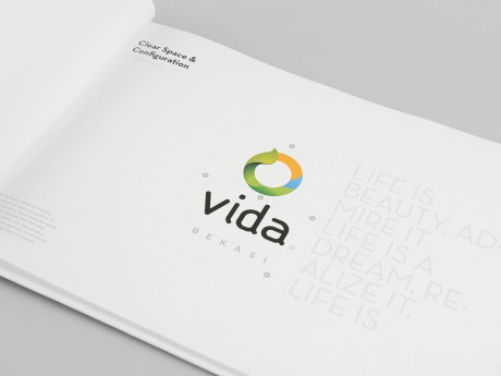
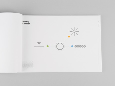
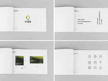
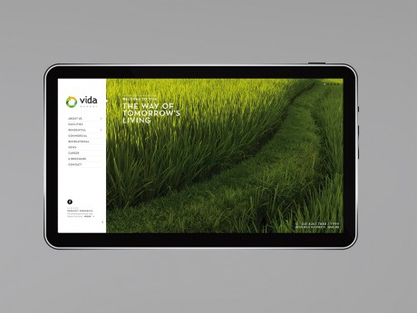
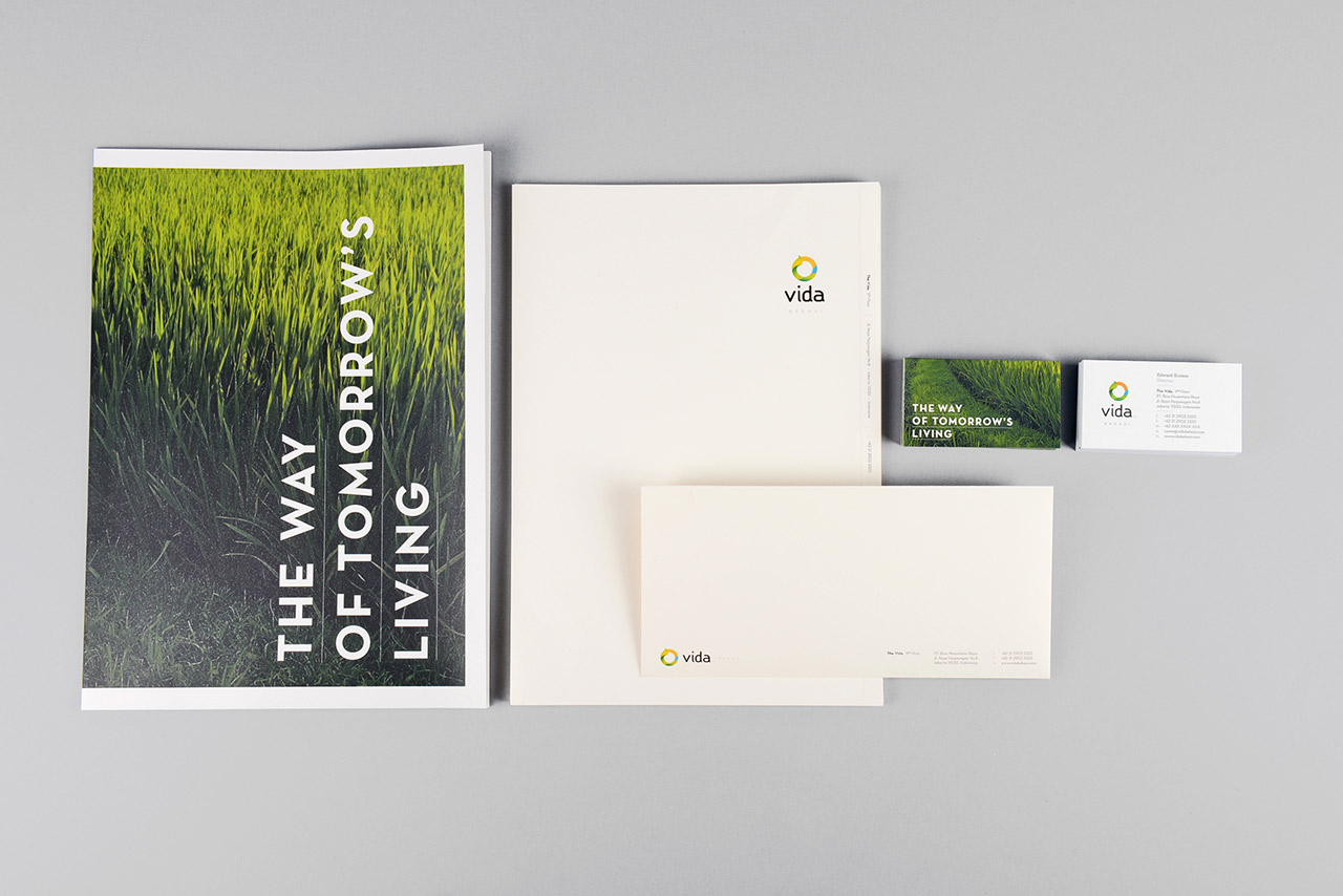
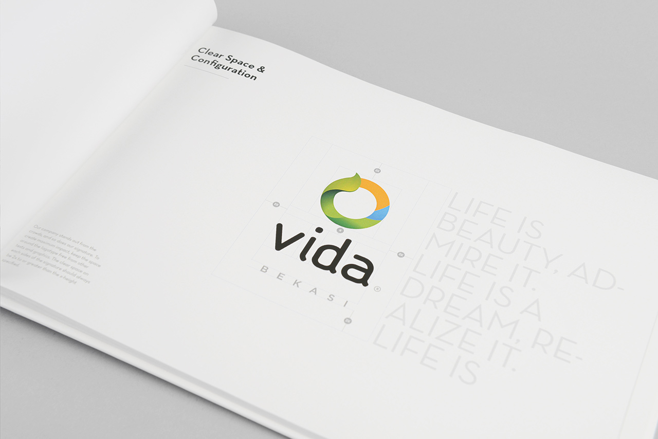
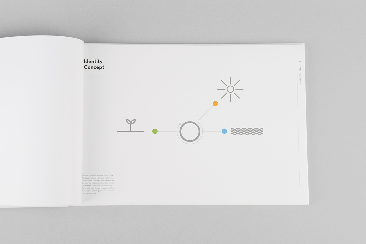
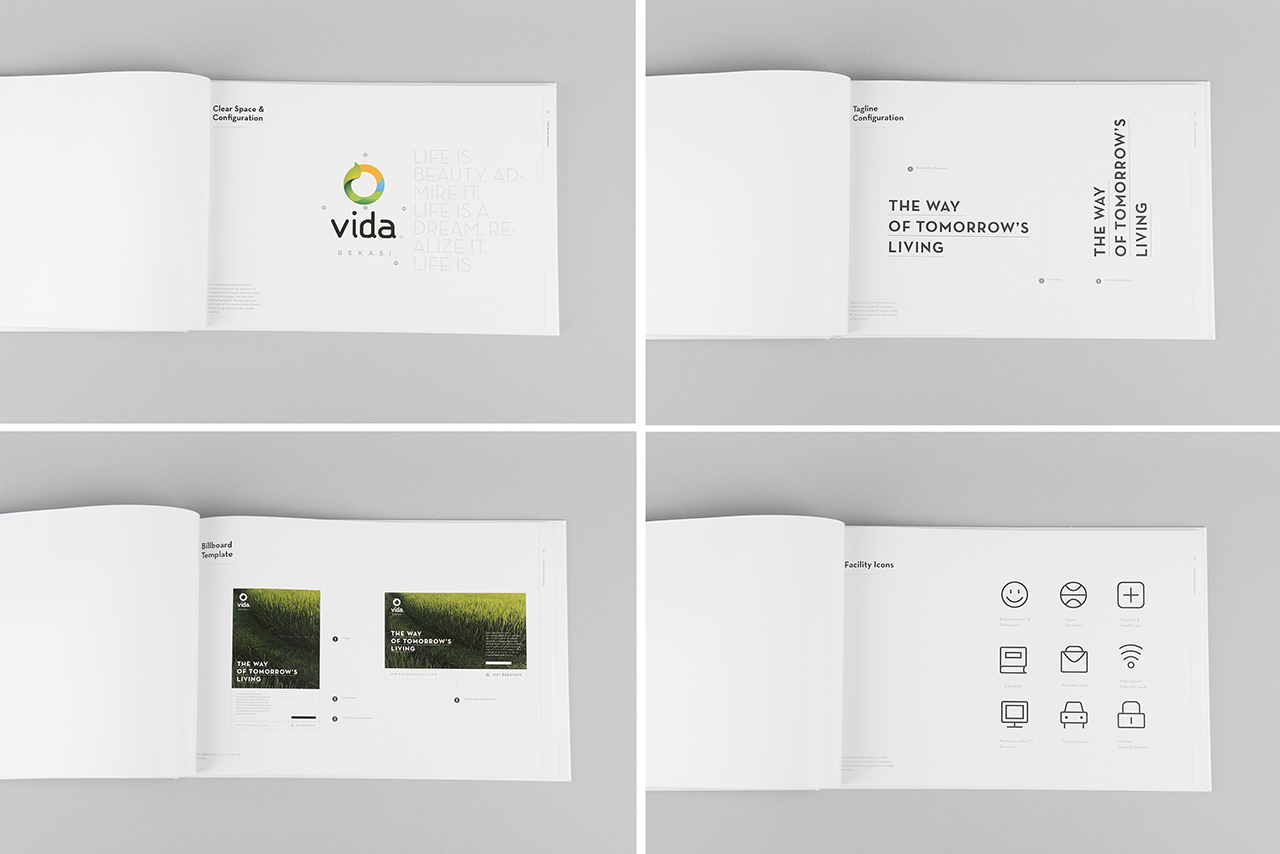
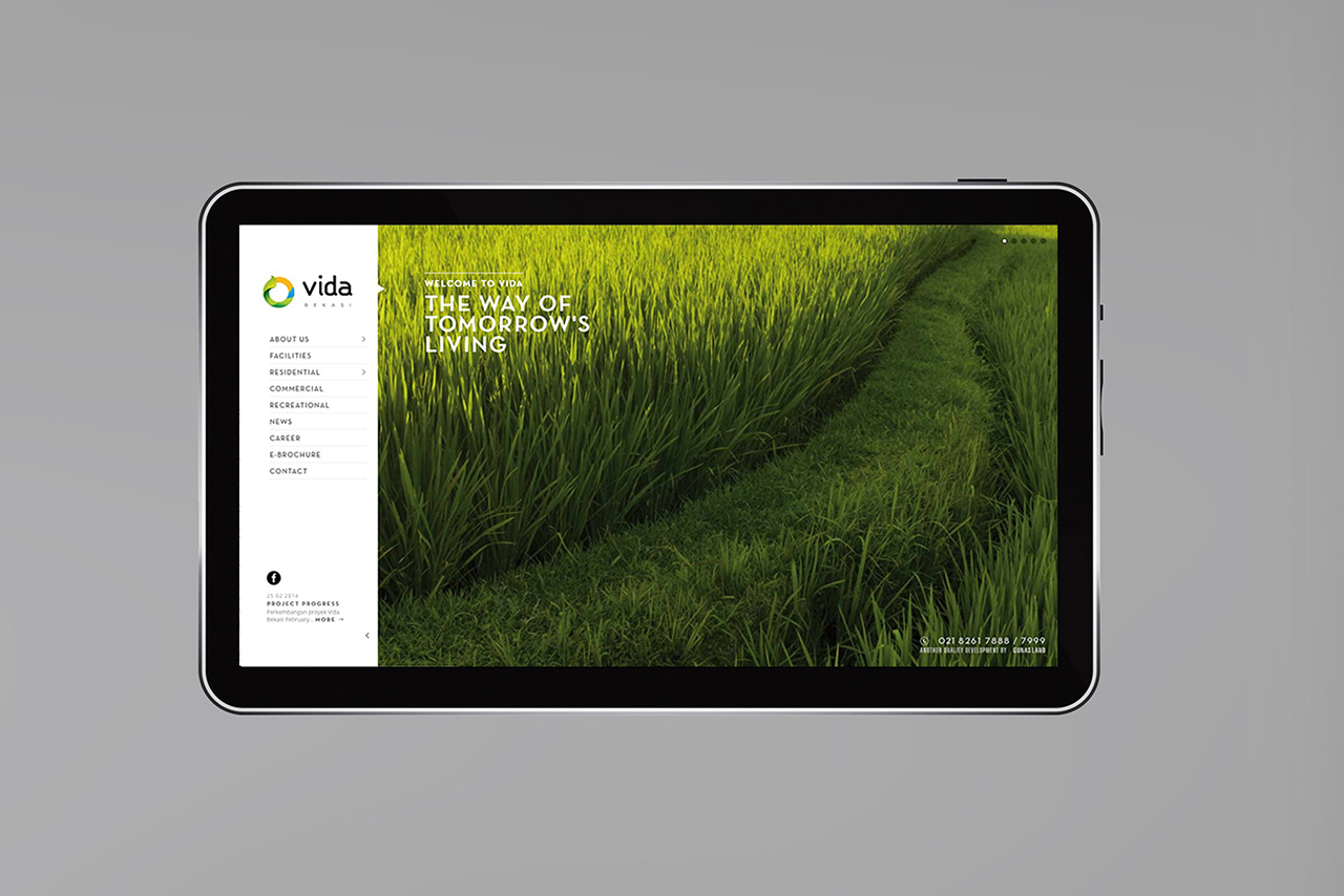
VIDA Bekasi
VIDA Bekasi comes in response to the needs of an emerging set of urban people that is seeking for a better quality of life. This new generation appreciates our approach of merging green living with local art and culture. Upon its completion, VIDA Bekasi will introduce a brand new lifestyle concept. This new development located at Narogong Raya, in the city of Bekasi is a vision to create a self-sufficient neighborhood in the midst of crowded areas surrounding the site. The masterplan is build upon the concept of Tropical Urbanism. It is an integration of contemporary design with specific green site planning. Tropical Urbanism is an approach that responds well to our tropical climate. www.vidabekasi.com
Client: Gunas Land
Year: 2013
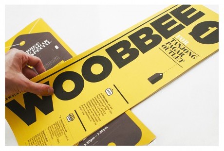
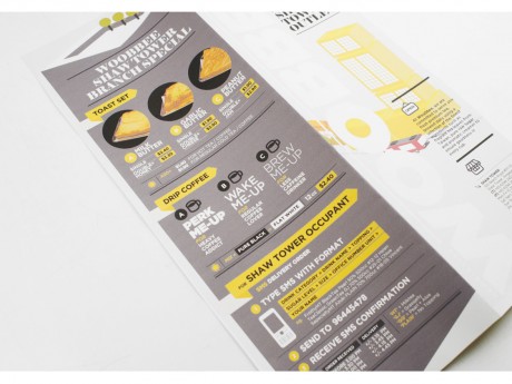
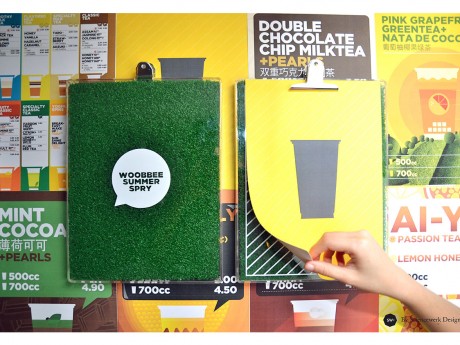
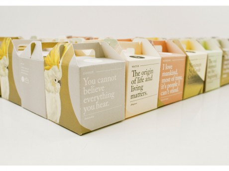
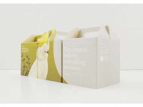
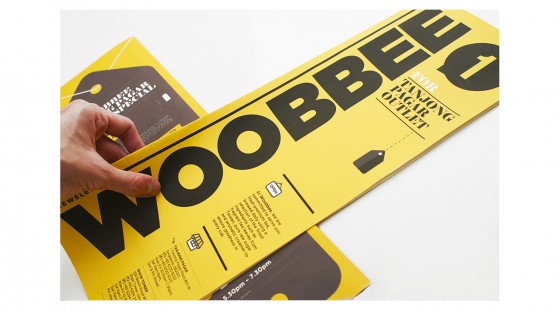
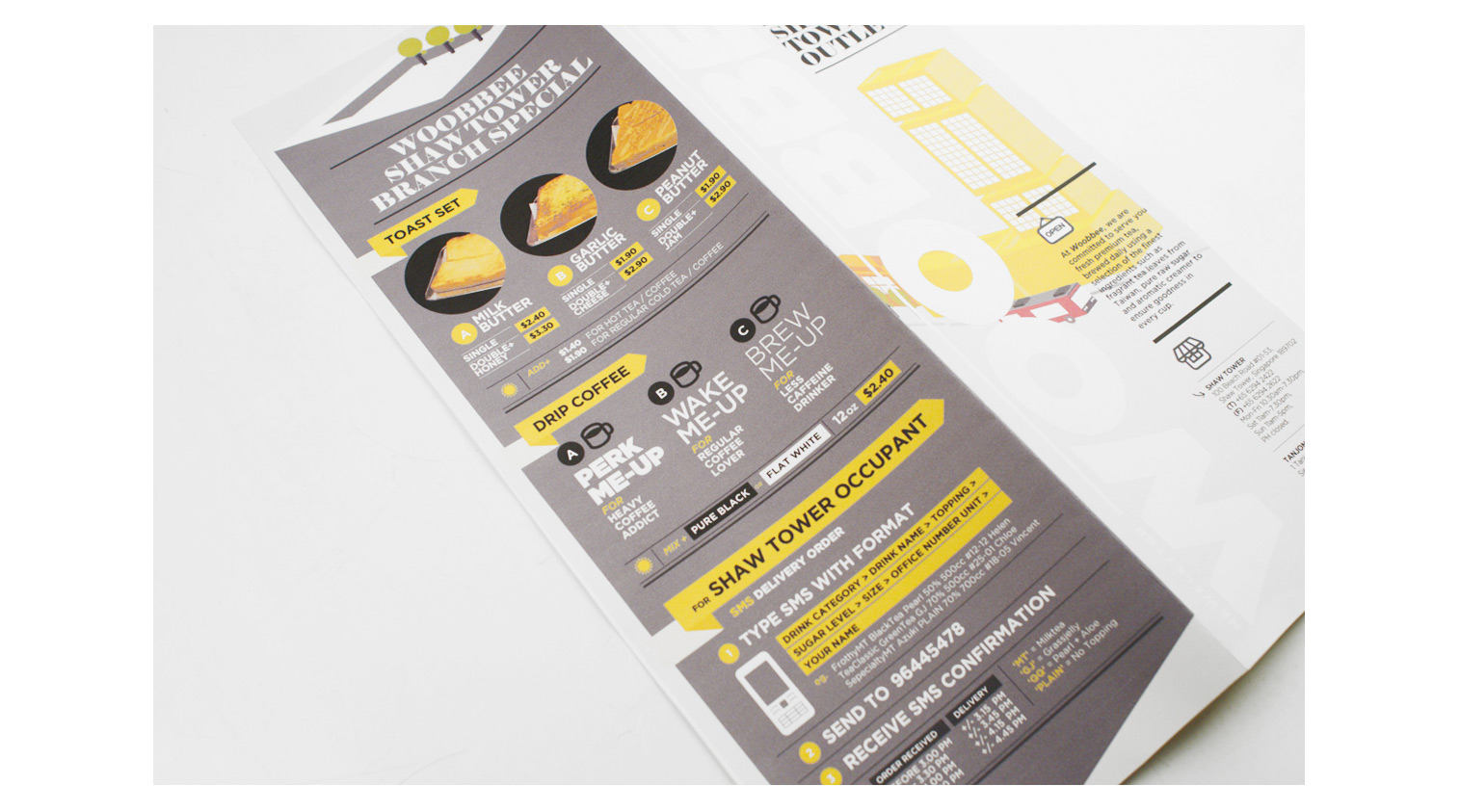
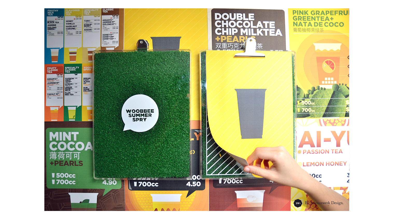
Woobee Prints
Woobbee specialise in serving the fresh premium tea which is brewed daily by using some of the finest ingredients. The use of raw sugar in all their tea preparations can be attributed to the Woobbee’s dedication towards making all their products as health-friendly as possible. This is the Summer collection menu box for Woobbee Bubble Tea. There’s nothing like that first sip of a chilled drink and green grass feel on a hot day.
Client: Woobee Pte. Ltd
Year: 2012 – Present
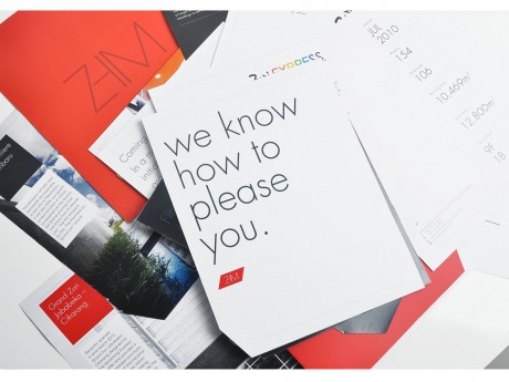
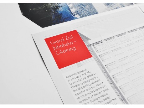
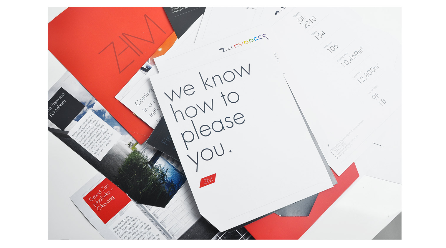
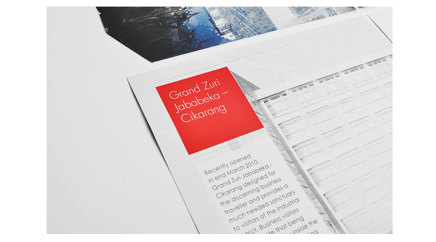
Zuri Hospitality Management
ZHM is a business on various inter-related industries. Apart from operating hotels, the group also operates laundry and bakery. With its vision to be a global contemporary brand and its locally anchored heart, is all about offering unique experiences for discerning customers. Our brief is to define the brand that encapsulated in the phrase ‘Moving upwards and grow’ and creating an identity that is timeless.
Client: Zuri Hospitality Management
Year: 2011
Cheap Labor
Cheap Labor – is a project run by designers & artists at Sciencewerk. All started with studio workshop to create experimental objects and packaging for fun and then came a random contemplation to clear our warehouse where hundreds of antiques, classic paintings, scluptures, things acquired from auctions, or random stuff found during our travel. And it’s now becoming a trading site, a place where they can sell things handmade, consigned, etc. The name cheap labor is to symbolise the notion that we build the project with a few cents and all materials used in the collaterals are from second hand papers, wood, and everything handmade, recycled, secondhand, or defect materials. And to describe ourself Designer as a Cheap Labor. The logo is a monogram, based on ligature one of the designer’s name, ‘OCTA’ and transformed into the symbol of ‘Cents’ / ‘¢’. Yes because we are Cheap Labor.
Client: Cheap Labor
Year: 2013
Glyphwerk: Years in Singapore
Dingbat submission for Glyphwerk Exhibition curated by StudioKaleido at Reading Room Gallery Singapore. Dingbat specimen inspired by several years journey. a long blissful tale in Singapore. The specimen humbly printed on an old unused textbook. “We made out a map of the island and you drew it on the back of my hand. We thought tattoos were for posterity, as were monuments, but perhaps the mistake was ours to make. They gave us nothing to remember them by and we were young enough to think that to forget was to forgive.”
Client: Glyphwerk
Year: 2013
Papillo Blu
Papillon Blu is a privately owned Spa & Wellness centre located at the heart of Surabaya City. Sciencewerk directed and designed the overall identity design, graphic, environmental signage, as well as the upcoming website at www.papillonblu.com. We created a memorable symbol, translated from the word Papillon Blu itself “Blue Butterfly” in french.
Client: Papillon Blu
Year: 2014
Prameya
Prameya is an interior design studio based in Jakarta. The word Prameya derived from Sanskirt which means Knowledge. We created an identity based on 3 principles; flexible, creative, and affordable. An interchangeable applications that does not stick only on one material. With this principles in mind we choose to play with Recycled Kraft Paper series as an affordable material option.
Client: Prameya
Year: 2011
The Rabbit & Monday Misfits
The Rabbit and the Monday Misfits is a story about two rabbit lovers, a quirky wedding concept for one of our core designer in Sciencewerk. We work closely with local contemporary illustrator Robi Dwi Antono to visualize the whole story of the couple and putting all the hidden & conceptual meaning about their relationship within the rest of the merchandise.
Client: Danis & Tiara
Year: 2012
Sciencewerk ID
The whole brand identity & design transformation of Sciencewerk since the beginning until present look, both offline and online media. 2013 – Goes minimalism and exploring the world of pictogram. 2010 – For the upcoming year of metallic rabbit, we do an experimental identity using Priplak board, silkscreen, and metallic papers.
Client: Sciencewerk
Year: 2013
VIDA Bekasi
VIDA Bekasi comes in response to the needs of an emerging set of urban people that is seeking for a better quality of life. This new generation appreciates our approach of merging green living with local art and culture. Upon its completion, VIDA Bekasi will introduce a brand new lifestyle concept. This new development located at Narogong Raya, in the city of Bekasi is a vision to create a self-sufficient neighborhood in the midst of crowded areas surrounding the site. The masterplan is build upon the concept of Tropical Urbanism. It is an integration of contemporary design with specific green site planning. Tropical Urbanism is an approach that responds well to our tropical climate. www.vidabekasi.com
Client: Gunas Land
Year: 2013
Woobee Prints
Woobbee specialise in serving the fresh premium tea which is brewed daily by using some of the finest ingredients. The use of raw sugar in all their tea preparations can be attributed to the Woobbee’s dedication towards making all their products as health-friendly as possible. This is the Summer collection menu box for Woobbee Bubble Tea. There’s nothing like that first sip of a chilled drink and green grass feel on a hot day.
Client: Woobee Pte. Ltd
Year: 2012 – Present