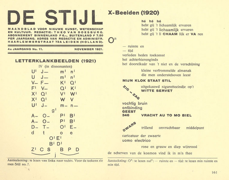
De Stijl
After World War I there was a turning away from old forms and philosophies among architects and designers, just as there was among artists and writers. Many of the same abstract ideas came into play, as did ideas that incorporated the “machine” aesthetics of the new industrial age. In fact, one of the important trends of the 20th century would be the increasing parallels between – even merging of – art and design, which had been separated since the end of the renaissance.
In the early 1920’s a group of architects and artists, influenced by some of the ideas of DaDa, formed a movement called de Stijl (Dutch for The Style). Theirs was a utopian philosophical approach to aesthetics, centered in a publication called de Stijl, which presented their ideas and designs. The founder of the publication and leader of the group was Theo van Doesburg, an architect. Other important participants were Gerrit Rietveld and Piet Mondrian.
The philosophy was based on functionalism, with a severe and doctrinaire insistence on the rectilinearity of the planes, which seem to slide across one another like sliding panels. All surface decoration except color was to be eliminated, and only pure primary hues, plus black and white were to be allowed.
The most important thing about this group was their ideas, since they managed to build very few of their designs. One important exception is Gerrit Rietveld’s Schroeder House, which is the most complete realization of the de Stijl aesthetic. Not only the house, but also the furnishings and decoration were planned by Rietveld. In spite of the apparently small output of this group, they would be very influential on subsequent design styles.
The initial source of their ideas came from DaDa notions about dispensing with the pretentious elitist design aesthetics of the pre war era. Some of the early work of Frank Lloyd Wright, which had been published in Europe in 1910, influenced their notions about form. Japanese sources were also of significance, though these ideas may have been derived through the work of Wright.
Source: Art, Design and Visual Thinking
De Stijl, the new universal vision.
Theo van Doesburg and Vilmos Huszår (Huszår designed this first cover) founded the De Stijl journal in 1918, a publication that protested war, individualism and nationalism. The De Stijl design concept was organized space on geometric principles and the use of pure colors only. Architects were involved in the movement who carried through their principles in several projects. Piet Mondrian, Dutch artist, was also involved with this group from its inception. It ended with the death of Theo van Doesburg in 1931 as he had been its driving force.
Source: flickr
Source: flickr
Paul Schuitema (?)-1
Paul Schuitema (?)-2
Source: flickr
1919
Exhibition poster designed by De Stijl member Bart van der Leck 1919.
Source: flickr
1920
Designed by Piet Swart or Paul Schutema, I think, in the 1920’s.
Source: flickr
An advertising poster promoting car lights for Philips 1920.
Source: flickr
1922
Piet Zwart design, double page, catalog, 1922.
Source: flickr
1923
Poster designed by Piet Zwart 1923.
Source: flickr
Title page of a brochure designed by Piet Zwart 1923.
Source: flickr
1924
Piet Zwart design for a flooring advertisement, 1924.
Source: flickr
1925
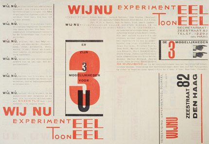
Piet Zwart, broadside announcement for Experimenteel Tooneel WijNu, 1925
Source: Design Observer
1925
Sign designed by Loxton Knight. A Dutch commercial art layout way back in 1925. Our advertising design roots run deeper than we sometimes know.
I would say that this was modernistic, in keeping with Europe’s dominant commercial graphic movement at that time.
Source: flickr
Travel poster designed by Adriaan van’t Hoff 1925.
Source: flickr
Paul Schutema designed this ad for P. van Berkel company 1925.
Source: flickr
I’m not sure about this. I know that it was designed by Piet Zwart 1925, but I just don’t know what it is.
Source: flickr
Source: flickr
1926
Catalog double page spread, designed by Piet Zwart, 1926.
Source: flickr
Source: flickr
Double page spread for a catalog, 1926 and designed by Piet Zwart.
Source: flickr
Double page layout for a catalog designed by Piet Zwart 1926.
Source: flickr
Exhibition poster designed by Paul Schutema 1926.
Source: flickr
Catalog cover designed by Piet Zwart 1926.
Piet Zwart was never a member of De Stijl as far as I know, although he knew and respected the people involved in the De Stijl movement. He went his own way, which was an application of his ideas and principles in the very commercial, tough, working world of advertising art.
Source: flickr
1927
i10, international revue publication co-founded with Arthur Lehning and Moholy Nagy.
Source: flickr
Piet Zwartz, page 2 and 3 from a catalog.
Piet was too busy getting graphic design out of the monotonous lay-outs of the 1920’s. Take a look at the advertisements in old National Geographic magazines of that time period, then look at his work.
Piet Zwart was truly a pioneer, a designer who actually made a living out of going his own way, following his own principles. That’s the toughest road of all.
Design today seems to center around the idea, not function and the visual. Software makes it so easy to push type and canned thinking around until it “fits”.
Source: flickr
1928
I think this is the title page of a brochure for broadcasting station Scheveningen designed by Piet Zwart 1928.
Source: flickr
Page 3 of a brochure for broadcasting station Scheveningen, 1928. It looks as if the designer Piet Zwart used the photogram technic for this beautiful layout.
Source: flickr
Film poster designed by Piet Zwart 1928.
Source: flickr
1929
Wendingen/Diego Rivera publication cover designed by Vilmos Huzår 1929.
In 1918, architect Hendrik Wijdeweld founded the magazine Wendingen (Changes). He chose the square format for the publication and used san serif type faces, both avant-garde for the day. It was printed on a Chinese paper stock and bound with raffia.
Source: flickr
Travel poster designed by Machiel Wilmink 1929. TYR just sent on a message that this is his great-great-grandfather’s design.
Source: flickr
Advertisement designed by Piet Zwart 1929.
Source: flickr
1929/1930
Page 5 of a brochure for airmail promotion, 1929/30. Designer Piet Zwart.
Source: flickr
1930
Design for a printing company by Piet Zwart 1930.
DaDa truly influenced this and this direction truly influenced how we see layout today. It was practically unheard of to use this type of visual in the time period just after WWI.
Source: flickr
Exposition poster designed by P.A.H. Hofman 1930.
Source: flickr
Piet Zwart design for a radio-cable advertisement, 1930.
Source: flickr
Advertisement, designer Piet Zwart 1930.
Source: flickr
I may be wrong but I think that this is a title page for a type specimen book designed by Piet Zwart 1930. I also think that he did most of his own photography.
Source: flickr
An advertisement designed by Piet Zwart 1930.
Source: flickr
A brochure for air-mail designed by Piet Zwart about 1930.
He took typography out of the nineteenth century and created design in keeping with the DaDa, DeStijl and Futurist movements, and the new industrial age of Europe. He was truly a pioneer of contemporary graphics.
Spource: flickr
1931
A Dutch film periodical cover designed by Piet Zwart 1931.
Source: flickr
More cover designed by Piet Zwart.
Source: flickr
Brochure “Reclame”, page 4. I am not too sure if this was designed by Piet Zwart or not. 1931.
It says;
advertisement is not a shout
advertisement is a science
advertisment is a force
Source: flickr
Piet Zwart design from a brochure, 1931.
Source: flickr
1932
A Dutch film periodical cover designed by Piet Zwart 1932.
Source: flickr
Exposition poster designed by Zeguers 1932. Strongly influenced by the modern movement.
Source: flickr
Automobile show poster designed by Jacob Jangma 1932.
Source: flickr
Source: flickr
Anonymous. Exhibition poster 1932.
Source: flickr
De Reclame, an advertising magazine cover, designed by J.A.W. von Stein 1932.
Source: flickr
All the elements of contemporary design are plainly visable in the title pages of de 8. Part of the foundation of design that we work in today can be found these early designs.
Source: flickr
The chances of finding a market for progressive design were extremely small in the 1930’s and the freelance designer just did not exist in the sense that we know today. Advertising was rated low and looked upon with disdain as the concern of the so-called advertising agencies. There was very little oportunity to produce progressive work, in Europe or the USA. The depression was full-blown during those years and times were hard everywhere.
Source: flickr
1933
Aviation poster designed by Adriaan van’t Hoff 1933.
Source: flickr
Aviation school poster designed by Kees van der Laan 1933.
Source: flickr
The group “de 8? included Dutch architects such as van Eestern, Karsten, Merkelbach, Rietveld, Zwart, van der Broek, Bakema and others. The chief initiating force behind the periodical was the architect Merkelbach. There was no editor-in-chief.
Source: flickr
1934
K.L.M. airline poster designed by Machteld den Hetog 1934.
Source: flickr
Poster for Netherlands PTT, designed by Piet Zwart 1934.
Source: flickr
Pioneer beginnings of New Graphic Design. Anyone involved with producing work in this direction faced infinitely greater technical and material difficulties than those that confront the graphic designer today.
Source: flickr
1935
An anti-alcohol poster/calendar 1935, no designer’s name. It’s interesting to see how the printer tipped in a standard trade printed calendar. The old and the new.
Source: flickr
1936
Travel poster designed by Wim ten Broek 1936.
Source: flickr
1936 de 8 en opbouw title page designed by the architects who were responsible for the publication. This pioneer Dutch periodical was issued from 1932 through to 1943, the economically toughest years of all.
Source: flickr
1938
A commerical application of the art moderne style. Magazine cover 1938. Anonymous.
Source: flickr
1940
An anti-Nazi poster designed by V. Reen 1940.
Source: flickr
1941
Exhibition poster designed by Steen 1941.
Source: flickr
1960
Netherlands exhibition poster “The man behind the designing of the post and telegraph graphics” designed by Peter Brattinga 1960.
Source: flickr
1961
Book, “G.R. Kruissink, Zuiderzee”, Jurriaan Schrofer, 1961.
Source: NAGO
1965
Poster, “Bijenkorfiade”, Total Design, Benno Wissing, 1965.
Source: NAGO
1969
Holland poster by Dick Elfers.
Source: flickr
1974
Book, “Radio Nederland, Opus 74?, Dick Elffers, 1974.
Source: NAGO
1980
Source: NAGO
1982
Source: NAGO
1989
Wim Crouwel was director of the Dutch Boysmans-van Beuningen museum in Rotterdam who commissioned the British design group 8vo to design a series of museum posters with the stipulation that Futura be used.
Source: flickr
1991
Wim Crouwel was director of the Dutch Boysmans-van Beuningen museum in Rotterdam who commissioned the British design group 8vo to design a series of museum posters with the stipulation that Futura be used.
Source: flickr
Source: flickr
1994
Wim Crouwel was director of the Dutch Boysmans-van Beuningen museum in Rotterdam who commissioned the British design group 8vo to design a series of museum posters with the stipulation that Futura be used 1989-1994.
Source: flickr
Note: Komentar dari kolektor (Marryellen, pengajar desain grafis) – yang terkadang tercantum pada deskripsi masing-masing karya – sengaja tidak dihapus, karena bisa merupakan informasi yang berguna untuk melakukan penelitian yang lebih mendalam.
Contemporary Dutch graphic design: an insider/outsider’s view
by Peter Bilak
It is too simple to suggest that Dutch graphic designers have an easy working life. The ‘official anarchy1 ’ of the design scene is often romanticised, but like anywhere else, the country has its share of mediocre designers and conservative clients. One still has to fight for a good idea.
However, the position of a graphic designer in the Netherlands remains very different from other countries, even neighbouring ones such as Germany or Belgium. It is impossible not to notice the impact of graphic design in everyday life. Take a traditionally conservative client such as the national bank: instead of the portraits of national heroes or symbols of power common to almost all other countries’ banknotes, the Dutch ones feature a bird, a sunflower and a lighthouse. Even more remarkable is the fact that these motifs were proposed by the designer himself. The reason why the Dutch currency is so out-of-step with other countries is, of course, due to the attitude adopted by the commissioner – De Nederlandsche Bank. Although the series of banknotes dated 1977 has since been partially replaced, the position of the designer has remained privileged. The new series employs wholly abstract images2. In their book Graphic design and Idealism, Leonie ten Duis and Annelies Haase describe the designer’s position: ‘With the idea that client and designer had separate responsibilities, the Bank never felt the need to take over the job of the designer or issue an aesthetic veto. Dutch money was the result both of the designer’s extensive autonomy and of the Bank’s flexible attitude as the client.’3
More than any other form of art, graphic design directly reflects the prevailing historical, economic, political and social contexts. Its apparent significance or relevance is therefore altered (lost, improved or damaged) by a change of context. Graphic design does not exist in a vacuum. Its position depends on the system of relationships between the commissioner, public and designer. The exhibition in the RAS gallery presents work which was created in a different country under its own specific conditions. In order to understand graphic design stripped of its original environment, further clarification is necessary.
Dutch graphic design is affected by a number of factors – the relatively small scale of the country, its long arts tradition, and prosperous economy – which have resulted in a uniquely creative atmosphere. In particular, the government’s generous cultural funding system is often purported to be the main reason for the ‘advanced’ nature of Dutch graphic design – the constant flow of money facilitating unconventional approaches. This central financial support is deeply rooted in the country’s history: artists have enjoyed a relatively high social status since the Golden Age of the Dutch monarchy.
The old mercenaries have been replaced by the government’s own commissioning strategies. Some larger companies have ‘aesthetic consultants’ responsible for selecting suitable designers for specific projects. The Dutch Royal Telecom (KPN), for example, runs an Art and Design department in charge of commissioning designers, and has long been one of the most respected graphic design clients in the world. The Dutch government itself is also a prime commissioning body. Each ministry strives for its own, unique form of visual expression much envied by designers from abroad for their courageous, risk-taking approach towards their visual output. Such progressive attitudes are not new. As early as the beginning of the 20th century, company directors and their consultants were busy supporting culture, which included promoting design and its impact on society. These efforts were often idealistic, a natural reaction of a small country surrounded by English, French and German speaking neighbours. Designers were asked to collaborate in creating a ‘contemporary look of companies’. In a relatively short time, the design profession managed to secured its ground, upon which the succeeding generations could build. The tradition of intelligent design policies are apparent in both the public and private sectors.
The existence of young, small studios in The Netherlands is made possible though financial grants from various cultural funds. The BKVB (The Netherlands Foundation for Visual Arts, Design and Architecture), for example, subsidised more than 5000 artists and designers in recent years, enabling them to concentrate on developing their work, to keep afloat in day-to-day practice or finance their personal projects. Such support offers newly-starting designers an opportunity to establish themselves without major financial difficulties. Although most of the stipends come directly from the central Ministry of Culture, the funding institutions make their selections independently, employing juries of experts. Many designers in the RAS exhibition benefited directly from this process.
All this is possible because of the history of country’s welfare. Built primarily on centuries of naval trade, the Netherlands’ prosperous economy created a healthy business environment and unique position for design: there appears to be enough work for everyone, and the scene does not seem overly competitive, at least by international standards.
Finally, the Netherlands’ long arts tradition has created superior conditions for its artists and designers, with a clear lineage through generations and styles. To take a random example from the people present in the RAS show: designers from Pingpong were students of Mevis & Van Deursen, who both spent their internships with Gert Dumbar, one of whose teachers was Dutch design godfather Piet Zwart. Such connections are very common. Outsiders are often surprised how closely the scene is interlinked. Because of the country’s small scale, Dutch graphic design is a hermetic world. To continue the story: all the members of Pingpong also used to work at Studio Dumbar; Linda van Deursen studied at the Rietveld Academy where she now teaches along with Experimental Jetset and DEPT, all of whom studied under her. Jop van Bennekom, who also teaches there, was a student of Armand Mevis at the Jan van Eyck Akademie.
The designer of those original Dutch banknotes, Ootje Oxenaar, was also once the director of the ‘Aesthetic Design Department’ of the PTT. He recalls his years as the head of the Design department as being ‘in the business not of making profits but of spiritual well-being’. This idealistic remark is now somewhat outdated, as the PTT and KPN are both privatised, and very much market- and expansion-driven. The KPN now responds to market mechanisms as much as any other multinational corporation, yet maintains its art and design department to ensure certain standards.
The RAS exhibition of young Dutch graphic designers lists an impressive array of already-established designers, though it is difficult to identify any commonalities across the generation. These designers share little other than an assertive attitude. Whilst another godfather, Wim Crouwel, fought for the idea of neutral information transfer, the new generation demands that their work be anything but neutral; it consists rather of contemporary expression and personal messages. Of course, the Internet offers limitless space for self-expression, and Dutch designers are zealously embracing it. There has never been a smaller gap between ‘new’ and ‘old’ media. The current generation realises that there are no fundamental differences; each medium requires specific solutions, but the laws of communication remain the same.
The position of the graphic designer is constantly changing. What was once described as a problem-solving industrial art no longer considers itself merely subservient. We are currently witnessing the designer’s urge to establish his or her own voice, which includes the creation of autonomous (non-commissioned) work. It is not unusual for designers to be involved in specifying the exact nature of vague assignments, or creating and editing content, so the difference between the self-initiated and ‘real’ commissioned projects becomes increasingly blurred.
‘Low culture’ (music, television, computing, advertising, and the Internet) is more influential than previous generations’ theoretical preoccupations. The designers here have been (and are being) brought up in a media-saturated information society. This is the first generation growing up considering such conditions ‘normal’; not being shocked by constant technological changes, but accepting them as inevitable. Instead of petty complaints about the perpetual (re)definition of hypermedia, the Internet, the ‘computer as medium or a tool’ debate, etc., they use all available techniques to their advantage. This generation is fluent in expression, using the computer as both tool and medium.
The overload of visual messages from all directions is making the public aware that all communication is manipulated. Designers now work in a situation where everything is questioned and nothing taken for granted. There is also a sense of nostalgia for a world defined by common values; what used to be simply polarised is now open for interpretation. In this context it is impossible to introduce a generic style (such as the ‘international style’ that originated in 1950s Switzerland). New forms are short-lived, with immediate counter-forms resulting from a constant search for the new. Robin Kinross viewed this trend with skepticism: ‘Despite its air of freedom, such an approach has deep limitations. Not only it is reactive (against what has gone before) rather than constructive (attending to the needs of its time), but it also reproduces the rejections already worked through by avant-garde of Dada and early typography. Forms that once carried a charge of social criticism become domesticated in the comfortable circumstances of western design culture.’4 The contemporary design scene is characterised by polyphonic voices, diverse styles and methods with apparently contradictory aims and audiences. In the words of the Dutch expat designer Max Kisman, the style of Dutch design ‘is the style of styles. There is pluriformity which is unique to Holland.’
Although contemporary Dutch design is impossible to label stylistically as a whole, one contemporary trend is the tendency against overdesigning. It is an obvious reaction to the visual gimmickry and slickness which was so highly valued in recent decades. Simplicity is appreciated again, as well as ordinary or obvious solutions in which the designer’s hand is practically invisible. This approach embodies a paradox: work radiates the appearance that it is not made by a professional, whilst actually being made by an expert. As such, ‘undesign’ is itself a design strategy. Designers combine conventions with unconventional approaches. To adopt art terminology such work might also be described as postmodern or ironic; combining the incompatible, referring to conventions and cliches, and staying free of doctrines.
Another prominent feature is self-referentialism or work made to appeal primarily to design colleagues or design competitions rather than responding to actual questions. Felix Janssens and Mark Schalken were frustrated by the current conditions so much that they issued their own Manifesto of the Sober Thinking Society : They present their aversion to formal voluptuousness, far from the substance of design: ‘Perhaps graphic design is doing so well in the Netherlands because not a great deal of thinking is put into it. What is the sense of this ever expanding stream of images. What is behind this ever renewing language of forms? Knowledge strangles, Dutch designers design, leaving other things out. Being illiterate, if anything else, you can always become a designer. The sunny image we get from graphic design is merely a facade. Considering the real developments, graphic design is not doing well at all. Changes are required.’5
So: Solid traditions and respect for graphic design; open, progressive education, funding to begin a practice, and a broad range of clients with subsidised projects. Ignore the first paragraph; the easy life is not such an oversimplification. Having studied, lived and worked in the Netherlands for the past few years, they are reasons why I work here too.
1 Term borrowed from Max Bruinsma’s article Official Anarchy, published in The Low Countries, Arts and society in Flanders and The Netherlands, A Yearbook, 1997 – 1998
2 The series of banknotes designed by Ootje Oxenaar between 1977 – 1985, has slowly been replaced by a new edition designed by Jaap Drupsteen, soon to be replaced by Euros.
3 The World must Change, Graphic design and Idealism, Leonie ten Duis, Annelies Haase, p.180.
4 Robin Kinross, Modern Typography 1992, pp. 139-140
5 Felix Janssens, Mark Schalken, the sense of design, manifesto of the Sober Thinking Society, 1993
First published in HD, New Dutch graphic design, ACTAR, Barcelona, 2001
To be continued.
Quoted
Sekolah membuat desainer menjadi pintar, bekerja membuat desainer menjadi paham, pengalaman panjang membuat desainer menjadi arif